 Adobe Community
Copy link to clipboard
Copied
I just did a major upgrade going from snow leopard to el capitan and from CS3 to CC. In CS3, when I wanted to add a new color swatch I went to Swatches > New Color Swatch > Pantone Spot Coated. When I do that now, there are colors that I have used consistently in the past that are no longer showing in the list. In searching for answers, I am getting mixed results ranging from manually creating the pantone color I need to importing libraries from my old system. Some say to add, some say to delete the pantone+ and replace. I would appreciate any and all suggestions and feedback. Thanks!
 1 Correct answer
Fyi, 99.9% of my jobs are printed cmyk so I do convert all my spot color selections to cmyk.
If you use the Pantone+ spot libraries, the conversion to process CMYK will be color managed Lab-to-CMYK and that's the biggest difference in InDesignCS6 and later—the output values will depend on your color settings. So that can be an effective way of simulating the spot color if you have the correct printer or press profile and you understand how the Color Settings' color intent choices work. So if yo
...Copy link to clipboard
Copied
Laubender wrote
hm, do you suspect that the given Lab values are not as accurate as they could be?
I've never used a spectro on a Pantone book to see what actual Lab values I get, but I have used a spectro with Pantone Colour Manager to read them, and they've always come up with the correct Pantone number, which I guess is a pretty good indicator of their accuracy.
But then there's substrate... how many jobs get printed on the same stock as Pantone books?
The solution is already happening: designers need to move on from the 'Pantone first' method of selecting brand colours! I've been mainly RGB-first for a few years now, but I wouldn't recommend it to designers that don't have a bit of an instinct for out-of-gamut colours.
Copy link to clipboard
Copied
This advice would only be correct if the company printing your work were printing to the exact same specifications that Pantone used to determine the CMYK builds in their 'Color Bridge' guides.
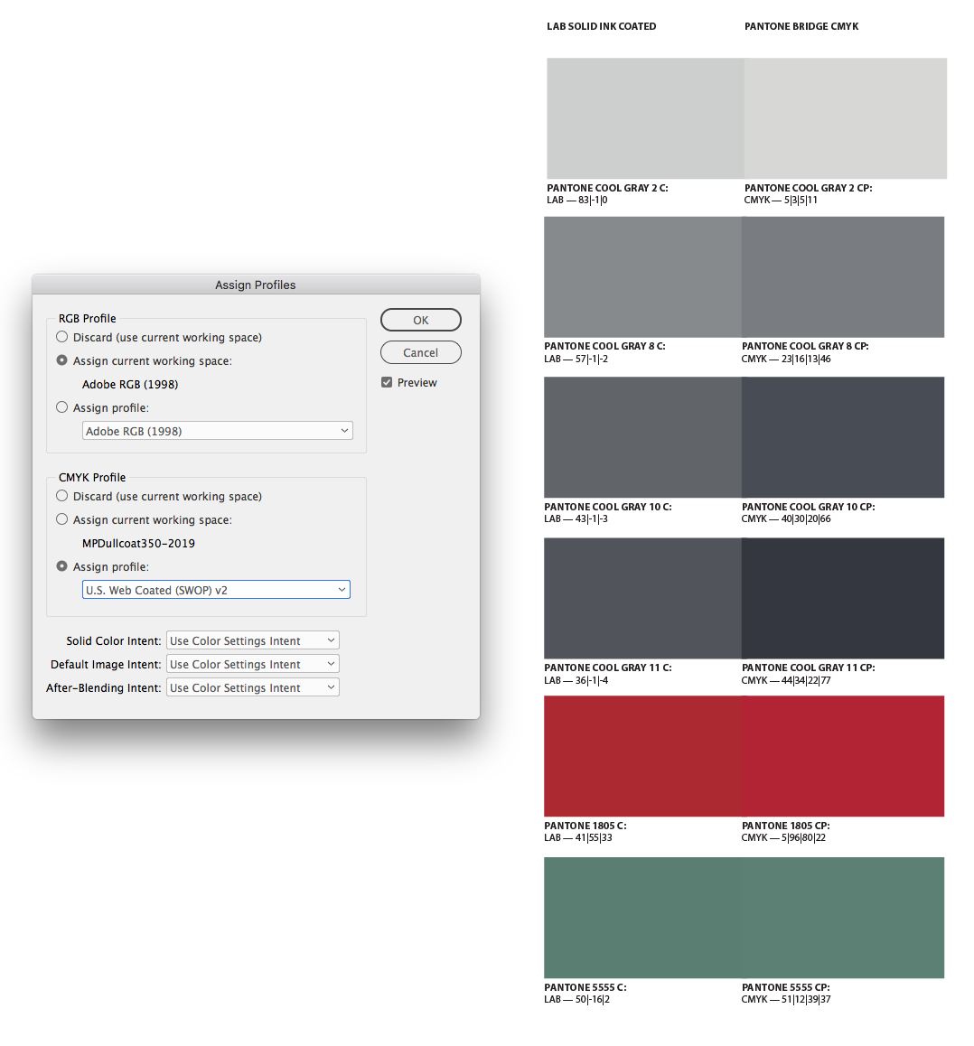
Hi Danny, And there's enough randomness to the Bridge values that makes me think they are not color managed conversions from the measured solid ink Lab values, but seem to be subjectively arrived at builds—I don’t think there is any press profile standard behind the Bridge CMYK values.
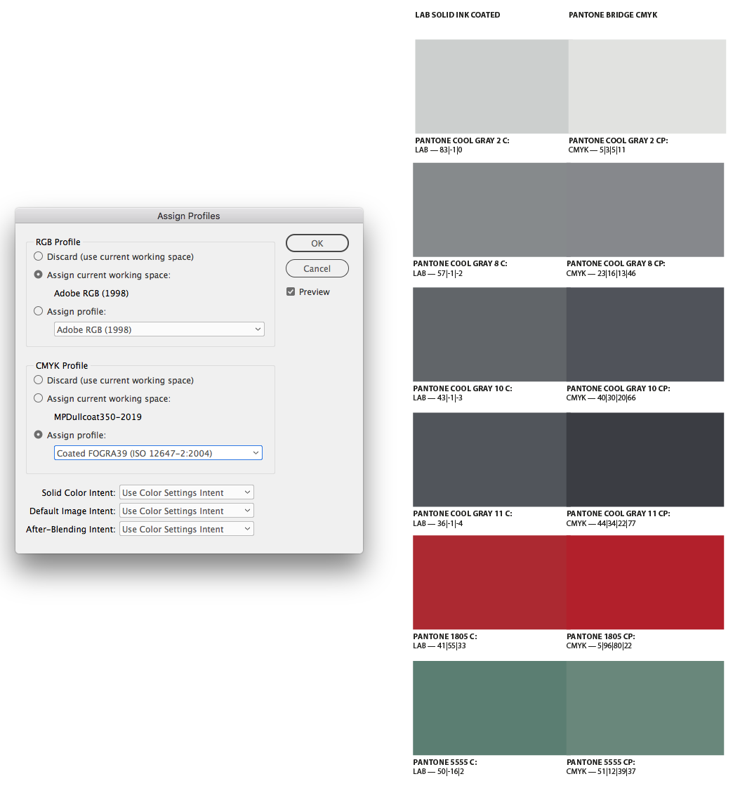
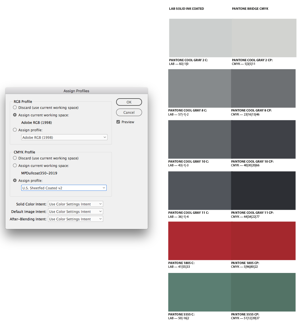
It’s most noticeable with neutral colors. If Pantone used a standard press profile to make the Bridge conversions, we should be able to assign that profile and get an appearance match between the solid ink Lab colors and the CMYK Bridge colors.
If I assign the default US Web SWOP Coated, none of the Cool Gray swatches match, and Cool Gray 2 is a lighter value while Cool Gray 11 is a considerably darker value.

I don’t get a match with any of the standard press profiles provided with CC:


Copy link to clipboard
Copied
"I would suggest moving from CS3 or CC to the latest Photoshop edition which would automatically update all the Pantone Libraries."
While I agree on updating, especially from a very early CS3 version, Adobe has not updated the Pantone+ libraries it ships since 2010.
The latest Pantone Solid books are now up to version 4. Adobe still ships the original Pantone+ (v1) books with CC 2019.
Every time Pantone releases new colors — as they did with the infamous 336 pallette, then 180-something colors in 2015(?), and which they just did again this week with another 294 — they instruct users to download their Pantone Color Manager software and export new ACB files.
And no, the newer books aren't compatible with the older books. The colors are book-specific. (if you pick a color from one book and give it to someone who doesn't have that book — even if it's an older, common color — they'll get "this file uses colors from a book you don't have installed" message.)
Copy link to clipboard
Copied
Hello All!
I am the original poster - I'm surprised to see this become active again after two years. Just goes to show there is a lot of interest and ideas on how to manage colors.
First - thanks to those who suggested the space after the 583 = that worked!!!
Second - As a small business, I chose to self manage my colors. My main concern was for my biggest client. Their logo contained PMS 280 which was a solid blue. When the new definitions came along it went to a very dark navy. My solution, though maybe clumsy, works. I simply copy the logo into each new file, it shows up in the swatches and I am good to go.
One more comment - I have read a lot of people using lab colors. As a print business, I convert them to CMYK before the job goes to press. If you are submitting your job for four color printing, I would make sure the colors are converted by you to assure you are getting what you want. ![]()
Thanks for all the feedback.
Rhonda
Copy link to clipboard
Copied
Their logo contained PMS 280 which was a solid blue. When the new definitions came along it went to a very dark navy. My solution, though maybe clumsy, works. I simply copy the logo into each new file, it shows up in the swatches and I am good to go.
I think this is a good example of why using Pantone's solid ink swatches as a reference for 4-color printing can be a problem.
The solid inks in Pantone‘s formula guides are not printed with CMYK process colors, they are custom mixed solid inks. That's the reason for the Lab definitions, is it is possible to use an instrument like a colorimeter to get an accurate color reading directly from the printed swatch. But, the accuracy of a displayed Lab color would depend on the accuracy of your monitor profile—to display a Lab color, InDesign or Photoshop has to convert the Lab values into your monitor’s RGB profile. If the monitor profile is not an accurate representation of your monitor calibration, then the Lab Pantone color could be off (or it might not be in the monitor‘s gamut).
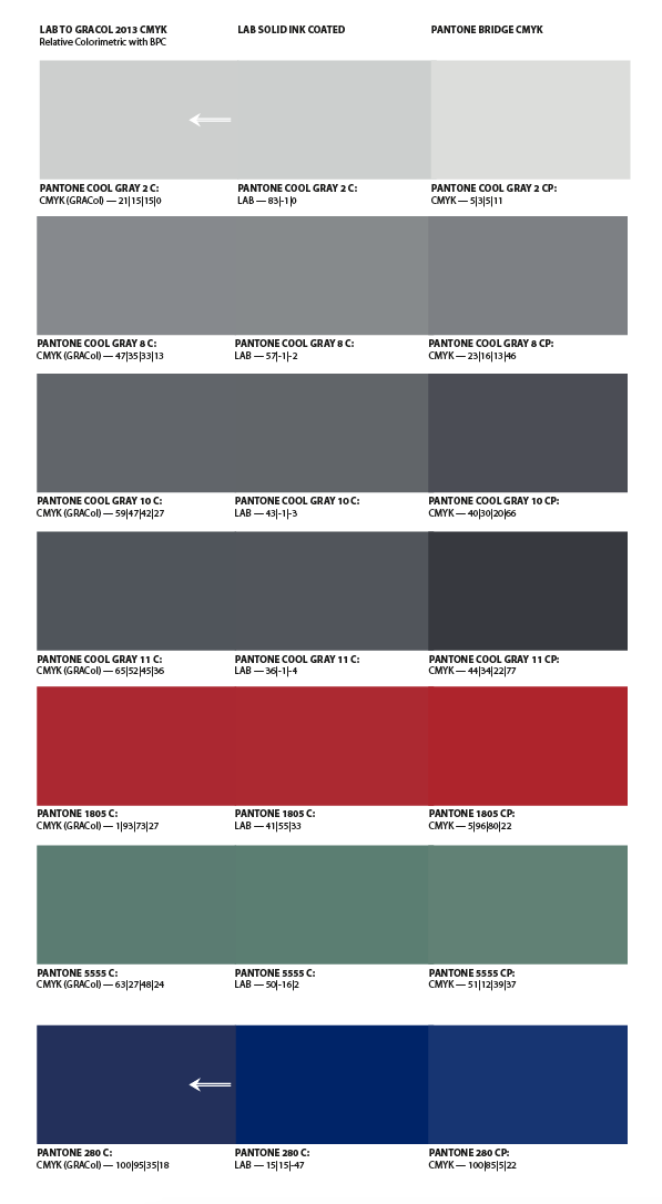
Pantone 280 is out-of-gamut to most CMYK spaces—InDesign or Photoshop will show an out-of-gamut warning for the provided Lab values—and it's not really printable with any CMYK ink set. If the client cares about matching the color, the solid ink has to be run as a separate plate on press.
In the case of 280 neither a Bridge or converted CMYK color would match. Here the column on the left is a conversion from the Lab values to GRACol Coated. The out-of-gamut 280 doesn't match, but the other colors do because they are in GRACol‘s gamut:

Copy link to clipboard
Copied
@ Rob - Interesting. The definition I have been using for PMS 280 for over 10 years is cmyk 100 | 72 | 0 | 18. My final product is a bright, vibrant blue (not dull like the cmyk shown in your attachment - it's more like the lab color shown). I think the gap between spot and cmyk printing has closed over the years as presses have become more sophisticated and accurate. What I have printed does match the colors in my pms books. If I was working for more corporate clients in a metro I would probably have to rethink my process. ![]()
Copy link to clipboard
Copied
I think the gap between spot and cmyk printing has closed over the years as presses have become more sophisticated and accurate.
I don’t think there's been much change in ink sets, CMYK still has a limited gamut relative to custom solid inks (think Pantone PurpleC).
Your 280 version is from the legacy Pantone solid library (which were all built CMYK definitions, not Lab) and if it is working for you that's great. But I don‘t think you could expect consistent results from any single set of device dependent CMYK formulas relative to the solid inks, because the color appearance of CMYK changes depending on the press profile.
The legacy 100|72|0|18 build does have better saturation, but is doesn't maintain the value of the Lab color. On my display the darker, saturated Lab value is a very close match to the printed solid ink in the Pantone book swatch.

The color managed conversion to GRACol is trying to match the dark value so saturation is sacrificed.
Copy link to clipboard
Copied
While the improvements in press control and colour management have helped standardise the CMYK gamut over the years, they haven't widened it. Gamuts have widened in toner-based digital print, but most DFEs/RIPs are set to mimic a press standard, so they don't really take advantage of it.
But as Rob suggested, if you're starting with Pantone's old CMYK builds as your target, you've a better chance of a match than you have trying the match the actual solid ink that's definitely out of any CMYK gamut.
Copy link to clipboard
Copied
If you've been using the same CMYK definition of this particular swatch, is there a reason you can't just define the swatch in CMYK and leave it at that?
Because Pantone sometimes does make changes — like they did when the defaulted to using Lab instead of CMYK for their color definitions when they changed to Pantone+. Many, _many_ of our hues shifted, on screen and, for example, on laser printers. This caused a small bit of confusion as people who printed one color last week were getting a different one.
Pantone will also change the pigments used in their formulas. Per their formula guide, the base inks stay the same, but the pigments used to create those colors are now different. And yes, we found this out the hard way when a book that printed with a particular Pantone ink reprinted with that _same ink_ only instead of a neutral beige it came out pink. Lots of arguing with the printer about how they mixed the ink wrong, with their insisting they matched the chip, only to discover that our chip book was from the old, original Pantone book, while the updated Pantone+ book had a visibily different hue. Again, same color swatch, same formula, visibily different hue.
If you have a CMYK breakdown that's working for you, don't complicate the matter by referencing it to an ink that isn't in CMYK. Depending on who converts it and how you can get varriable results.
-
- 1
- 2
