 Adobe Community
Thick letter L in pdf

Copy link to clipboard
Copied
when i export an indesign file to pdf, any letter L's in the text appear to be very thick and stand out like a sore thumb. is there any reason for this and is it possible to ge rid of this problem.
thanks in advance
Phil


 87
Replies
87
87
Replies
87
Copy link to clipboard
Copied
Hi Kenneth
Thanks for your reply. I will embed text in the future but your example of the 'italic book' just confirms that pdfs - embedded or otherwise are still not completely reliable. You mention 'bluelines' - do you mean printed proofs? Problem is that, in my neck of the woods, printers are abandoning all forms of paper proofs and just sending pdfs to sign off. I had a job recently where I sent the printer an InDesign pdf. The printer then sent me their paginated pdf. I approved it and the job was printed. When I got the job back there were two lines of text missing. I checked the proof that I'd signed off and the text was there (This text wasn't embedded - it was part of a placed illustrator file that had been converted to paths). Anyway I got on the phone to the printer ready to play hell with him only to discover that when he viewed exactly the same pdf, he couldn't see the extra text - so he never new it was there!
So I originally sent him a pdf where I could see the extra text.
... He received it but he couldn't see the extra text.
... He sent me his paginated pdf for approval - and I could see the text.
- Neither of us new the other was seeing the text differently. So I couldn't sue him because all his records showed the extra text never existed. And the proof that I approved - as far as he was concerned - never had the extra text on it.
Anyway, since then, I've always sent an additional set of jpegs of each page and said I'm only approving the job on the basis that they have checked that the jpegs match the pdf. But it's far from ideal and I'm not sure what legal rights I'd have if there was a similar print problem again.

Copy link to clipboard
Copied
White text on a dark background by chance? If so, and you still have the file, check to see if it's set to overprint in Illustrator?
Bob
Copy link to clipboard
Copied
Bob - Thank you, Thank you, Thank you!
You're right. And I've now set up Illustrator, InDesign and Acrobat Pro to spot the problem in future. Obviously my printer must have had his version of Acrobat Pro set to Preferences - Page Display - Use Overprint Preview - Always.
The mystery solved at last!
And the root of the problem: Freehand. The Illustrator file was originally a Freehand file with the fonts outlined in Freehand before it ever got to Illustrator. And Freehand was always notorious for turning colours to overprint when outlining.
Cheers!
Copy link to clipboard
Copied
You mention 'bluelines' - do you mean printed proofs?
Yes.
If your printer won't send you paper proofs, maybe you need a new printer. I've worked with printers in China who send paper proofs.
It's easy enough to rasterize a perfectly good vector PDF if you have Acrobat Pro. Export a PDF from Indesign. Open it in Acrobat Pro. Print to the Adobe PDF printer and turn on Print as Image. The resulting PDF will have no fonts embedded, no vector data, just rasters. Much easier than making truckloads of jpegs. Of course, this is going to limit the PDF to, I think, 600 dpi, so you would want to instruct your printer to use this for proofing purposes only. And you yourself should check it against the full vector PDF with embedded fonts before you send it out.
BTW, the example I gave you happened 13 years ago, using probably Acrobat 3. Things have gotten better since then. The purpose of the example was not to prove that PDF is fallible; it was to illustrator the necessity of checking proofs. The truth is that PDF is amazing, but we all know there is no perfect software, especially when it's being written and used by humans, a particularly imperfect species.
Ken
Copy link to clipboard
Copied
Thanks Kenneth for your advice.
I'll certainly have a go at your procedure for rasterizing pdfs for proof purposes.
You'll see in the reply above that Bob Levine has solved the mystery of my missing text.
So all in all I'm now feeling a lot more positive about working with pdfs!
Cheers
Copy link to clipboard
Copied
Hi everyone - I've doscovered a solution. I hope it works for other people as well. (As it was happening to me a hell of a lot)
I am using InDesign CS3 btw.
Instead of selecting the "print" to PDF option from the file menu - select the "Export" option - then export the document to PDF and the rendering issue should disappear entirely.
It really was that simple - no rasterizing, no create outlines or not creating outlines - no issues between copying and pasting text from other sources - just export the document rather than selecting to print the document.

Copy link to clipboard
Copied
I often get that thick letter 'l' and I always export...it doesn't print out
that way, though.

Copy link to clipboard
Copied
In doing some tests, I've found this thickness issue occurs with any basic rectangle shape, whether it's from a sans serif font converted to outlines, or if I draw a thinly shaped rectangle in Illustrator or InDesign. It appears more so at smaller zoom sizes where Acrobat avoids adding any anti-alias smoothing.
These shapes render correctly in Acrobat Pro (Mac v.9.5.0) if you turn off "Enhance thin lines" found under Preferences > Page Display > Rendering
Since it would be difficult to ask all end users of a PDF being sent out to turn this "feature" off, I have discovered that the issue can be resolved with either of these two ways:
- Add an extra point (without altering the appearance) to the rectangle shape's edges, so it's no longer just 4 vector points. It'll still visually appear as a straight rectangle, but Acrobat must view it as a polygon now instead of a rectangle and adds proper anti-alias smoothing.
- With logos or type, make all the letters a compound path (In Illustrator choose Object menu > Compound Path > Make). This is why a lowercase i doesn't have problems. The dot is already a compound path with it's rectangle below.

Copy link to clipboard
Copied
Nice summary, Mattw0023. I've been horrified by this problem in PDFs for many years, and I've sought solutions (or at least explanations) now and then, without success. But this thread (and a few of its links) certainly nails it.
Even though savvy PDF creators now know how to eliminate the problem (albeit sometimes with font editing or unacceptably tedious hand editing), and even though savvy PDF readers now know to turn off Enhance thin lines, it's utterly amazing to me that the Acrobat team hasn't fixed this problem. The problem again came to my attention most grotesquely this morning when I received my PDF of the 2013 February issue of Scientific American. There are several pages right at the beginning which are peppered with dozens of gigantic sans-serif ones and lower-case els, so much so that the whole page looks like a cruel joke on the publisher.
The same issue also displays tons of examples of jagged baselines, especially with one of their main fonts (BrunelDeck Bold, 10pt.) which looks terrible well into high magnifications.
Clearly, Scientific American would be shocked to see how bad their PDF magazine looks to many of their customers, and I'm sure somebody at Adobe would be equally chagrinned to see how just a tiny bit of ignorance on the part of legions of end-users, or just a tiny bit of ignorance on the part of numerous respected publishers, is producing such a clunky unprofessional result. We may speculate on why the magazine hasn't managed to eliminate the problem, but ultimately (and rightfully) it all reflects on Acrobat, which is a shame, since it's the only near-universal page display format we have. The fact that this problem has been around, unfixed, for many years just makes the whole situation more astonishing.

Copy link to clipboard
Copied
ashtangakasha,
You seem to imply that this is a problem that Adobe can resolve? Given the quite old thread that you re-opened fairly well sums up the issues as really issues of font design, outlining, etc., none of which are under the control of Acrobat/Reader, what do you suggest Adobe do to “fix” this problem?
- Dov
Copy link to clipboard
Copied
Hi Dov,
Well, I didn't mean to imply that Adobe could solve this problem -- I meant that Adobe most certainly can and should solve this problem. It's slightly ridiculous that an app specifically designed to provide precise representation of typography and graphics would tolerate, without warning, such an egregious violation of accurate reproduction.
Note that many commenters in this old thread (for an old problem) point out that other text rendering engines (e.g., Apple's) don't have this problem. Note also that everyone has found that when printed, there is no problem. This suggests that the problem can be solved, not that we have to provide special instructions as a work-around.
The essence of it seems to be a choice the Acrobat developers made long ago concerning how "four-anchor-point" rectangles should be rendered. Coupled with the "enhance thin lines" feature, outlined rectangular glyphs end up looking terribly inaccurate. If this isn't an obscure technical glitch, then I don't know what is. Surely you don't believe end-users should have to be warned about this kind of thing?
If the problem is, as you imply, not Adobe's, then the solution is a classic waste of resources -- thousands of end-users and PDF creators must be taught to accomodate a short-coming in something that one or two programmers could resolve. PDFs are being used more and more as end products, not just for print preview or document interchange, and converting to outlines is a perfectly rational thing to do. Since it's not an error in the outline conversion, why not give the venerable Acrobat engine a tweak so that it's not causing problems for anyone? (Of course, the real tweak isn't in the engine itself, but merely in the implementation of Enhance Thin Lines.)
If nothing else, why not make ETL (a) not the default, and (b) insert a note to the user alongside the setting ("May cause small rectangles to render inaccurately"). I'm certain that if even just this small concession were made, anyone noticing that note would probably slap his/her forehead and exclaim, "So that's what was causing that!"
Considering the swift and ubiquitous trend towards higher resolution displays, perhaps the ETL feature itself is obsolete. (Its only real purpose, as far as I can tell, is to prevent fine lines from disappearing, and there are almost certainly better algorithms for doing that.)
Although the thread is indeed old, it was especially helpful. I've been running into the issue it addresses consistently for about a decade. Isn't it at all relevant that people still need this information? Adobe can certainly fix this problem.
Respectfully,
Allen
[changed "four-control-point" to "four-anchor-point" - ac]
Copy link to clipboard
Copied
Hear Hear!
I completely agree Ashtangakasha.
Adobe have known about this problem since at least 2008 - probably some time before that. It's inexcusable that they haven't fixed it yet.
Copy link to clipboard
Copied
Why is this an issue if it's for print only?
Seriously, you already know you shouldn't be doing this anyway. If you
need a PDF for screen just create one.
You can't begin to tell me that a press ready PDF with outlined type is
going to be preferred to one optimized for online viewing with real type.
Finally, this isn't an InDesign issue, it's an Acrobat issue and should
probably be discussed in the Acrobat forum.
Bob
NickLW <mailto:forums_noreply@adobe.com>
Saturday, January 19, 2013 1:22 PM
>
Re: Thick letter L in pdf
created by NickLW <http://forums.adobe.com/people/NickLW> in
/InDesign/ - View the full discussion
<http://forums.adobe.com/message/5007008#5007008
Copy link to clipboard
Copied
Bob, I completely agree that this discussion should be on the Acrobat forum. But I couldn't resist responding to Matt's summary of the situation. That precipitated further discussion, which was also hard to resist. And your post is also irresistible. It's a catch-22! What's a lad to do?
Why is this an issue if it's for print only? Well, for one thing, people send PDFs back and forth as "soft proofs" all the time, and the "four-anchor-rectangle" bug causes enough confusion to be worth fixing.
A press-ready PDF with outlined type is indeed preferred by many a quick-print service center. Perhaps you just deal with the top-flight print houses; I have to work with what's available in small towns, many of whom can't print their way out of a paper bag. (To coin a phrase.)
As for "shouldn't be doing this anyway," well, gee, I'm really sorry.  I'll be sure everyone involved is dealt with, but since some of them are paying for "doing this," I have to go easy on them.
And I promise that I won't post any more replies on this thread. (Unless the temptation is truly irresistible.)
Allen

Copy link to clipboard
Copied
Thanks for everyone's explanations above. This acrobat issue hits us on both Illy and Id.
I'll look for an acrobat thread, but in case anyone is on the fence regarding the need for a fix... a number of printers, of various sizes and capabilities, want outlined text, as do we as designers for the final file.
Clients will often review the final print files prior to prodcuction (not just a "preview), and in some cases are responsible for the actual submission. In every case, they will waste all parties' time by having to call about the strange bold letters . And in every case, we waste time going back to double check that we didn't really "mis-bold" something this time. Then, the client may have to try to explain it to their supervisor and/or business partner who may or may not grasp it, and so on.
It's easy to just render out alternative image formats for everyone's preview, but there will periodically be (an often legitimate) need for dissemination of the final print files to lay pesons.
Copy link to clipboard
Copied
This thread is a year old and the fact remains that outlining type is wrong. If you insist on doing it, you’ll have to live with the consequences.

Copy link to clipboard
Copied
Bob Levine schrieb:
This thread is a year old and the fact remains that outlining type is wrong. If you insist on doing it, you’ll have to live with the consequences.
I completly agree.
Outlining causes not only a problem with L or I or l or - or – or —, but also with the loss of automatic numbers, paragraph rules, underlines, strikethrough, bullets, text frames, strokes and a lot more. There is no reason to outline fonts, avoid it and you will not run into problems where rectangle glyphs are converted into a line with 2 anchors which will end up in a bad screen experience.
(This thread is not 1 year old, it is 6 years since this thread has started!)
Copy link to clipboard
Copied
Yes, this is a rendering (anti-aliasing) bug/flaw that Acrobat introduced back around version 5. Older versions of Acrobat did not have this issue. So, I do believe it is up to the Acrobat team to correct this issue they introduced.
I've attached a screen shot from Acrobat and Preview to see the difference. The rectangluar outlines should be anti-aliased.
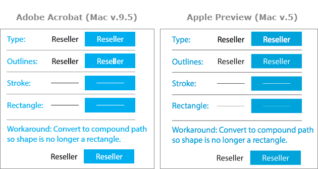
If you have a PDF with a lowercase "L" as type, Acrobat will anti-alias (smooth) it's edges correctly. If you convert this type to outlines or draw a thin recangular shape, Acrobat stops anti-aliasing these paths, which makes them appear innacurately thicker and out of place next to other complex paths.
It stems from the "Enance Thin Lines" preference which is useful for making the onscreen appearance of thin strokes remain bold by not anti-aliasing them into nothing. The solution is that Acrobat should only "enhance" strokes, but not rectangles as it once did in older versions.

Copy link to clipboard
Copied
SOLUTION!
If you are working in Illustrator all you need to do is take the "Add anchor point tool" and add an extra point on the sides of the I's and L's and probably periods too. See screenshot below. When you save as PDF and view in acrobat the thick lines will now be gone. This is not an easy fix if you have a lot of text, but it works none the less.
Copy link to clipboard
Copied
Better solution: Don't convert text to outlines!
Copy link to clipboard
Copied
+1
Amen!
If there was a feature of Adobe software that I would revoke if I could, it would be outlining text. If you review these forums, many, many more problems have been caused by using this technique than any imagined problems of those demanding it have been resolved! 
- Dov
Copy link to clipboard
Copied
That's a bit extreme, even in InDesign, considering the still vast number of small presses (not to mention non-print output devices) that don't (or won't) handle real fonts. And in Illustrator there are so many reasons for outlining text that have nothing to do with printing. Surely some of those might even have legitimacy in InDesign.
Allen
Copy link to clipboard
Copied
Any press/RIP/system that's can't handle real fonts should be avoided. You'd be dealing with a vendor that refuses to spend any money to support customers and is not worthy of your business. Outlining text for anything other than artistic effects (which would not have anything to do with what this thread is about) is just plain wrong and should not be done.
You can debate that if you want but you're not likely to find too many professionals in agreement with you.
Copy link to clipboard
Copied
Actually, I'm not debating anything. I'm just commenting on the inappropriateness of removing a feature that many people rely on, even if their uses are unrelated to this thread. Features shouldn't be removed on the basis of their appropriateness to a thread on a forum, and advocating that, as the post seemed to be doing, is (hopefully) just hyperbole.

Copy link to clipboard
Copied
Just wondering, where does writing postscript, exporting eps, and flattening transparency fall on the list of features to revoke?

 AdChoices