 Adobe Community
- Home
- InDesign
- Discussions
- Re: Tint vs Transparency - This seems weird...
- Re: Tint vs Transparency - This seems weird...
Copy link to clipboard
Copied
Hello,
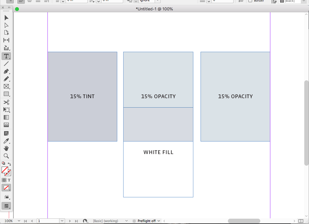
With the basic document settings in InDesign it appears that applying opacity to a coloured shape produces an incorrect result, whereas applying tint to the swatch produces the correct result.
There's also some weird behavior in that putting white underneath the opacity treated object causes it to change.
These differences are shown in the attached PDF.
I have two questions:
1) Is there a document setting I'm missing that will bring the same result from both methods?
2) Am I wrong to assume the results should be the same - and if so, why?
Thanks in advance.
https://shapecreative.co.nz/
 1 Correct answer
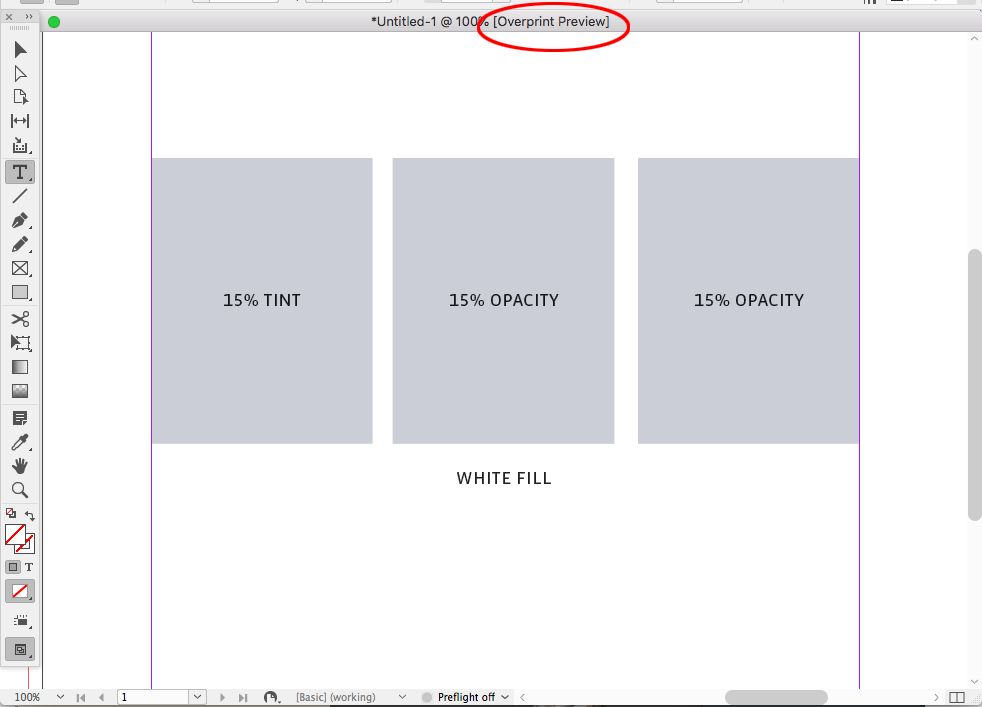
Opacity changes depending on the object below, so if there is nothing below you would have to turn on Overprint Preview to see the output appearance when the page is flattened.
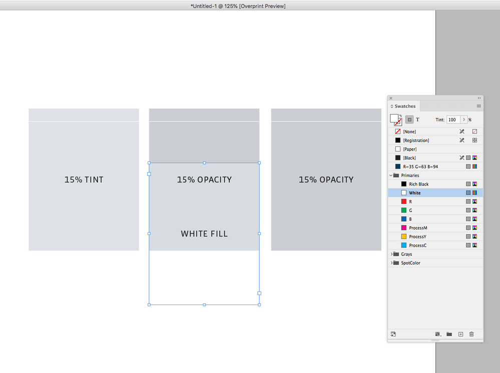
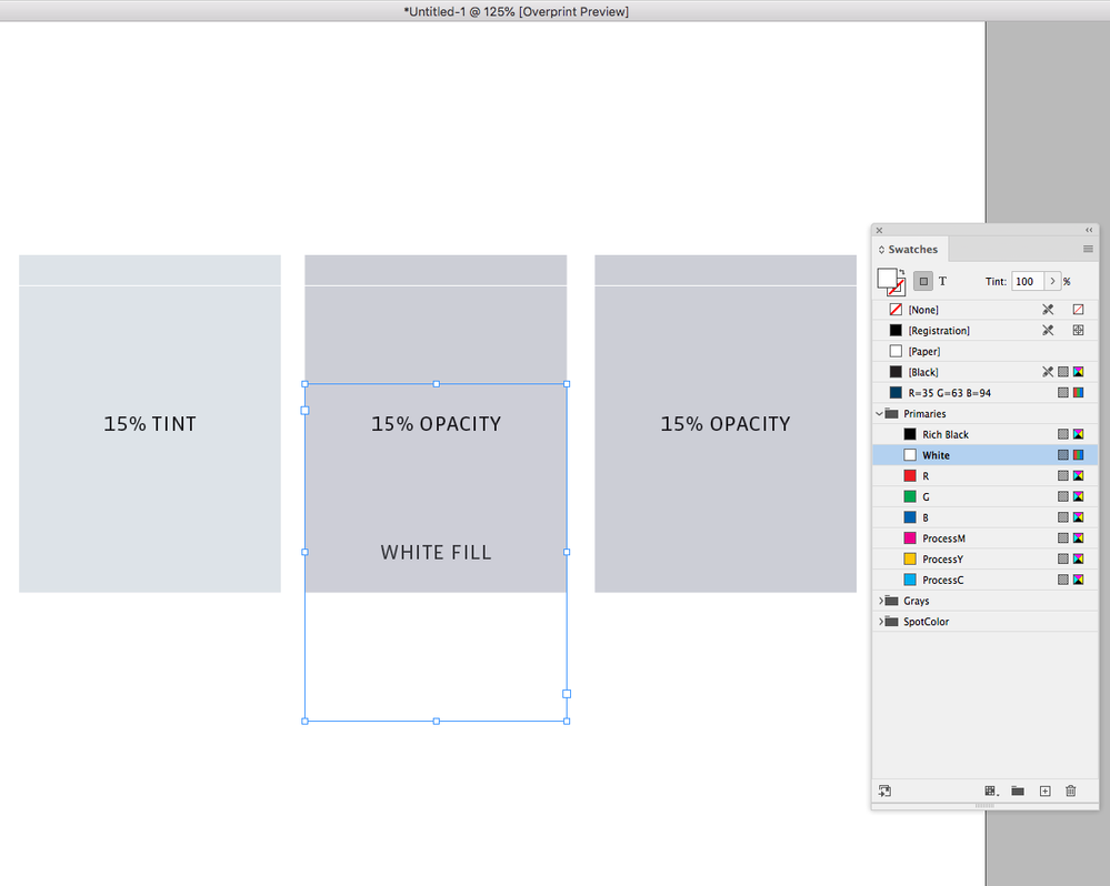
Output Preview turned off:
Output Preview on:
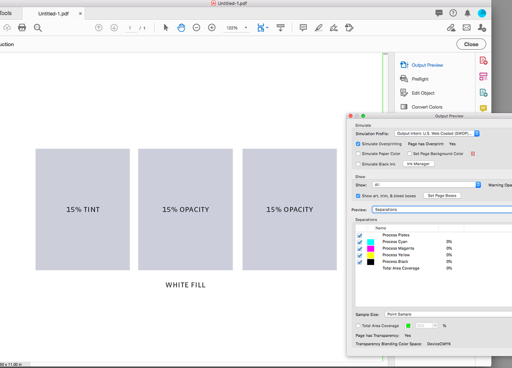
A PDF/X-4 export viewing via Output Preview in AcrobatPro—output values match:
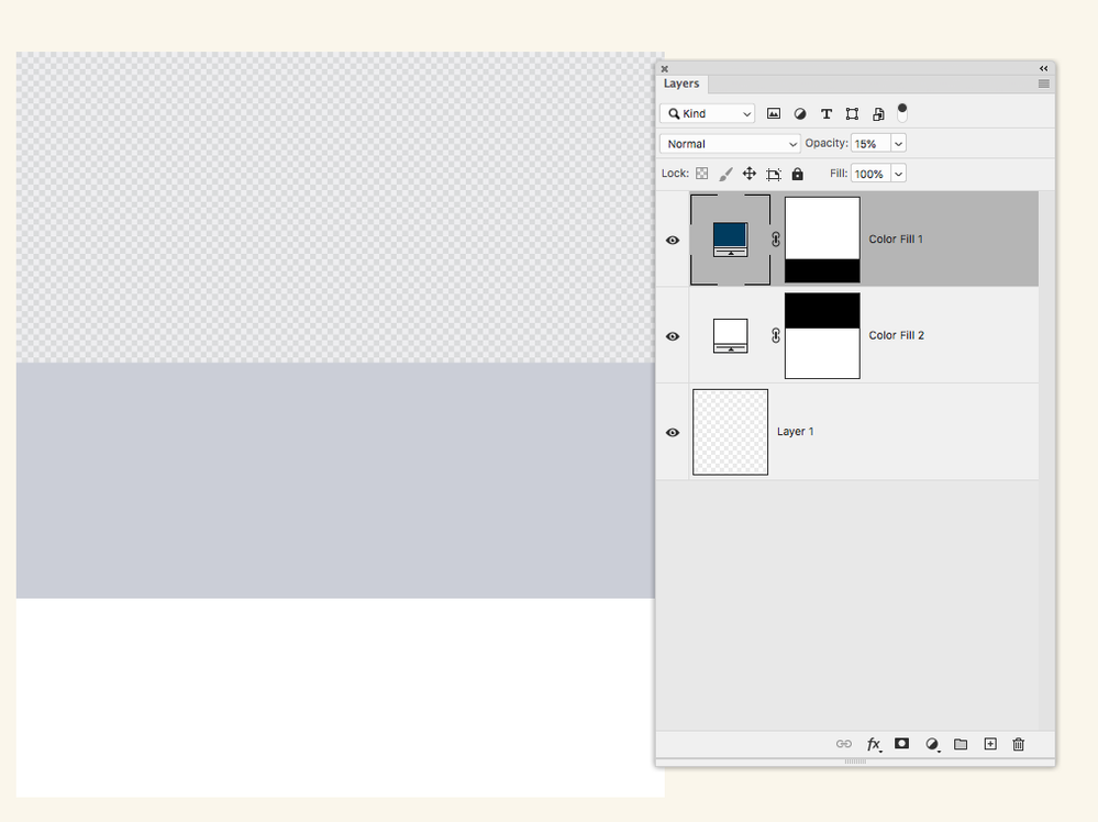
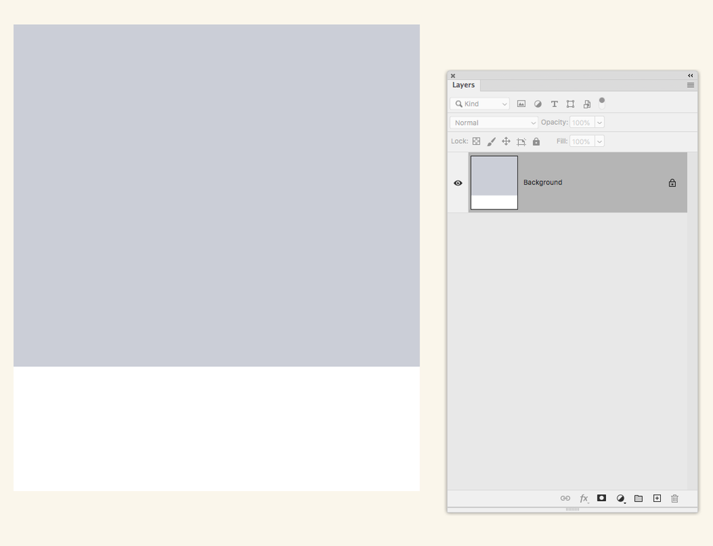
Photoshop works the same way—a layered file with live transparency:
The layers flattened:
Copy link to clipboard
Copied
The results are not the same except in special cases.
Generally speaking, unless you are trying to achieve some special effect, you should not use transparency as a replacement for use of a tint on an opaque graphical object.
Transparency involves interaction, i.e. “blending,” with the object's underlying content. The Adobe imaging model (also the PDF imaging model) supports 16 distinct transparency blending modes that describe the interactions of an non-opaque object with the underlying content.
There are only special cases in which a tint of a color is the same as transparency of the same percentage as the tint on a solid color. One such example might be an opaque rectangle of CMYK=(0,0,1.0,0) with a tint of 20% versus a rectangle of CMYK=(0,0,1.0,0) with 20% transparency with normal transparency blending overlaying CMYK=(0,0,0,0) content.
Copy link to clipboard
Copied
Thanks Dov,
Whilst it's not immediately apparent to a user that this would be the case, it makes sense when you describe it this way.
I have another question -
In the example I attached - the transparent colour has a different hue and brightness to the tinted one. The tinted one, in the context of the design I'm working on is less attractive in this case. – I notice that if I switch the colour to RGB, InDesign displays the same colour across both the transparent and tinted methods - in this case the cooler, lighter colour (which I prefr) of the pair is applied to both. Would this techincally be a more optically accurate representation of the tint of the blue than the CMYK handling?
https://shapecreative.co.nz/
Copy link to clipboard
Copied
Opacity changes depending on the object below, so if there is nothing below you would have to turn on Overprint Preview to see the output appearance when the page is flattened.
Output Preview turned off:
Output Preview on:
A PDF/X-4 export viewing via Output Preview in AcrobatPro—output values match:
Photoshop works the same way—a layered file with live transparency:
The layers flattened:
Copy link to clipboard
Copied
Thanks Rob - Interesting to know - Am I right to assume this would not be the case in RGB?
https://shapecreative.co.nz/
Copy link to clipboard
Copied
There would still be a difference between a white object below and nothing below, and the chosen Transparency Blend Space would have an affect. In any case if the document is for print you’ll need to turn on Overprint Preview to get the an accurate output preview.
RGB Swatch, RGB vs CMYK Transparency Blend Space with OP turned on:


