 Adobe Community
- Home
- InDesign
- Discussions
- Re: Typeface appears uniform in digital but is dif...
- Re: Typeface appears uniform in digital but is dif...
Typeface appears uniform in digital but is different weights when printed
Copy link to clipboard
Copied
Relative newbie to InDesign here; thanks for your assistance. I've got a simple InDesign document that I've converted to PDF. When viewed in ID and in the PDF, the typeface looks perfectly uniform throughout. Yet when I print the document, some sections of the text are heavier than other sections:
(I turned it sideways to emphasize the weight; red dots indicate lines that are heavier.) I checked every variable I know of but so far the only thing changing from line to line is the kerning - everythng else appears to be exactly the same (color is uniformly black, 13pt font, all Constantina regular). Any ideas why this might happen? Thank you!
Copy link to clipboard
Copied
Can you post the PDF file on Creative Cloud or Dropbox or some other service so others can download and test? (You can't upload a PDF file in our forum.)
Copy link to clipboard
Copied
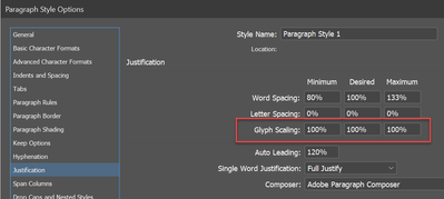
Check to see if you have any glyph scaling applied:
Copy link to clipboard
Copied
David, may I ask, what amount of glyph scaling would need to be applied in order to (potentially) run into this issue? My understanding was that a range of 1–2% either way (that's 2–4% total) would be safe for body text. Is that in error, or any caveats? Kind thanks.
Copy link to clipboard
Copied
Hi @Typothalamus , Glyph Scaling only changes the horizontal scaling of the text and would not affect its weight.
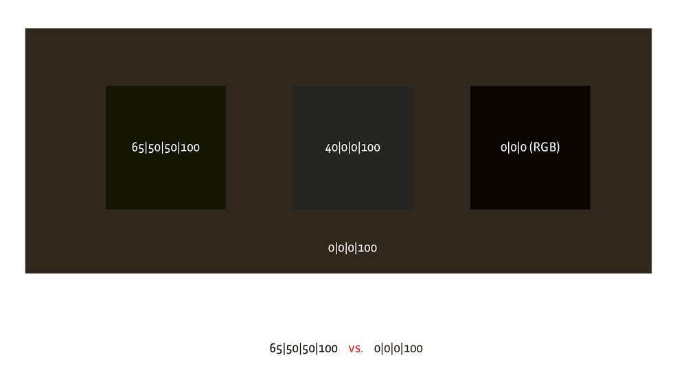
Text that is filled with 0|0|0|100 CMYK black vs. a rich black or an RGB converted black, e.g. 85|75|60|100, would affect the printed weight.
Copy link to clipboard
Copied
Hi @rob day , thanks for your reply. I'm overseeing a design book go to print on a 4-color press here in Taiwan, but come from a POD background. Needing to becomee keenly aware of what it seems you know well – how the various blacks behave in print. What is the norm/standard for a higher-end art book – should the main body text be in standard black (0|0|0|100) and the larger titles in rich, or should all text be in rich? I'm concerned also because the chosen typeface (Calluna Sans, 10pt) is appearing a tad too heavy, and if it prints heavier, we're in trouble. And Calluna Sans Light is too light.
I get that glyph scaling changes horizontal scaling, yet must be a bit confused about the term – why wouldn't that see vertical features such as font stems, for example, becoming wider? I've long heard that we need to be aware of such distortions (in weight, it seemed) from scaling, and thus partly why it's a bit of a 'type crime'. I'm at a loss here.
Copy link to clipboard
Copied
Offset inks are somewhat transparent, so the addition of CMY affects the color of "black". But the affect becomes less discernible in line art and small text, and has the downside of creating registration problems and changing the apparent weight of small text.
InDesign can preview th affects of Black + CMY when the Appearance of Black Preference is set to Display All Blacks Accurately, and the correct CMYK color profile is assigned to the document (Edit>Assign Profiles). Here the fills with CMY added are obvious when the coverage is large, but not noticeable in the small type:
The CMYK profile also affects the appearance of black. Black will print differently on an uncoated sheet and an uncoated profile will soft proof that effect. Here the assignment is GRACoL Uncoated 2013:
why it's a bit of a 'type crime'
Whether you need Glyph Scaling depends on what you are trying to justify. I wouldn’t use it in a headline Paragraph Style because there would be no added benefit in fitting the text.
But with small, justified body text, set in a narrow measure, there would be noticeable copy fitting benefits—you might solve white space "river" problems at the cost of a 1% or 2% distortion. Also, when you use Glyph Scaling it isn’t necessarily applied to all of the text—it’s only used for copy fitting difficult lines.
Copy link to clipboard
Copied
Tremendously helpful @rob day – I have a clear sense of what's being conveyed with that. The book will be printed on coated stock but not ultra high-gloss. As such, is it common practice to leave body text in standard black, not CMYK? Sounds as if doing so might yield sharper results, avoid registration problems, and keep the font from appearing heavier.
At the same time, sidenotes to the text set in grey. Since they're not black, should they be a percentage of black or, in CMYK?
Are profiles to be obtained directly from the paper manufacturer in order to be accurate?
My glyph scaling is very moderate (min. 99.33% and max 101.5%) and so to the word and letter spacing adjustments. It's applied to body only, and resolves all H&J violations. Thank you again.
Copy link to clipboard
Copied
Your only choices for process color modes in InDesign are CMYK, RGB, and Lab (HSB is color managed as RGB). Make sure your blacks and grays are set to CMYK black only 0|0|0|K.
The document CMYK assignment should be recommended by the printer. Make sure it is assigned to the document (Edit>Assign Profiles). If you are providing a PDF use one of the default PDF/X presets.
Copy link to clipboard
Copied
>> At the same time, sidenotes to the text set in grey. Since they're not black, should they be a percentage of black or, in CMYK?
As Rob said, you don't want those in CMYK, but you need to be aware that K-only grauys are printed as a screen, so will not be sharp, and the lighter the shade the worse it will be. If you want truly sharp gray text you will need to set it in a spot gray ink and pay for the additional plate and press charges. You should discuss this with the printer, and at the very least ask if he can supply some samples of gray text.
Copy link to clipboard
Copied
Are you sure the text fill is all the same black—0|0|0|100 CMYK is a different black than 0|0|0 RGB? The heavier weight black looks like it is printing as a 4-colors—there seems to be a magenta fringe on the edges of the text. Is there any transparency on the spread?
Copy link to clipboard
Copied
Hey all - apologes for the delay in replying back info on my own post! And thanks for the questions. I actually saved it as a High Quality Print format, in Adobe 9.0 version and higher, and the different font weights went away. No clue what caused it but once I saved it for 9.0 and above, the issue went away. Never look back... 🙂 Thanks again.
LL


