 Adobe Community
- Home
- InDesign
- Discussions
- Re: Wasted space and useless infos (Links pane)
- Re: Wasted space and useless infos (Links pane)
Wasted space and useless infos (Links pane)

Copy link to clipboard
Copied
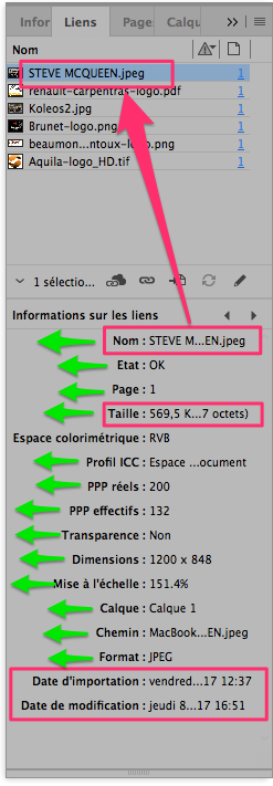
Why wasting so much space in the Informations part of the Links pane?
Please, align texts to left (as in the Name part), so even images with a short name will not be truncated, the image size will display correctly and the ICC profile too.
And please, use a short date string for the 2 dates (at the bottom), since a truncated long date string is really useless.
Thank you.


 6
Replies
6
6
Replies
6

Copy link to clipboard
Copied
Hi,
I guess because the fifth information heading "Espace colorimetrigue" cannot be moved further left... and the colons":" need to be aligned perfectly for ease of readability and better visual appearance.
As you can see below, the headings are somewhat more towards left in my English InDesign

To prevent trimming of the names for images with long names, you can always enlarge the panel horizontally...
-Aman
Copy link to clipboard
Copied
ease of readability
Nonsense: reading truncated names is not easier.
and better visual appearance
Improving readability is more important than appearance. I prefer a practical and useful software to a beautiful software.
you can always enlarge the panel horizontally.
This will only cause more space to be wasted, this is not a valid solution.
.
Copy link to clipboard
Copied
Hi,
I guess there was a mis-interpretation of my comments.
I meant the colons need to be aligned (like they are right now) for ease of readability and better visual appearance.
The fifth entry "Espace colorimetrigue" cannot be shifted further left due to lack of space, and hence such a design.
JR_Boulay  wrote you can always enlarge the panel horizontally.This will only cause more space to be wasted, this is not a valid solution.
.
This was merely a workaround. i do agree this is NOT a solution.
The above is only my opinion, I do not mean to defend the design or put aside your point of view.
-Aman
Copy link to clipboard
Copied
Since I'm a lazy guy I often use Google translate for writing messages in English, so sometimes translations may be inaccurate.
Don't care, I understood your point of view (I read English better than I write it). 
Copy link to clipboard
Copied
Hi,
Glad 
You can still find a feature request here Feature Request/Bug Report Form suggesting how it can be made better. Am sure there is scope for improvisation!
-Aman

Copy link to clipboard
Copied
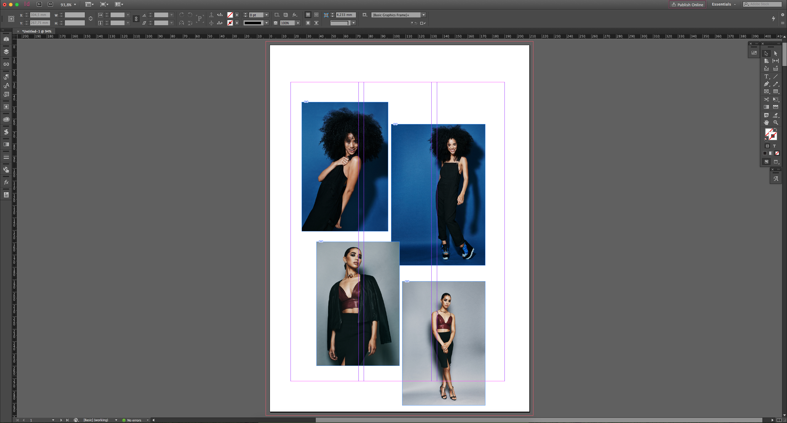
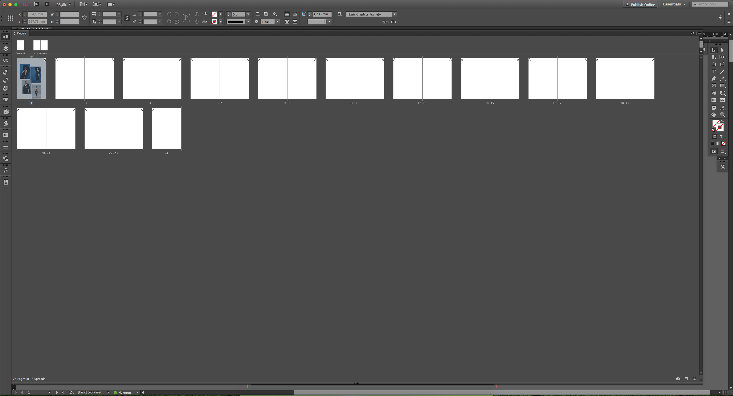
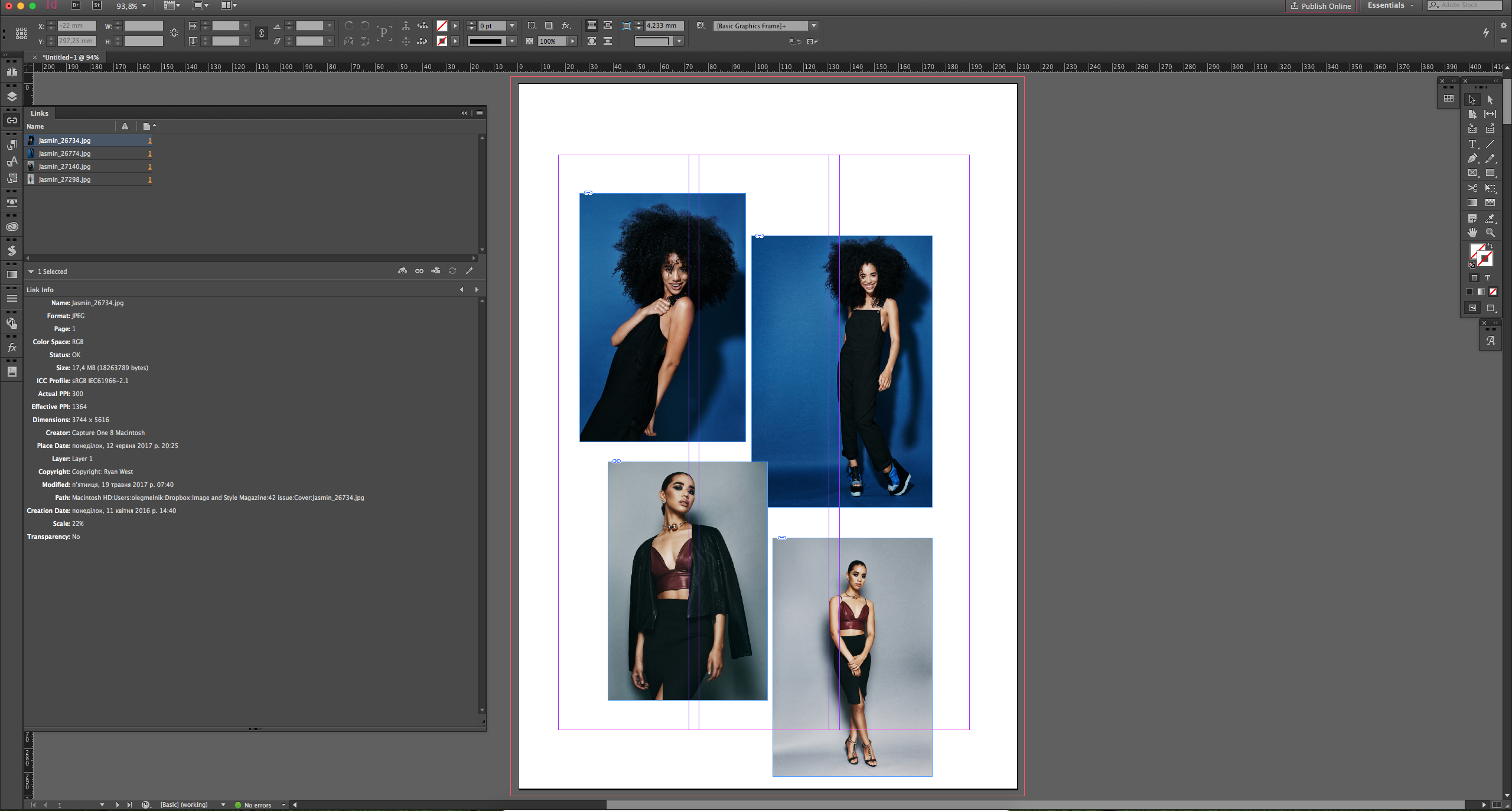
This panel is hidden by default, you can see info of the selected image/file only, so I don't think you keep this panel opened all the time... you just open it when you need it and hide once you get the info you were looking for... so there should not be a problem to open this panel to [almoust] full screen (this is what I normally do for pages and libraries panels - they are almost full screen in my workflow and showed only once needed, just for a moment)
Also, I like it to be aligned as is.
UPD:
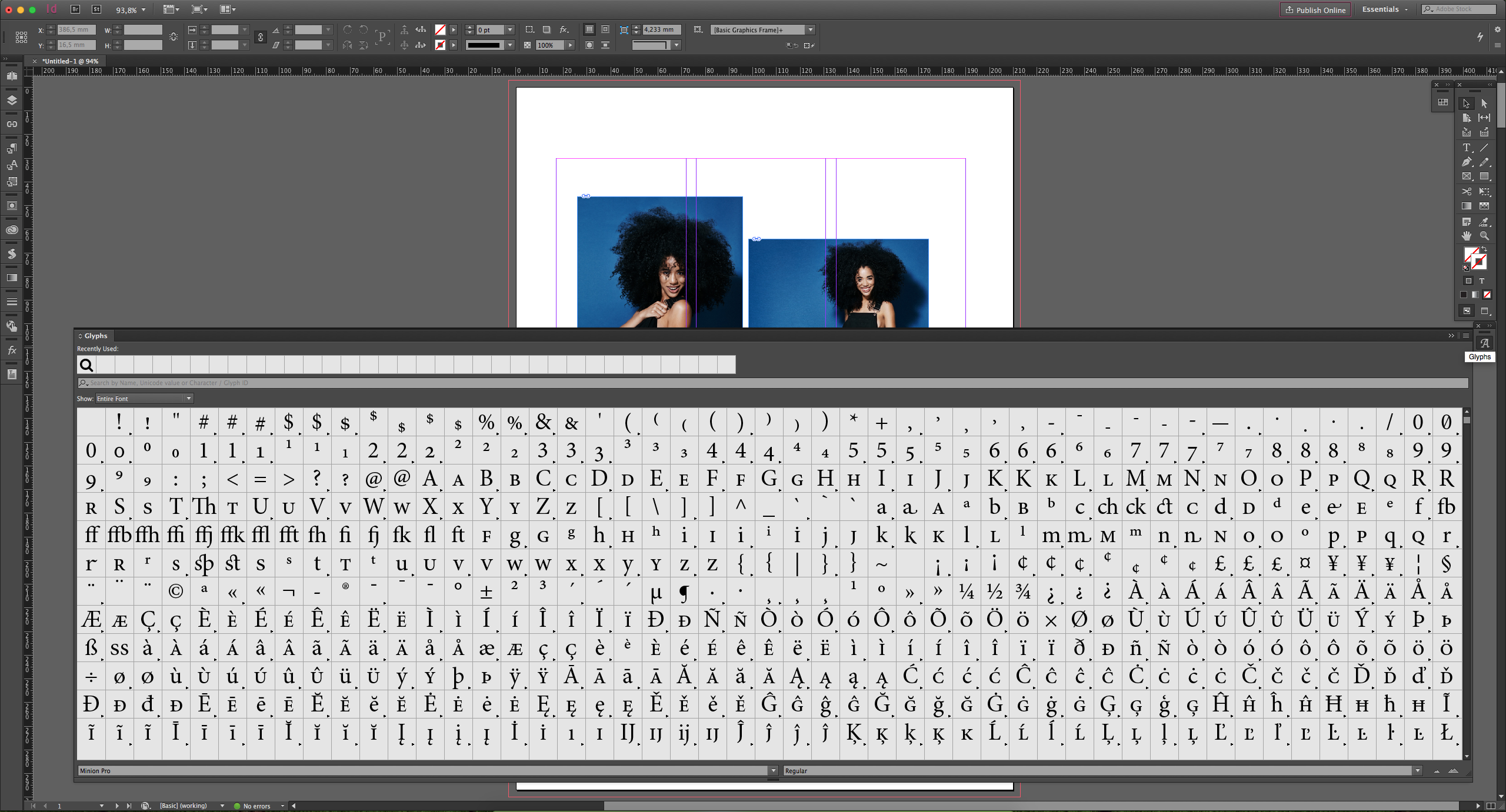
here are screenshots of my workflow setup (showing at 27" iMac, but normally I'm working at 24" Windows PC)
1. all panels is hidden to maximize workspace and see pasteboard
2. Pages panel - I can see 50-60 pages at 24" screen - almost entire magazine at once - but only for a moment I need it!
3. Links panel
4. Glyphs
same goes to swatches, paragraph/character styles, CC libs, etc.

 AdChoices