 Adobe Community
- Home
- Lightroom Classic
- Discussions
- Re: Different colors after export - Lightroom clas...
- Re: Different colors after export - Lightroom clas...
Different colors after export - Lightroom classic / macbook
Copy link to clipboard
Copied
Hi, I have not encountered this problem before (at least i believe so) - colours nad exposure&contrast are different after exporting from lightroom to jpg (srgb).
I use adobe color, i export to srgb, i reinstalled lightroom, i turned off/on graphic accelerator.
I use macbook air 13 end external eizo mointor color calibrated. I have not have this problem before.
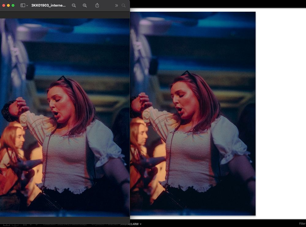
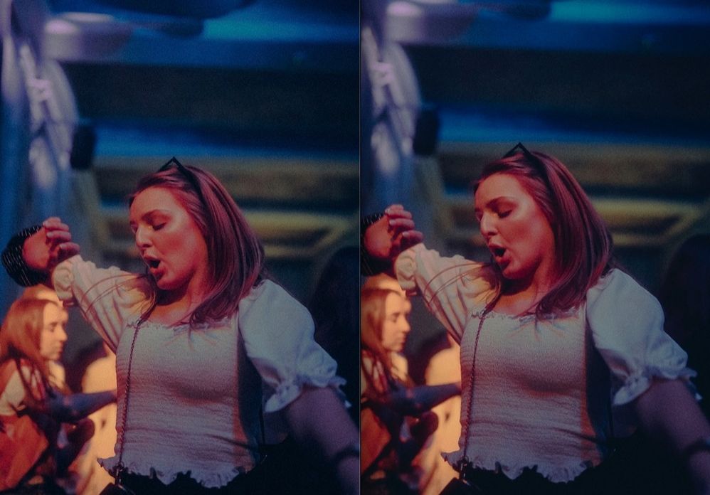
Left pic is preview of the jpg - its more saturated and more exposed 😞 (right one is lightroom)
HELP
Copy link to clipboard
Copied
You're viewing the 'other' image (outside of LR) where?
FWIW, the screen captures above look the same on this end.
Copy link to clipboard
Copied
I view in Preview or in Chrome, no difference. I also tried to open jpg in Lightroom and its the same situation.
Please look agaian. it's obviously brighter and less contrasty.
Copy link to clipboard
Copied
Again, the two appear virtually identical, here's a screen capture from Safari:
Preview on Mac IS color managed and should match Lightroom Classic. However, you must view in LR in Develop module, it uses a unique preview architecture. Soft proof to sRGB if that's your export color space.
You need the zoom ratio for both applications to be 1:1 (100%). If you are doing so and you see a mismatch, there are a few things to try:
First, try disabling GPU in the Lightroom Preferences (Performance tab). Any better?
If not, recalibrate and build a new ICC display profile, the old one might be corrupted.
If you are using software/hardware for this task, be sure the software is set to build a matrix not LUT profile, Version 2 not Version 4 profile.
Copy link to clipboard
Copied
Yeah, it usually did match it, but recently something went wrong. Its not a big difference but its noticeable, on your screen is also very much visible for me, the left one is brighter, more saturated, less contrasty. I also noticed it's visible more on some pics depending on style of color correction.
I tried to off GPU - does nothing.
Later I will try to calibrate the monitor again. But when I open both pics on my macbook screeen its the same problem so I don't know
Copy link to clipboard
Copied
you've converted a wide-gamut image to sRGB, so there's always going to be a difference after export... especially if you're trying to view sRGB on a wide-gamut display. This is 100% to be expected.
Copy link to clipboard
Copied
Nice article thank you so much. follow the Dotcreative
Copy link to clipboard
Copied
If the original image is noisy, this is probably due to the scaling algorithms used in preview vs Lightroom. Preview does this very differently than Lightroom in the develop module, however, the display in Library should be more similar to what you see in preview- not erfect as that is impossible except if the scaling algorithms are identical. This affects images with a lot of noise particularly where you dial in strong noise reduction settings. Those will only look identical if you zoom to 1:1 in Develop.
Copy link to clipboard
Copied
i think you're replying to the wrong thread.
Copy link to clipboard
Copied
Not necessarily, it's a valid point here. Very noisy images can easily shift in apparent brightness with different resampling algorithms.
To rule that out, always check at 100% first.
Copy link to clipboard
Copied
Yes I was replying to this thread indeed. This is a very common observation with noisy images. You see this in night sky images, concert photos, etc. Another example of this effect occurs in Photoshop, where if you work in lab space, scaling can give you different results than when you work in a gamma-corrected space especially for very fine detail or for very noisy images. If you average a few pixels in a gamma-corrected space, the result is different in more than just brightness than averaging them in linear space. This is only one reason for the difference between Develop and Library/exported image (Develop works in linear prophotoRGB and library/exports work in a gamma corrected space). There is also a great dependence on the actual scaling algorithm used. It is usually not just a simple average of neighboring pixels.
Copy link to clipboard
Copied
Sure, i totally understand that, but this appears to be a simple color space issue. OP is comparing the sRGB output in Preview to the wide-gamut rendering in Lr.
Copy link to clipboard
Copied
The sRGB export is the one that is perceived to be more saturated in appearance so unlikely to be a color space issue but yeah I meant the comment in addition to color space.
Copy link to clipboard
Copied
Did you find a solution? I have a similar issue with my exports and did not find any solution unfortunately.
Copy link to clipboard
Copied
Even though the OP never came back to confirm, the "problem" above was almost certainly different screen resampling algorithms on a very noisy image.
So the solution is to always make critical comparisons at 100% view, which represents one image pixel by exactly one physical screen pixel - and especially so if the image is a very noisy one. In this context, noise includes things like starry night skies and so on.
Gamut limits of color spaces was mentioned as a possible explanation above, but that is out of the question since it was the sRGB export that was perceived as the most saturated.


