 Adobe Community
- Home
- Lightroom Classic
- Discussions
- Photos highly saturated when exported from lightro...
- Photos highly saturated when exported from lightro...
Photos highly saturated when exported from lightroom

Copy link to clipboard
Copied
Please help me! I have just got a new computer and have subscribed to Lightroom and photoshop etc. The problem is, that when I export from Lightroom, the images are more saturated and highly contrasted! Not my editing style at all. I've read through other answers on here to questions very similar to this one. I have read about screen calibration, exporting in sRGB (I have tried this and every other option I could find), and then finally I found one answer explaining that the viewer in which I was looking at my photos (Windows photo viewer for anyone interested) was probably not colour correct. I have since downloaded Adobe Bridge, and emailed the files to myself to view them on my phone. And amazingly, they look fine on my phone! But here is my biggest concern. The photos are not colour accurate in windows photo viewer.. so what are my clients going to do?! If they have windows photo viewer or any other viewing app that is not colour correct, how are they going to view my images the way I've edited them?! I really am at a loss here. I have three albums to deliver over the next few weeks, and I need to be confident that the photos they will see on their monitors will be as close to how I've edited them as possible. Any suggestions greatly appreciated, thanks x


 9
Replies
9
9
Replies
9

Copy link to clipboard
Copied
Well, they shouldn't be using Windows Photo Viewer ... but if they are, that's just too bad ... there's no way to prevent someone from viewing the photo with a non-color managed viewer.
I have three albums to deliver over the next few weeks, and I need to be confident that the photos they will see on their monitors will be as close to how I've edited them as possible.
Other than standing over your clients and telling them exactly what viewer to use and making sure they have a calibrated monitor ... I don't think there's any way to guarantee color fidelity. Maybe if you really want, send them a few prints with the correct coloring so that they can make sure their monitor matches the print (and even that can be problematic).

Copy link to clipboard
Copied
The Windows Photo Viewer is color managed, and should display the same as Lightroom. If it doesn't, you probably have a defective monitor profile.
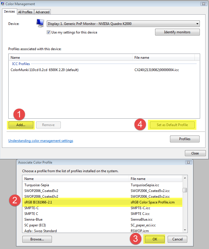
As troubleshooting, and as a possible temporary fix, try setting the monitor profile to sRGB.
Go to Control panel > Color management, add the sRGB profile (use Adobe RGB if yu have a wide gamut monitor) and set it as default. Make sure Use my settings for this device is checked.
If this fixes the issue, you should ideally calibrate your monitor with a hardware calibrator, although sRGB may be close enough.
Another possibility is that you are using the Windows 10 Photos app, and not the Photo viewer. The Photos app is not color managed, and will display wrong colors, particularly on a wide gamut monitor - over saturated like you describe.
If you do have a wide gamut monitor, it is crucial that you only use color managed applications to view your work.
Since you have a new computer, it will have Windows 10, and I think the Photos app is the default image viewer.
The Photo Viewer should also be there, but Microsoft has apparently hidden it. (i'm on Windows 7, so I don't know the details)
Copy link to clipboard
Copied
Per Bernsten, thank you! I am continuing to try and work out the problem, and I will definitely try your suggestion. Thank you for taking the time to reply

Copy link to clipboard
Copied
Since you have a new computer, it will have Windows 10, and I think the Photos app is the default image viewer.
The Photo Viewer should also be there, but Microsoft has apparently hidden it. (i'm on Windows 7, so I don't know the details)
See this article for how to access the Windows Photo Viewer on Windows 10. Since it involves registry tweaks, it's probably not a viable alternative for you to recommend to your clients.
Copy link to clipboard
Copied
johnrellis wrote
See this article for how to access the Windows Photo Viewer on Windows 10. Since it involves registry tweaks, it's probably not a viable alternative for you to recommend to your clients.
Thanks for that link, John.
The Photo Viewer has now gone missing on my Windows 7 install, but I only used it to test for color management.
For general image viewing I'm very pleased with ACDSee.

Copy link to clipboard
Copied
Just to sum up:
- "Windows Photo Viewer" in Win 7 is fully color managed. It will convert/remap from the document profile into the monitor profile.
- "Photos" in Win 10 is not color managed, and will just send the original RGB numbers straight through.
- If the OP sees oversaturation in an sRGB file in "Windows Photo Viewer", the monitor profile is broken/defective/wrong.
- If the OP sees oversaturation in an sRGB file in "Photos", he/she has a wide gamut monitor. It will not look like that on a standard gamut monitor. It won't be correct in either case, but the standard gamut monitor will be close enough to sRGB that it will look roughly right.
Copy link to clipboard
Copied
Just to sum up:
- "Windows Photo Viewer" in Win 7 is fully color managed. It will convert/remap from the document profile into the monitor profile.
- "Photos" in Win 10 is not color managed, and will just send the original RGB numbers straight through.
Thanks, I must have confused these two in my mind.

Copy link to clipboard
Copied
Do you have any idea about that how can i use this "not color managed" versions in lightroom?
Copy link to clipboard
Copied
@Ege Balkıs wrote:
Do you have any idea about that how can i use this "not color managed" versions in lightroom?
There is no such 'thing' as a "not color managed" version of Lightroom.
Untagged documents are assumed to be in sRGB. Don't work with untagged documents but if they are imported into LR, they will be assumed to be in that color space.

 AdChoices