 Adobe Community
- Home
- Lightroom Classic
- Discussions
- Tool bar color in Lightroom classic
- Tool bar color in Lightroom classic
Tool bar color in Lightroom classic
Copy link to clipboard
Copied
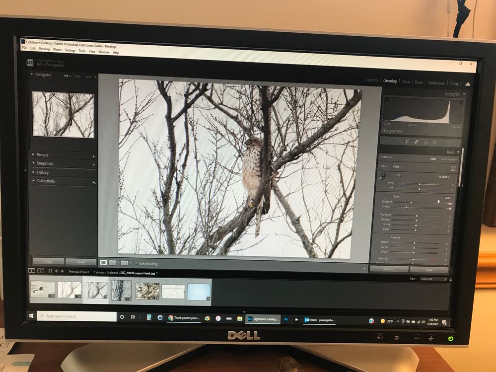
Tool bars are too dark and very hard to use. The current version is not as easy to use as are earlier versions.
Copy link to clipboard
Copied
AFAIK, nothing has been changed by Adobe here. What earlier version, can you provide a screen capture from it and the newer one you say is too hard to use?
Copy link to clipboard
Copied
Unfortunatly, I can't supply the look of the previous build. Attached is what I see now. The dark grey of the tool bar background is very tough for me to deal with. The functionaluty seems equivalent to the previous build or, at least,I can learn to adapt to it. Thanks for the review.
Copy link to clipboard
Copied
To be clear, when you say 'Tool bar color' you mean that white at the top, showing File, Edit, etc? That doesn't look right to me. Do you see this only in Lightroom Classic? Could it be some Windows setting (sorry, I'm a Mac guy). The menu's you've shown in white are drawn by the OS. Or should be. If you have Photoshop, does it appear the same?
Copy link to clipboard
Copied
Thanks for following up. It is the tool bars to the right and left side of the image being managed in Lightroom Classis that are the ones I have a hard time seeing.
Is is interesting that Photoshop is much easier to read as the command fonts are in white so are very visible. An example is attached.
Solutions would be appreciated.
Copy link to clipboard
Copied
You may have to lower the display resolution a little so the fonts then get drawn a bit larger.
Copy link to clipboard
Copied
My current setting is 1920X1080. I am not sure which settings lower. Can you offer a suggestion? Thanks
Copy link to clipboard
Copied
I'm a Mac guy, sorry but on this end, I can lower it. Perhaps this helps?
https://www.laptopmag.com/articles/change-screen-resolution-in-windows-10
Copy link to clipboard
Copied
I did get that far but Thanks,
I will just pick a couple of options and try them out.
Have a good day
Copy link to clipboard
Copied
The interface colors haven't changed in the latest version.
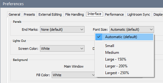
If text is hard to read, try increasing the font size in Edit > Preferences > Interface.
You should ideally run the monitor at its native resolution. Lowering the resolution may affect apparent sharpness.
Copy link to clipboard
Copied
Thanks for the help. I think my best choice is to switch from the "classic" version to "plain" lightroom. That seems to work better for me. I need to play around with the newest version but I think that is the way I will go. Thanks again for all the suggestions and support.

