• Global community
    • Language:
      • Deutsch
      • English
      • Español
      • Français
      • Português
  • 日本語コミュニティ
    Dedicated community for Japanese speakers
  • 한국 커뮤니티
    Dedicated community for Korean speakers
Exit
1

P: Please give us an option to turn of the new "preset amount" slider to conserve screen real estate

Explorer ,
Jun 16, 2022 Jun 16, 2022

Copy link to clipboard

Copied

This 'feature' is completely useless to me as there is already a profile strength slider on the right hand side (the side where all the other sliders go). This slider simply takes up space for me without providing any extra functionality that I use, and because it isn't hideable it means I cannot see as many of my presets at once without having to scroll. Either get rid of it, give me the option to hide it, or move it to the right side of the screen where every other slider goes.
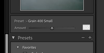
 

Screen Shot 2022-06-17 at 14.44.17.png

Idea No status
TOPICS
macOS , Windows

Views

331

Translate

Translate

Report

Report
Community guidelines
Be kind and respectful, give credit to the original source of content, and search for duplicates before posting. Learn more
community guidelines
11 Comments
Explorer ,
Jun 16, 2022 Jun 16, 2022

Copy link to clipboard

Copied

Frankly, even for the people who do like this as a feature, the placement of it is baffling. I don't understand why you didn't put it on the right hand side of the screen where every other slider goes. The left side of the screen is not for adjusting settings, it is for management and organisation.

Votes

Translate

Translate

Report

Report
Advocate ,
Jun 17, 2022 Jun 17, 2022

Copy link to clipboard

Copied

It's not on the right since Presets are displayed on the left so it's logical that it should sit on the left where Presets are.


This said yes it takes a bit of sapce, 2-3 presets less to see actually,  and we should be able to collapse it if we don't use it or need it.


.

Votes

Translate

Translate

Report

Report
Explorer ,
Jun 17, 2022 Jun 17, 2022

Copy link to clipboard

Copied

Think about it C.Cella, it should go on the right.


Sure, you select what preset you want on the left, but when have you ever adjusted a preset on the left? Never. Because every tool to adjust your edits is on the right side.


It's the same thing as the profile amount slider, which also goes on the right, like every other slider. Why should this be different? Right side is for editing, left side is for organization (the presets panel is an organization tool where you organise your presets. A slider to adjust preset strength is an editing tool)

Votes

Translate

Translate

Report

Report
Advocate ,
Jun 17, 2022 Jun 17, 2022

Copy link to clipboard

Copied

I have 500+ Preset (probably even more, I stopped counting long ago after 400) and they are displayed on the left.

I access them there and I would not want the Preset Amount to be on the right and be forced to navigate to the right every time to change it.


If nothing I would want to have custom UI and organize/place panels wherever I want, in the order I want, (like in Photoshop) BUT that's another story.


Profile Amount, Mask Amount and Preset Amount are not the same.


I expect the Preset Amount, that controls and affects presets,  to be where presets are.


I agree with you that we should be able to collapse the UI dedicated to Preset Amount should we not use it.


.

Votes

Translate

Translate

Report

Report
Explorer ,
Jun 17, 2022 Jun 17, 2022

Copy link to clipboard

Copied

Except profile amount and present amount are basically the same. They are both sliders that change the intensity of an adjustment to your entire image.

If your preset involves a profile then guess what, sliding the preset amount slider actually changes the profile slider position too. Even Adobe agrees with me, they're basically the same tool. 


Ok cool you have over 500 presets, why should that change that the amount slider is an editing tool? You've had to go to the right hand of the screen to edit your photos after choosing a present in the past anyway so your argument there makes no sense.


"I expect the Preset Amount, that controls and affects presets,  to be where presets are."

Yeah idk if you realise this but every other tool to adjust your presets is on the right... The presets are just settings from the right side that are collected into a group for you to easily come back to. The left side just organises them. The right side edits them. See the difference yet?

Votes

Translate

Translate

Report

Report
Advocate ,
Jun 17, 2022 Jun 17, 2022

Copy link to clipboard

Copied

I only agree with you we should be able to collapse or hide the preset amount UI/segment.


As to where the Preset Amount should be placed I am perfectly happy that Preset Amount is located on the left, at the top, where Presets all are.


In ACR is on the right, where Presets are dispalyed.


My option is that we users should be able to customize UI and place each and every UI panel/element where we want.


Custom UI, like custom shortcuts, will arrive for "Lightroom Modern" when it ships in 2050.


.

Votes

Translate

Translate

Report

Report
Explorer ,
Jun 17, 2022 Jun 17, 2022

Copy link to clipboard

Copied

"In ACR is on the right, where Presets are dispalyed."


Y'know what else is on the right in ACR? Editing tools. Because this slider is an editing tool. It belongs on the right (if anywhere). Like every single other slider.


But yes they should give us the option to hide it entirely because it's really not very useful at all anyway.

Votes

Translate

Translate

Report

Report
Advocate ,
Jun 17, 2022 Jun 17, 2022

Copy link to clipboard

Copied

• It should belong and be placed where WE users want!


Customizable UI is a not yet in Lightroom DNA unfortunately.


I like that Preset Amount is at the top left where presets are.

I would want to be able to collapse and hide it to gain those 2-3 lines of vertical space.


I am the only one so far that has upvoted tour suggestion.


I have nothing else to say.


.

Votes

Translate

Translate

Report

Report
Engaged ,
Jun 17, 2022 Jun 17, 2022

Copy link to clipboard

Copied

Actually, the Presets Amount slider is not in the Presets Panel. I think it should be so that it is not visible when the Presets Panel is closed.


As for it being on the right side and not with the Presets, I totally disagree. It should be with the Presets. As I see it, the Preset Amount is intended as a once only adjustment, scaling all the scalable Preset's settings accordingly. The slider only remains active until one of the Preset's settings is manually changed. Most of the time it will be inactive and once it is inactive, users cannot go back and readjust it.


The Preset Amount is similar, but not the same, as the Profile Amount nor the Mask Amount. The Profile and Mask Amounts can be readjusted at any time.


As for the Preset Panel being an organisational tool for Presets, we wish. The ability to organise Presets is far too limited to the point of being almost non existent. I'm sure that C.Cella and many others would love to be able to organise Presets more easily from this panel.


I see the Presets as an editing panel, since selecting a Preset applies edits to an image. So it could be argued that it should go on the right side along with the other editing panels. However, with an ever growing number of Presets, I think this would become a nightmare.


I agree with C.Cella that users should have the ability to arrange al the panels in any position they prefer, but just like him, I'm not holding my breath while waiting for that one.

Votes

Translate

Translate

Report

Report
Community Expert ,
Jun 18, 2022 Jun 18, 2022

Copy link to clipboard

Copied

That option is available, but only on new (or updated) presets. So if it really bothers you, then apply such preset to an image and then update the preset with the same settings. Then you can uncheck the option to support the amount slider.


1 2022-06-18 18-30-38.jpg


-- Johan W. Elzenga

Votes

Translate

Translate

Report

Report
Explorer ,
Jun 18, 2022 Jun 18, 2022

Copy link to clipboard

Copied

LATEST

@drtonyb 

Actually the preset slider is part of the presets panel. If you go into your window settings and turn off the presets panel the slider disappears along with it. So clearly it is part of it in adobe's eyes.


As for presets panel being an organization tool, I never said it was a good organization tool. But it's not an editing tool. Presets aren't you adjusting settings, they're you storing edits you've already made for future use. When you select a preset you're just accessing previously made edits, you're not actually editing something new. Once you start changing the intensity of the preset you're back to editing and so that slider should go on the right with all the other tools that would be used to modify your preset. 


@JohanElzenga 

I wish you were right but unfortunately this doesn't actually hide the slider entirely. It just disables it when you use a preset with that option selected. The slider doesn't go away permanently, which is what I want.

Votes

Translate

Translate

Report

Report