 Adobe Community
- Home
- Lightroom Classic
- Discussions
- Re: Lightroom Black & White conversion presets and...
- Re: Lightroom Black & White conversion presets and...
Lightroom Black & White conversion presets and auto mix (automix) vs. panchromatic film

Copy link to clipboard
Copied
Is there a b&w conversion preset in Lightroom that would be thought of as standard or normal?
In my mind, the look would emulate Plus-X or Tmax 100 or, for that matter, most medium-speed panchromatic films.
My understanding of pan film is that all colors are recorded equally, without bias. i.e., a mid-tone blue and a mid-tone red that register the same luminance on the meter translate to the same density on the b&w negative. It seems to me that normal in Lightroom would be all color sliders set to 0, but most stock presets and auto mix seem to be biased plus or minus. I'd like to know the thinking or the science behind these choices.
If anyone can explain or point me to an explanation, I'd appreciate it.


 7
Replies
7
7
Replies
7

Copy link to clipboard
Copied
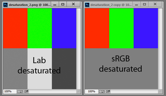
You shouldn't have equal density for all colors, because that doesn't take into account the inherent lightness of a color.
A fully saturated yellow is a very light tone that should be represented by a very light gray. A fully saturated purple should be represented by a very dark gray.
The Lab color model has this built in, but the RGB model doesn't. A desaturated bright yellow is middle gray, the same value as a desaturated dark purple. So you need to compensate for this particular shortcoming in the RGB model.

Copy link to clipboard
Copied
IIRC panchromatic film was so called not because it was objectively "correct" in some way, but more because it dealt with the subjective shortcomings of other emulsions - most particularly, orthochromatic film's tendency to show little tonal contrast with particular hues (such as, the contrast of someone's lips vs their face) that the human eye does distinguish easily as contrasting tones - and that we find it especially important to distinguish in terms of facial expression etc.
So early makeup for movies consisted of green lipstick etc, rather than red: the film stock being too "slow" for corrective filters to be practicable.
Perhaps we might stretch the words "correct" or "accurate" to mean: producing a similar result subjectively, as human vision might.
However human vision is notoriously varied between people; also variable and adaptive for a single person in different circumstances; also heavily dependent on non-optical processing within the nerves and brain.
A good illustration of how RGB processing differs from processing that separates tone and hue, comes when you lighten or darken an image using Tone Curve vs the Basic panel adjustments. Watching what happens to the saturation of the different hues as you do this.
LR's standard B&W conversion builds in some target assumptions that are not so different from those relied on for panchromatic B&W film, because serving the same practical ends, and the same aesthetic, within the same cultural traditions. Of course you can widely alter these to suit your own intent, the same as when using a colour filter over a mono emulsion.
Personally I prefer LR to remain in colour mode even for a B&W-intent image, which I do by fully desaturating all the colour ranges in HSL. This leaves every colour adjustment still live and effective - whereas taking the image into B&W mode switches off some of those, in favour of a simplified set of tone response sliders. Furthermore, if going into PS I tend to do so still as a colour image and then apply B&W processing only onto the round-trip version once back in LR. This permits multiple virtual copies to play around with varying B&W conversion options, as well as with other matters in response to those conversions, all non-destructively.
Copy link to clipboard
Copied
Thank you Richard. This is very helpful.

Copy link to clipboard
Copied
Richard, I'm wanting to recreate the orthochromatic film look; do you have any suggestions on how to emulate that look?
cheers
Copy link to clipboard
Copied
Not something I've tried, but I'd start by raising lowering the luminance of the red and orange hue area, in the HSL panel. As I understand it, early film stock was relatively more sensitive to the higher energy / shorter wavelengths - so, the bluer hue components. There is also a broader difficulty of approximating the 'silvery' tonalities of film, in a digital derived image. For a visual reference of what that looks like (as well as a delightful website in itself) - maybe take a look at www.shorpy.com.
Just for fun I've had a go at that - maybe exaggerating things - as below. This is from a cellphone shot in weird lighting just to see how much things fall apart when you do this. Main differences between the two are in Clarity, the Basic tone settings and in HSL. The reference image has raised orange luminance just to help separate the faces - and a more punchy treatment overall. The "ortho" version has got heavily lowered luminance for the red / orange spectrum, differently shaped tonality and slight negative Clarity.

Copy link to clipboard
Copied
Thank you. Very helpful!

Copy link to clipboard
Copied
Consider using an external editor, specifically DxO NIK SilverEfex. Can emulate many film stocks, can emulate some lens filters.

 AdChoices