 Adobe Community
- Home
- Muse (read-only)
- Discussions
- Re: Having breakpoint issues - Motorola Droid
- Re: Having breakpoint issues - Motorola Droid

Copy link to clipboard
Copied
I'm putting together a site which has a background video element in it but things aren't going so well. The initial issue was that the video was loading in the background but not "full screen" and not auto-playing. However because of overlaid elements, you couldn't even click "play". To remove this (and save bandwidth for mobile site visitors) we created breakpoints which, when down to mobile sizings, drop the video and instead have a hero slider in the background. This seemed okay.
However.....when viewed on the Droid the centered page elements overlaid over the background seem to be centered based on a different screen size - the elements run off the right side of the screen and two elements that are actually joined left and right, separate from each other leaving a gap behind the nav elements.
I've created a test page for him with tags in the top left so I know which breakpoint is active. I just recently tried adding a 460px breakpoint based on something a search turned up in these forums but the Droid is still just grabbing the 380px breakpoint.
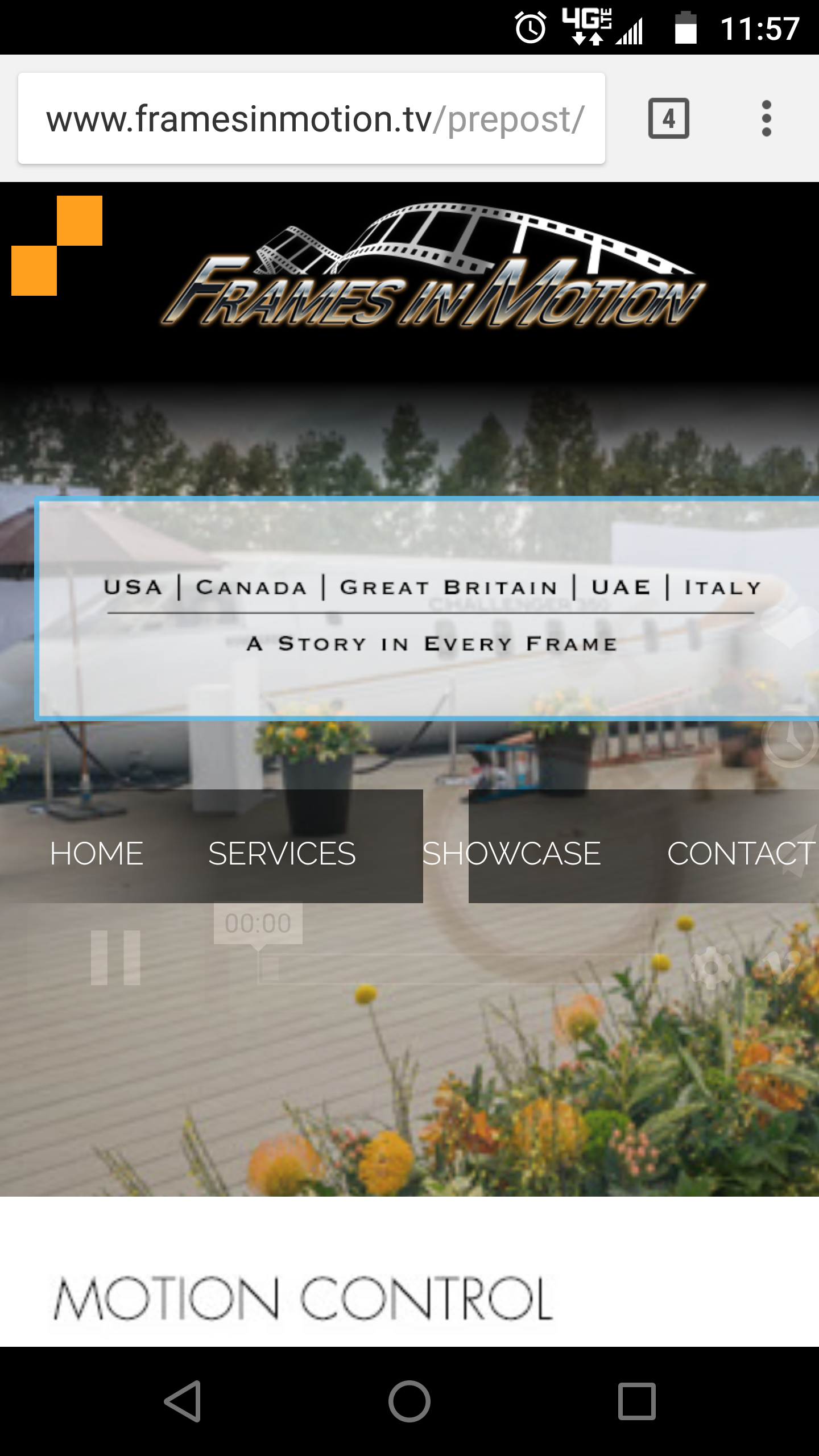
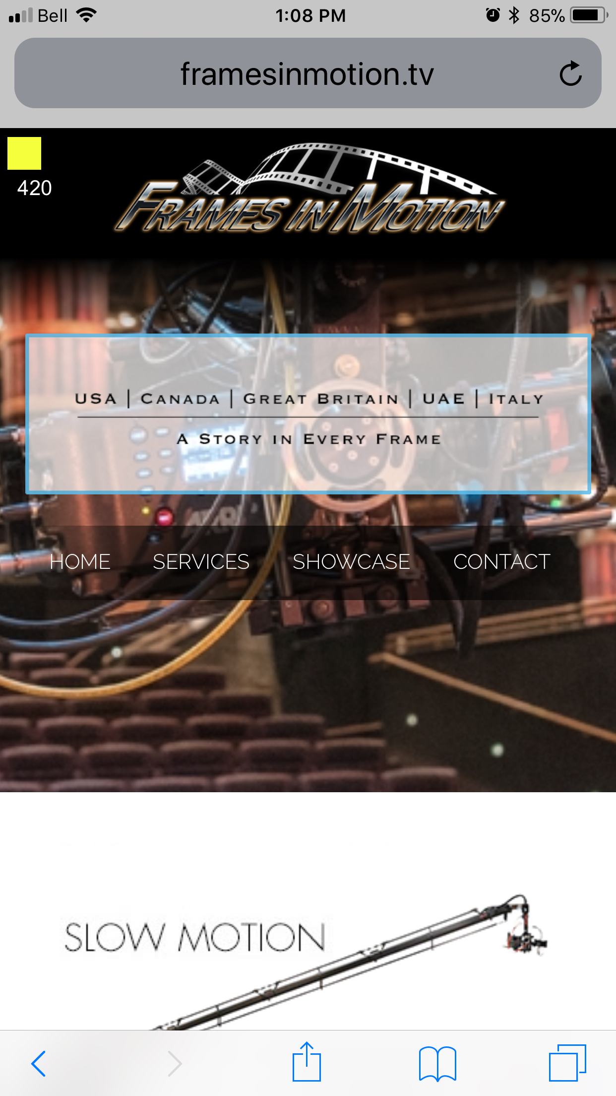
On my iPhone 6+ I'm grabbing the 420px breakpoint and everything is perfect. His Droid will not grab anything other than the 380 breakpoint.
Super frustrating because the launch of the site has been delayed months trying to figure this one out. Hopefully someone here can help? Desperate for the guy now.
Screen shot from the droid attached as well as from the iPhone. Page/site is preposted at: http://www.framesinmotion.tv/prepost/droid.html


 1 Correct answer

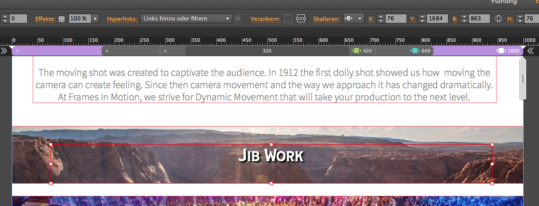
It´s almost the same issue with the second page (solved easily with the text set to responsive width):
… and some questions to the footer settings:
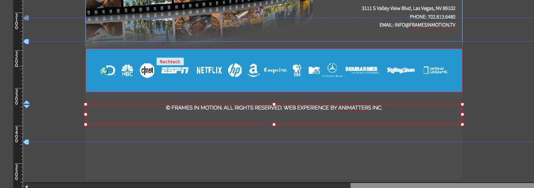
These guides for footer, browsers edge, pages edge are there for some reason and could look like this:
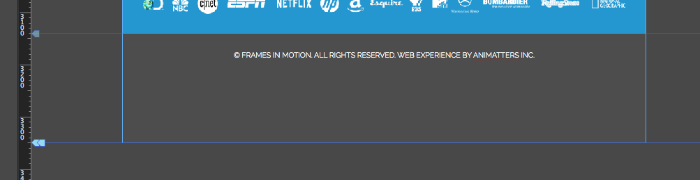
As mentioned before those breakpoints are maybe one or two too much and might not be really necessary and make your site heavier.
Best Regards,
Uwe
 12
Replies
12
12
Replies
12
Copy link to clipboard
Copied
Watching your site on desktop and android I see some misalignments that may be caused from misalignment in your muse.
So maybe the devices do not show as intended because they don`t "know" what to show?
Give us a .muse with only one page like "Services". Save that one with deleted other pages with a new name into your Creative Cloud Files. Share it via your CC files by right clicking on it.
From the first view, I would recommend to use fixed width breakpoints instead of fluid width bgreakpoints.
Have you ever thought of that approach?
Best Regards,
Uwe
Copy link to clipboard
Copied
Oh wow. I'm not seeing any of the misalignment you're showing there. Is that from the Android? And if so it is portrait or landscape? I don't have the breakpoint markers set on any page other than the droid test page so I don't know which breakpoint is showing in your screen shots but since the film strip is showing I can guess it's one of the larger format breakpoints. On the iPhone 6 Plus in both portrait and landscape the contact page is flawless in terms of alignment (attached). Argh. What happened to the good old days when the lowest common denominator of 800X600 was all you had to be concerned with? hahaha
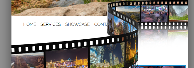
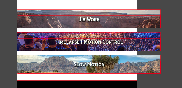
I need to keep the breakpoints fluid so that the elements scale based on the browser width (if I recall correctly). Particularly the film strips used in the header and footer.
Hopefully this Share works. I haven't used the CC storage yet (didn't realize it was there and so easy!).

Oh, and thanks for your help here by the way. I appreciate it.
Copy link to clipboard
Copied
For some reason my browser keeps white. I click your link, get prompted to the Adobe Creative Cloud window, but keeps "empty".
You used this one?
If it doesn`t "want" to work, you cold also use dropbox.
Best Regards,
Uwe
Copy link to clipboard
Copied
I did. But I've never done it before so may have got it wrong. I've added it to my DropBox. Let's see of this works....
Copy link to clipboard
Copied
I realize this:
This could get solved by changing this frame to "stretch to browser width":

Before it was pinned to the left and no resizing.
These text boxes should get set to responsive width as your images are set to stretch to browser width:
There´s one issue left with the text in the black box.
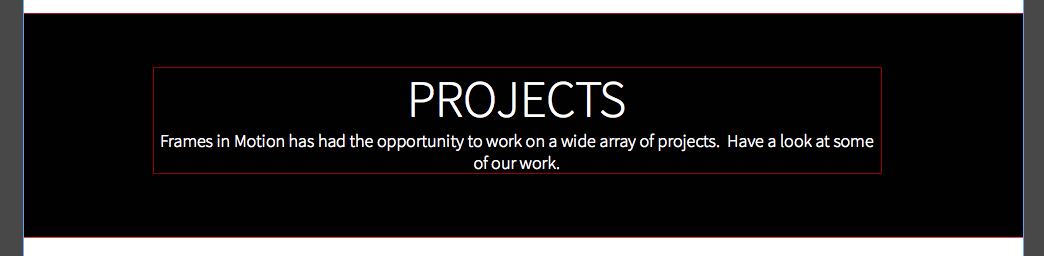
Personally I would change the browser background to white and use a black rectangle, if even necessary for your top video background. Then the white background isn`t necessary any more. This causes some issues with the responsive in width an height:

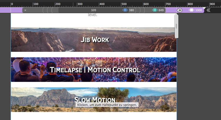
On your second page, without going too deep, I find these narrow breakpoints too narrow. There should be another way to organize it.
Best Regards,
Uwe
Copy link to clipboard
Copied
I got all excited there for a second. There were oversized elements in the site a couple of months ago causing similar grief but I found them all and fixed them. Which is why I was excited. It looked for a moment like I had just missed one. However when I click through the file you have I don't see that on any of the breakpoints anymore. On either the home page or the droid page.
The page in question here in the file you've got is the second page. Disregard the first page - we will adopt whatever "fix" we find from the 'droid' page to the actual home page. Can you tell me which breakpoint you're getting those oversized elements in? It's possible I've just missed them but I'm not seeing them. Or are you working at a manual width and seeing them over extend like that? And therein lies my problem?
Copy link to clipboard
Copied
I must watch the second page as well – later the day.
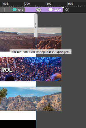
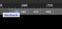
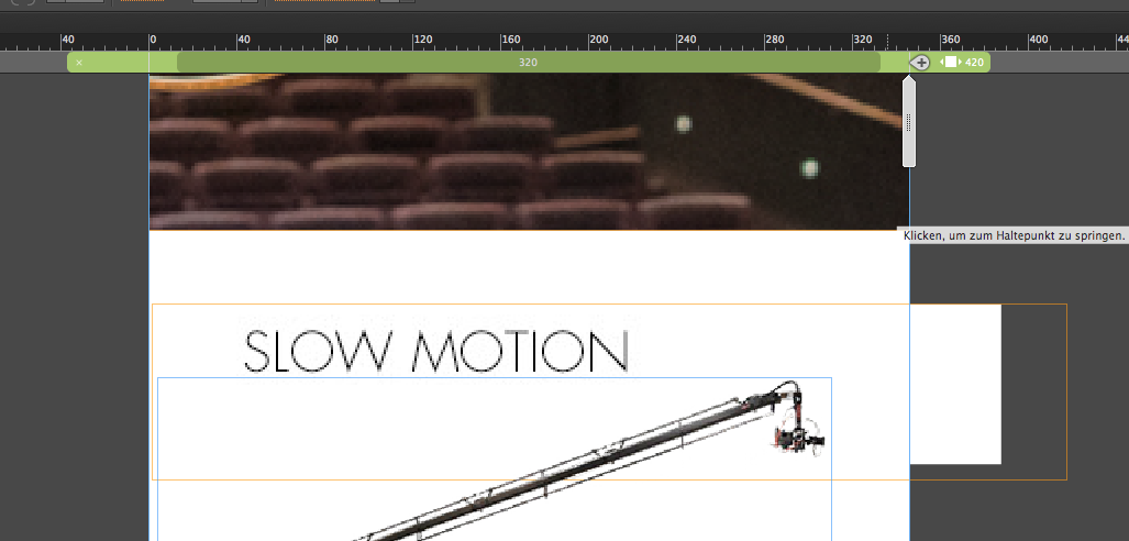
These "oversized" elements occured between two breakpoints (that why I added a screenshot with the breakpoint bar).
You get there by using this vertical grey elements which is often called THE SCRUBBER  .
.
All elements should never leave the canvas in no breakpoint and not between breakpoints as well.
Best Regards,
Uwe
Copy link to clipboard
Copied
It´s almost the same issue with the second page (solved easily with the text set to responsive width):
… and some questions to the footer settings:
These guides for footer, browsers edge, pages edge are there for some reason and could look like this:
As mentioned before those breakpoints are maybe one or two too much and might not be really necessary and make your site heavier.
Best Regards,
Uwe
Copy link to clipboard
Copied
Oooooh! Okay. That makes sense. I'll get its there and try to adjust. I'll let you know how it goes. I can't thank you enough for your time.
KD
Copy link to clipboard
Copied
Hi KD,
yep  .
.
Uwe
Copy link to clipboard
Copied
That did it. Thanks a million! I wasn't sure where I was going to find that answer. I appreciate your time.
KD
Copy link to clipboard
Copied
Sometimes we all need helping hands. Glad that I could help. Have a great time.
Best Regards,
Uwe
 AdChoices