 Adobe Community
- Home
- Muse (read-only)
- Discussions
- Re: How to edit responsive muse template to adjust...
- Re: How to edit responsive muse template to adjust...

Copy link to clipboard
Copied
I have a muse template that I have edited to my liking for my site but when I adjust the page from 1200 to 700 as an example some parts readjust and some don't. I don't want to have the site messed up on different devices.


 1 Correct answer

You´ll find the same button when text element is chosen. Set it to responsive in width - text then pushes down other content in most cases when there´s nothing pinned on that page. Pinning in some cases avoids pushing content down.
Best Regards,
Uwe
 8
Replies
8
8
Replies
8

Copy link to clipboard
Copied
I can't guess what you have done. What's the URL?
Alt-Web Design & Publishing ~ Web : Print : Graphics : Media
Copy link to clipboard
Copied
Without seeing and so just by guessing, if the template was not done responsive, you have to place elements as desired in different breakpoints . Like Nancy already asked, give us some more input, please. You might have changed some settings when changing the layout for your needs.
Kind Regards,
Uwe
Copy link to clipboard
Copied
Here is the template which states is responsive. Notice the brick wall background resizes from 1200 breakpoint. The middle section however won't resize. Thanks

Copy link to clipboard
Copied
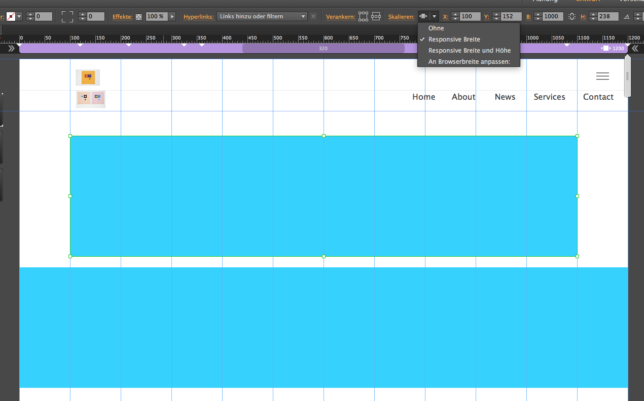
Looks like your wooden wall isn´t set to resize in width/stretch to browser width. Same to your text that should also be set to resize in width. It will then scale up in height of course.
Does this help?
Kind Regards,
Uwe
Copy link to clipboard
Copied
How do I set it to resize? Thanks
Copy link to clipboard
Copied

Kind Regards,
Uwe
Copy link to clipboard
Copied
That appears to work but what about text instead of running over images or best way for images to display nice on mobile devices/tablets.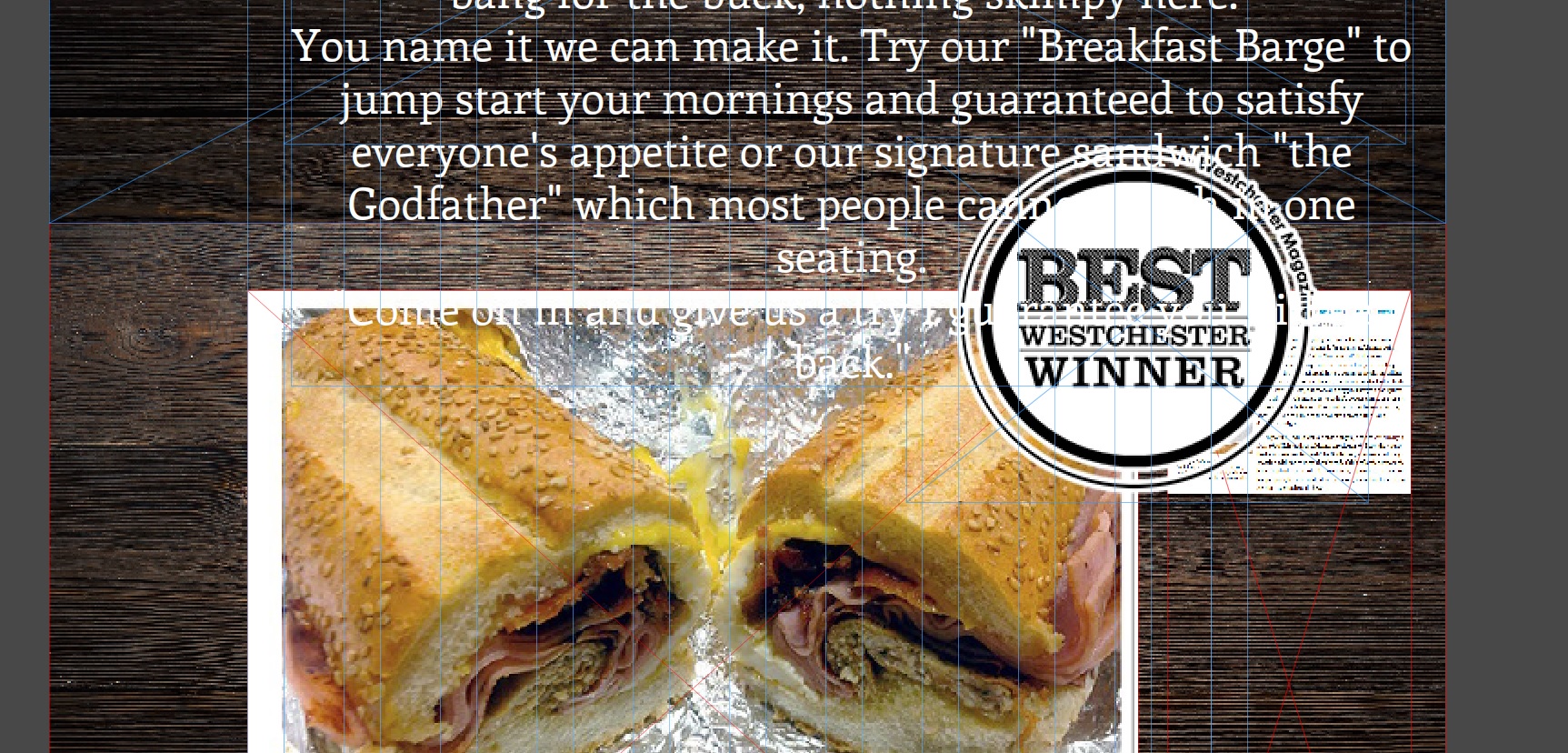
Copy link to clipboard
Copied
You´ll find the same button when text element is chosen. Set it to responsive in width - text then pushes down other content in most cases when there´s nothing pinned on that page. Pinning in some cases avoids pushing content down.
Best Regards,
Uwe
 AdChoices