 Adobe Community
- Home
- Muse (read-only)
- Discussions
- Re: Menus with Responsive Width in 4k Resolution
- Re: Menus with Responsive Width in 4k Resolution

Copy link to clipboard
Copied
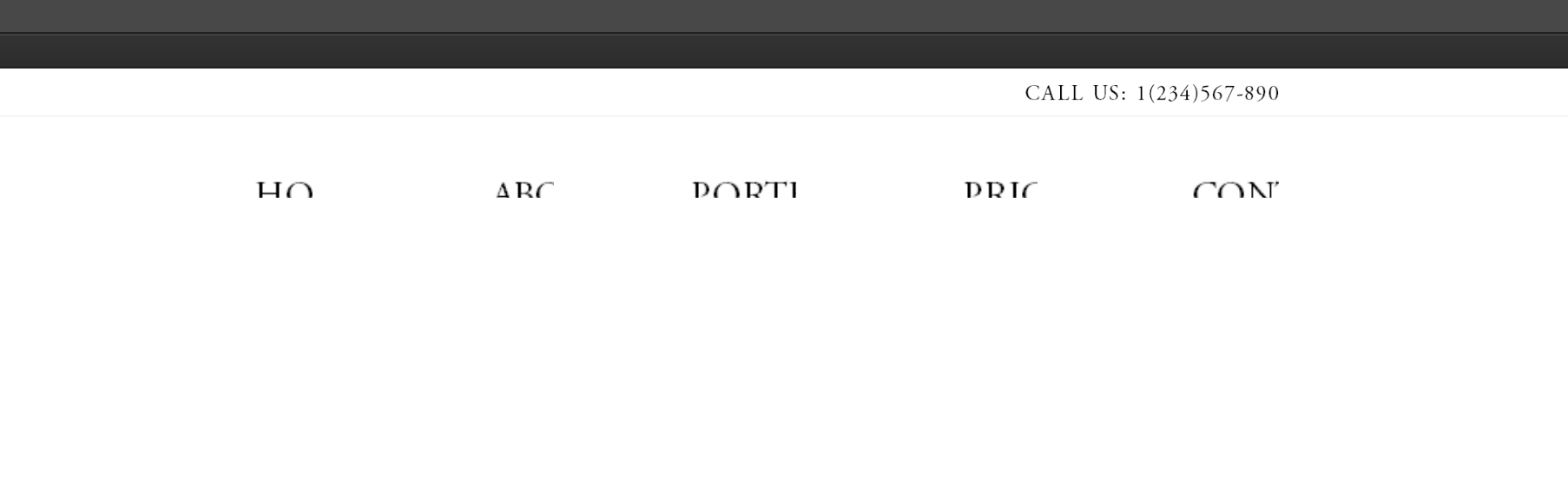
Hallo All..
I'm trying out Muse and so far I have really enjoyed the experience, but there is this one thing.
When I make menus with unifrom size and responsive width, the text get all screwed up when I preview in Muse and browsers.
I'm pretty sure It's the 4k resolution and/or Windows High-DPI Interface Scaling, since when I set the screen down to 1920x1080 everything seems to be fine.
I really hope I'm doing something wrong or there is a way to fix it, besides not using 4k screen.
I hope that someone smarter then me can help with this problem.
This is Uniform Size and Resize set to Responsive Width:
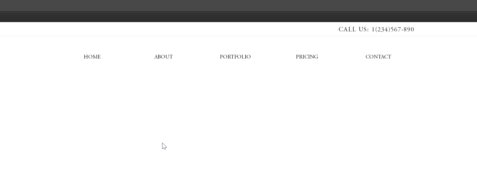
And this is Unifrom Size and Resize set to None:


 1 Correct answer

Did you use system fonts for the menu?
Did you expand the page to browser width by clicking onto the small double arrows ("<<") to the left/right of the breakpoint bar?
 14
Replies
14
14
Replies
14
Copy link to clipboard
Copied
Did you use system fonts for the menu?
Did you expand the page to browser width by clicking onto the small double arrows ("<<") to the left/right of the breakpoint bar?
Copy link to clipboard
Copied
When I change the "<<" to ">>" it looks like this:
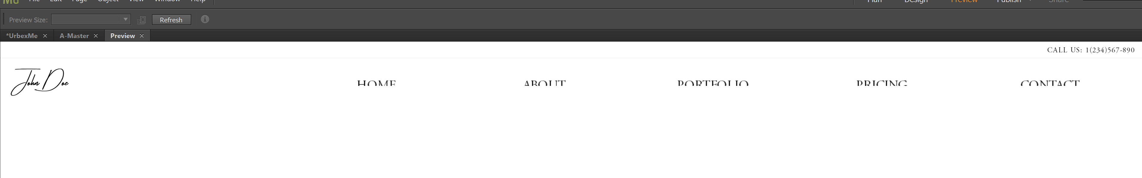
Better, but still not really what I was looking for.
The font is Adobe Garamond Pro.
I haven't tried changing it, but I will try it and se if that does anything. 😃
Copy link to clipboard
Copied
It was apparently the font..  Changed it to Arial, and everything is working now.
Thank you soooo much! Didn't even think of it being the font.. And It was really getting on my nerve! 
Copy link to clipboard
Copied
Perhaps it may help, to know the reason, NXID:
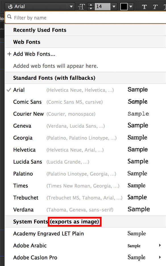
Muse can’t know, which fonts are installed on the machines/devices of the visitors of your site. That is why it has to convert system fonts to images. Therefore (and for other reasons) always use standard fonts (are supposed to be installed on every machine) or web fonts, which will be loaded to your visitor’s machine temporarily, when they open your site.
When a textbox with a system font applied has to be converted to an image, this image is scaled proportionally (as images do), when the browser is resized. In opposite to that, „normal“ text elements don’t scale proportionally, but only horizontally. This difference causes the different appearance of fonts, which you are encountering.
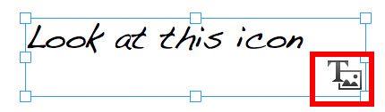
1. If a text box will be converted it is indicated by a small icon bottom right of the text element:
2. If you have a closer look into Muse’s font menu, you will notice, that the behaviour, I described, is indicated there too:

Copy link to clipboard
Copied
That is, this does not fix it? Need to change the font?
Copy link to clipboard
Copied
What do you try to say, @bogette?
Some more words ( in smaller size, if possible) may help!
Copy link to clipboard
Copied
I want to say that you can not fix this problem with the quality of the fonts? You can solve the problem only one way - change the font to another one. Correctly?
Copy link to clipboard
Copied
That means:
- Fonts remain font if you use „standard fonts“ (they are considered to be present on every machine/device); If they aren’t , browsers use similar fonts („fallback fonts“)
- Fonts remain font if you use „web fonts“ (self hosted or hosted by TypeKit or Edge). These fonts are temporarily uploaded to your visitor’s machines to display the site correctly.
- Fonts are converted to an image, if you use „system fonts“, because it can’t be guaranteed, that these fonts are installed on your site visitor’s machines/devices. And since an image scales differently as a text box does (images scale proportionally, text boxes only horizontally), your page will necessarily get mixed up, when you resize the browser window.
In summary: The problem in question has nothing to do with font quality, but only with a correct usage of your fonts.
More informations here: https://helpx.adobe.com/muse/using/typography.html
- Are you definitely sure, that you choose the „Arial“ from the „Standard Fonts“ section of Muse’s font menu? Many systems have installed more than one „Arial“ and that will cause problems.
- Are you sure, that your text box isn’t marked with the „text conversion icon“ (See above)
- Are you absolutely sure, that there is no single character (a „.“ a blank or whatever) left in your text box? One system font character will cause conversion.
- When you preview your site in browser, are you able to select characters, words, paragraphs on your page or are you only able to select the complete text box? In the last case, your fonts are converted to an image.

Copy link to clipboard
Copied
The image of the font menu (above) has Courier New, Helvetica, and Times. I am using all three these fonts in my website (+180 pages). As Standard Fonts supposed to maintain their font characteristics, which can hold Hyperlinks, when they are uploaded to a website ... I am finding it frustrating one of these fonts (which one is unknown at this moment) are being cited by Muse as not being able to have a hyperlink.
In addition the fonts seem to work fine in a micro test website (4 pages; in preview mode)), but the 180 page site is having temper tantrums over fonts and hyperlinks.
Copy link to clipboard
Copied
Please give us a small  .muse file (via Dropbox, CC Files, …), containing only one of these misbehaving text boxes following theses instructions: https://forums.adobe.com/docs/DOC-865
I assume, that not Muse causes the frustration, but a simple layout error. Why don‘t you test-wise only use one of these fonts in one text box, and you‘ll certainly find the culprit? Be aware, that only one single system font character — even a blank — will cause converting the text frame.
Copy link to clipboard
Copied
With all due respect. My frustration is not with Muse directly but my frustration comes from not being able to spot these offending characters in layout form quickly. I'm not sure if you've spent time going through 180+ pages of a website to locate all offending characters because of font classification/implementation. Trust me I do understand why the deviation of implementation needs to be done from Muse's development team's view. As one might expect I am using hyperlinks on key words, or phrases.
Stepping this discussion forward. I am presuming any font that shows up in the Muse font menu with a globe before it would be a Standard Font. Any other symbol preceding a font name might be suspect or absence of font name might infer as error in the highlighted area that is being evaluated.?
If ... your suggesting that I convert the entire site to one font I would have problems with that as trained layout design artist. When used correctly multiple font styles can break up the page to show sections and ease the monotony of reading. As Muse has no tabulation system within its text block, layout structure I use monospaced fonts for tables of information. I use Serif fonts for paragraphs, and Sans Serif for section headers on that page.

Copy link to clipboard
Copied
Thank you so much! This totally solved a frustration for me, and made complete sense the way you explained it! I learned something and fixed something...that's a good day!
Copy link to clipboard
Copied
This is strange, but for some reason even the fact that I changed the font on Arial did not solve my problem. Why?
Copy link to clipboard
Copied
What should I say? Tabulation system? Ever seen this in the web? No. HTML doesn‘t support it, and therefore there is no way for Muse to support it.
Offending characters? It is up to you, to define your typo correctly. Ever seen this alert icon, which shows you, that a system font is used? If yes, your issue would have been definitely discovered after placing the first text containers.
The font menu not only shows, but explains precisly, which fonts are converted to an image. So please don‘t blame the application for not respecting this. And, as I said in the parallel thread: If you have used paragraph styles, these kind of issues are corrected within seconds.
PS: Would be simpler, if you post in one thread instead of continuing this already answered and solved one.
 AdChoices