 Adobe Community
struggling with mobile menu

Copy link to clipboard
Copied
Hello
Now I'll give up soon. I've been trying all day to find out why the mobile menu comes in to the left on my page. Can anyone take a look?

Home


 4
Replies
4
4
Replies
4

Copy link to clipboard
Copied
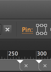
Make sure you pin that mobile menu to the TOP RIGHT if you want it right or TOP LEFT using the pin function below - i will assume you have a master page - or if its a one page site u may not need one

Copy link to clipboard
Copied
There´s quite a bit of work to do as Guenter mentioned, …
cheeky71 schrieb
Make sure you pin that mobile menu to the TOP RIGHT if you want it right or TOP LEFT using the pin function below - i will assume you have a master page - or if its a one page site u may not need one

… and pinning on mobiles is not recommended at all, especially the devices with this tiny little "i" don`t really like pinning, though.
Uwe

Copy link to clipboard
Copied
Are you using fluid (with breakpoints) or Desktop/Tablet/Mobile version? Your menu makos needs a background in order for it to stand out over the content. You can set the menu panel to the browser width and then position the various items within that (hamburger and MENU text an adjust the size of the accordion (and position) width to your desired spec. If you want to see a sample let me know.

Copy link to clipboard
Copied
I think, there are other issues too. The simplest way to find a solution:
Delete all pages, but the „home“ page and delete the slide show. Now we should have a small file to examine.
Give us this file by using these instructions: https://forums.adobe.com/docs/DOC-8652, then we can have a closer look without guessing.
 AdChoices