 Adobe Community
- Home
- Muse (read-only)
- Discussions
- Vorschau immer mit einer falschen Bildschirmgröße?
- Vorschau immer mit einer falschen Bildschirmgröße?

Copy link to clipboard
Copied
Welchen Grund kann es haben das mir Adobe Muse die Seite in der Vorschau immer mit einer falschen Bildschirmgröße anzeigt? Sprich das was ich gelayoutet habe schaut in der Vorschau ganz anders aus (wirft die Seite durcheinander). Wo kann ich die Vorschaugröße einstellen?


 1 Correct answer

I will answer this question in English, to give other members of this forum the possibility to follow.
Your problem is very clear! And it is also clear, that you are very new to web design! 
But step by step:
- Open the „Willkommen“ page in Muse and preview it in browser.
- Relative to your screen size, the 5 coloured elements bottom right of your page loose their alignment. The reason: There are many element above these 5 objects and Muse has to guess, which one should push down which other one – and i
 12
Replies
12
12
Replies
12
Copy link to clipboard
Copied
Bitte gib uns eine einen Screenshot oder noch besser: Ein kleines(!) .muse-Dokument, welches dein Problem zeigt. Ich ahne(!) wo das Problem liegen könnte, aber dazu müssen wir ein Beispieldokument sehen. Vermutlich hat das Ganze nicht mit einer „falschen Bildschirmgröße“ zu tun.
Bitte nutze unbedingt diese Anleitung, um uns ein .muse-Dokument zukommen zu lassen: https://forums.adobe.com/docs/DOC-8652
Copy link to clipboard
Copied
Dein .muse-Dokument habe ich erhalten.
Es ist jedoch sehr schwierig, deine Probleme genau nachzuvollziehen, da du Webfonts verwendest, die ich nicht besitze.
Könntest du bitte einen Screenshot zur Verfügung stellen, wie die Seite bei dir in der Muse-Layoutansicht aussieht?
Noch besser wäre es natürlich, wenn du mir darüber hinaus die Webfont-Dateien per Download (wie die .muse-Datei) temporär zur Verfügung stellen könntest.
Copy link to clipboard
Copied
Hallo Günter, anbei die gewünschten Daten.
Vielen, vielen Dank für dein Bemühen.
Liebe Grüße
Maket
2017-08-15 1:44 GMT+02:00 Günter Heißenbüttel <forums_noreply@adobe.com>:
Vorschau immer mit einer falschen Bildschirmgröße? created by Günter
Heißenbüttel
<https://forums.adobe.com/people/G%C3%BCnter+Hei%C3%9Fenb%C3%BCttel> in *Help
with using Adobe Muse CC* - View the full discussion
<https://forums.adobe.com/message/9766480#9766480>
Copy link to clipboard
Copied
Es gibt kein „anbei“, wenn du via E-Mail antwortest. Anhänge werden dabei verworfen. Du musst dich schon ins Forum bemühen.
Copy link to clipboard
Copied
https://adobe.ly/2i1fTZh
https://adobe.ly/2uJPtwX
https://adobe.ly/2uX2xP6
https://adobe.ly/2uXRwgf
Sorry, bin neu.
2017-08-15 10:36 GMT+02:00 Günter Heißenbüttel <forums_noreply@adobe.com>:
Vorschau immer mit einer falschen Bildschirmgröße? created by Günter
Heißenbüttel
<https://forums.adobe.com/people/G%C3%BCnter+Hei%C3%9Fenb%C3%BCttel> in *Help
with using Adobe Muse CC* - View the full discussion
<https://forums.adobe.com/message/9766937#9766937>
Copy link to clipboard
Copied
I will answer this question in English, to give other members of this forum the possibility to follow.
Your problem is very clear! And it is also clear, that you are very new to web design! 
But step by step:
- Open the „Willkommen“ page in Muse and preview it in browser.
- Relative to your screen size, the 5 coloured elements bottom right of your page loose their alignment. The reason: There are many element above these 5 objects and Muse has to guess, which one should push down which other one – and it guesses wrong. You can help Muse by grouping the 5 square elements (Attention: Forget the text within these elements for now! We’ll come back to this later on. Just group the 5 squares. When you preview now in browser, you see: The squares keep their alignment.
- Now, you can see one more effect: If you minimise the browser window, the text box „Fühlen Sie sich wohl …“ reduces its width (because it is responsive) and grows in length, to „match“ the text length. Growing in length causes the 5 squares below to slide down dynamically.
Now you are confronted with the next problem:
The text pushes down the 5 squares, but the big image to the left shrinks! The size of responsive images is growing/shrinking proportionally, when the browser window is resized. That is the deeper sense of responsive layout.
In this special case you run into a contradictory situation:
- To the right, the text pushes the squares downwards, and
- to the left, the image reduces its size,
- Result: The image and the squares loose their alignment. This is logically unavoidable, and you can’t solve it by any means, except one: Create a fixed width page, without fluidity, and this will be possible without any problems. (I really don’t know, why beginners always try to start with complex responsive layouts – not really knowing, what they do. Just like somebody, who has no driving license but wants to take part in the Rallye Paris – Dakar )
Let us go further:
- The top „orange" background is an image frame created by using the crossed out rectangle tool from your toolbar. These image frames scale proportionally, because they are used to place images.
- Consequence: The elements, placed onto this frame (headline, menu) tend to run out of the area of this orange rectangle, when resizing the browser window, because the background shrinks and the text elements grow.
- Solution: Delete this image frame and replace it by a „normal“ rectangle (= the rectangle tool without crossed lines). Now the background grows, and keeps the elements within its area.
Next issues:
- You now see, that your menu isn’t shrinking, when you resize the browser window. It can’t do this because it is set to „Uniform Spacing“ instead of „Uniform Size“. If you want to know why, just read this: https://forums.adobe.com/thread/2370315
- On with the show: If you resize the browser window, the headline („Hauptsache …“) breaks at a certain point into 2 lines. What else should Muse do, when the text doesn’t fit into one line any more? Therefore make the text container as wide as possible, and at the point, where the line breaks, create a breakpoint and redesign the header area to make it fit. The same is necessary, when your menu entries start overlapping. Just learn, how to use breakpoints, and you can fix these issues!
The last issue:
- These text boxe covering the 5 coloured squares at the bottom of your page. In the meanwhile you should know, why the drift apart: The squares scale proportionally, the text boxes only vertically and need to give room for the text in vertical direction.
- With your actual Muse skills, you won’t definitely be able to solve this problem. But there is one way out: Create square images with this text and place these images into the coloured squares.
You see: The thread started with „Preview in a wrong screen size“ and end up in the simple fact, that you should really learn about responsive design, instead of using the Muse canvas just like a pin board.
Her you find a really great starting point for learning: https://helpx.adobe.com/de/support/muse.html
Copy link to clipboard
Copied
Herzlichen Dank für die Antworten, die haben mir schon mal ganz gut weiter geholfen.
Jetzt sind natürlich weitere Fragen aufgetaucht.
1. Wo kann ich „Uniform Spacing“ auf „Uniform Size“ (hab deinen link gelesen, kann aber nicht wirklich was damit anfangen) auf Deutsch finden und umstellen?
2. Wie kann ich den Text in einen Imagerahmen einfügen (wie geraten, siehe letzter Punkt)?
Danke für die Empfehlung das ich lernen soll und genau das versuche ich gerade doch manchmal kann man vor lauter Wald (welches Tudorial, wo schau ich nach, etc.) die Bäume nicht sehen, wenn man nicht genau weiss wonach man suchen soll.
Copy link to clipboard
Copied
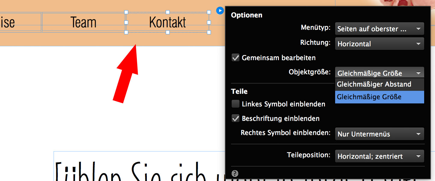
1. Aktiviere das Menu, öffne den kleinen blauen Pfeil rechts am Menü um die Einstellungen zu sehen und ändere dort den Eintrag „Objektgröße“ von „Gleichmäßiger Anstand“ zu „Gleichmäßige Größe“.
2. Du kannst keinen Text in einen Bildrahmen einfügen. So etwas ginge zwar mit einem „States“-Button, hilft aber nicht weiter: Wenn ein Textrahmen schmaler wird (durch Verändern der Fenstergröße im Browser) muss er halt länger werden. Wohin sollte sonst der Text?
Du kannst dich behelfen, indem du ein Bild von dem Text erstellst: Photoshop/Illustrator: Text schreiben, als Bild (jpg, svg) sichern und in das Quadrat platzieren.
Du kannst auch folgendes probieren:
Erstelle die Rechtecke mit dem „normalen“ Rechteckwerkzeug (nicht mit dem Bildrechteck (= durchgestrichenes Rechteck) und lege dein Textobjekt darauf, so dass es nicht überlappt. Sollte das Browserfenster nun kleiner werden und der Text „zerfällt“ in 2 Zeilen, so verlängert sich das Rechtck entsprechend. In diesem Fall musst du dafür sogen dass die nebeneinander liegenden Text-Elemente zur gleichen Zeit größer werden. Das ist eine Frage der Layout-Kreativität!
Schau dir dieses Beispiel an: https://www.dropbox.com/s/4we06fl8zuhuo23/Demo%20HP%202017_Mod.muse?dl=0
Es zeigt, wie man die Lösung solcher Probleme prinzipiell angehen muss. Aber:
Ich denke nicht, dass du mit deiner Seite wirklich glücklich wirst. Um es klar zu sagen: Deine Kenntnisse reichen definitiv noch nicht aus, um die Probleme, die man sich mit responsivem Design einfängt, zu lösen.
Deshalb: Meine unbedingte Empfehlung: Starte mit nicht-responsivem Design und fester Seiten-/Breakpointgröße.
Copy link to clipboard
Copied
Sorry, ich checks einfach nicht. Welches Menü meinst du, soll ich aktivieren? Wo finde ich das?
Copy link to clipboard
Copied
Glaubst du wirklich, du packst eine responsive Webseite mit dieden (Vor)Kenntnissen? Ich glaube es nicht!
Das meine ich:
Bitte, zeige Realismus, und erstelle eine Webseite mit festen Haltepunkten. So wird das nichts, glaub’ mir!
Copy link to clipboard
Copied
Herzlichen Dank für die Tipps, Infos und die Hilfe, ich werde es
wahrscheinlich auch so machen (feste Haltepunkte).
Doch "jeder Fachmann" sagt es sollte unbedingt eine "Responsive Web-Seite"
sein den das ist das A und O und die ganzen Suchmaschinen finden die Seiten
leichter etc.
Als Einsteiger ist es ziemlich verwirrend da einen Durchblick zu bekommen,
trotz lesen, Videotraining, usw.
Eine "Dummy-Frage" hätte ich da noch, warum ist es sooo schlimm wenn man
eine HP mit festen Haltepunkten (z.B. einen Haltepunkt für Smartphones,
einen für Tablets und einen für PC's) erstellt?
Etliche "Responsive-Seiten" die ich bis jetzt gesehen habe laufen überhaupt
nicht wirklich vernünftig und da bin ich mir halt nicht sicher was netter
anzusehen ist, eine Seite bei der ich vielleicht ein wenig herumschieben
muss das ich alles erfassen kann oder eine Seite die "herumhüpft" und der
Text dann eher "unleserlich" wird.
Man kann es sowieso nicht allen recht machen (unzählige Displaygrößen am
Markt, usw.) wie ich gelesen habe.
Ich bleibe auf alle Fälle dran auch wenn mir noch ziemlich der "Plan" fehlt
aber ich schaffe das.
LG
Copy link to clipboard
Copied
Natürlich schaffst du das!
Vergiss diesen halbgaren Quatsch, dass "Google responsive Seiten besser findet"!
Das ist einfach nicht wahr. Google beurteilt, ob Seiten auf mobilen Geräten gut zu nutzen sind (keine zu kleinen Schriften u.ä.). Aber das ist natürlich mit festen Breakpoint auch zu erreichen. Gute adaptive Seiten erreichen das gleiche Google-Ranking wie gute responsive Seiten – und ein besseres als miese responsive Seiten.
Und: Hauptkriterium für Google ist nach wie vor die Anzahl der Besucher deiner Seite. Ich würde mich durch das ständige Stirnrunzeln der selbsternannten Googe-Spezialisten nicht lähmen lassen! Glaub mir, feste Breakpoints sind einfacher handzuhaben und wesentlich einfacher zu gestalten – und eine gut gestaltete Seite, die sauber funktioniert, bringt mehr Besucher und ist letztlich 'Google-freundlicher". (Wobei ich selbst mich nicht so sehr um den Datenoloch Google schere. Aber das wäre ein anderes Thema …
Also: Sammle deine Erfahrungen mit Muse. Homepages sind nicht in Stein gemeißelt. Du kannst alles jederzeit ändern, wenn sich deine "Skills" entsprechend entwickelt haben!
 AdChoices