 Adobe Community
- Home
- Muse (read-only)
- Discussions
- Re: Accordion menu behavior issue – browser vs pre...
- Re: Accordion menu behavior issue – browser vs pre...

Copy link to clipboard
Copied
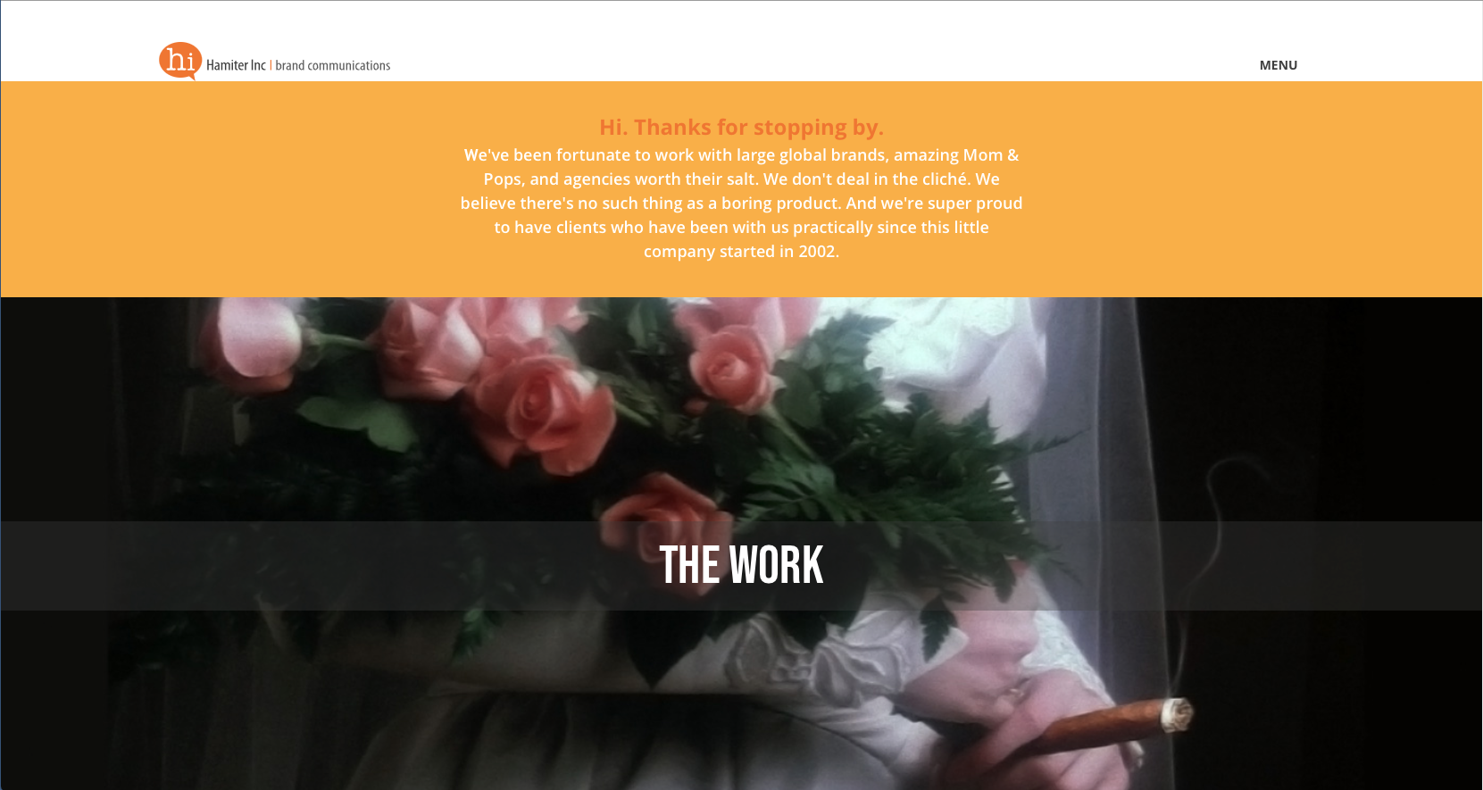
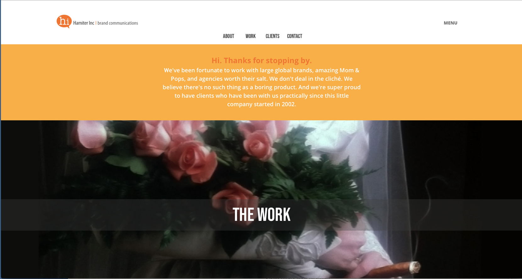
Hello,
I was double-checking/testing my temporary business catalyst site, and noticed the following:
The Issue
• When clicked, the menu slightly hesitates or "twitches" when it transitions down – but...this only happens at certain breakpoints. It transitions smoothly at other breakpoints on the same page.
• This mainly happens at the desktop level.
• I have a phone layout built as well – no problems with the menu transition at this size.
• When I preview pages in the browser the menu behaves as it should. Same in preview mode.
The Specifics (in case this helps)
• How the menu is built: Standard accordion panel with manual horizontal menu created with text.
• Desktop: Set at 1366, minimum width 320. Breakpoints at 1024, 768 and 414. No other real problems with content at these points.
• Phone: Set at 380, minimum width 320.
• Muse Version: 2018.0
• No third party menu widgets.
Not sure why it's doing this inconsistently. Any help would be appreciated. I've included screenshots showing the menu closed and open. Pretty simple, and basic.
Regards,
Jimmy


 1 Correct answer

Only to understand you correctly:
You are saying, that clicking the menu button on your site (nice site by the way: clear and straightforward!) sometimes causes a slight „hesitation/flouncing“, when/before the menu sheet slides down. This seems to appear especially in Safari’s Responsive Design Mode.
Is this correct?
If so: I tested on macOS 10.13.3. with the latest Safari, with and without Design Mode and didn’t notice such a behaviour at all. The sliding-down of the accordion is very soft and eve
...
 5
Replies
5
5
Replies
5
Copy link to clipboard
Copied
Could you give us the Businesscatalyst link to your temporary site?
Copy link to clipboard
Copied
Yessir, here you go: http://haminc-3.businesscatalyst.com/index.htmlhttps://haminc-3.businesscatalyst.com/index.html
Thanks!
Copy link to clipboard
Copied
Gunter,
One more thing. My preview was in Safari's Responsive Design Mode. When not in Responsive Mode the menu seems to behave normally. I just noticed that this morning. So would the Responsive Mode somehow not be giving me a true preview? Just wondering.
Thanks again!
Copy link to clipboard
Copied
Only to understand you correctly:
You are saying, that clicking the menu button on your site (nice site by the way: clear and straightforward!) sometimes causes a slight „hesitation/flouncing“, when/before the menu sheet slides down. This seems to appear especially in Safari’s Responsive Design Mode.
Is this correct?
If so: I tested on macOS 10.13.3. with the latest Safari, with and without Design Mode and didn’t notice such a behaviour at all. The sliding-down of the accordion is very soft and evenly. The same in Chrome. If I look very(!) concentrated, I perhaps(!) notice a very slight „stumbling“, when Chrome opens the menu for the first time, using a very wide browser window (about 2500 px width). This might be related to the extended image sizes in this case. But this might be imagination as well. 
Here is, what I see in Safari:
As you already remarked: It is possible, that these simulation modes in Safari, Chrome, … don’t work precisely in every situation. To obtain ultimate clarity, there is no way around testing on real devices.
Copy link to clipboard
Copied
Thanks so much for this, Gunter, and for the compliments on the site! Interestingly, in FireFox's simulation mode, the menu behaves as it should. It does on my phone as well. So, as you intelligently summed up, perhaps simulation mode may not be a truly exact preview.
Moving forward with much appreciation for all your help. As we say in the states (and perhaps where you are as well), you rock!
 AdChoices