 Adobe Community
- Home
- Muse (read-only)
- Discussions
- Re: Accordion menu collapse on click?
- Re: Accordion menu collapse on click?

Copy link to clipboard
Copied
Hello,
i created a responsive one page site with an accordion menu for smaller viewports that links and scrolls to anchors on the same page, when an item is clicked the page scrolls down to the anchor but the accordion menu doesn't collapse and hides content off the screen behind it.
I don't think the accordion widget was initially designed to house a navigation menu inside of it, but i think we all use it for that purpose, and before the recent responsive update you couldn't pin items (on mobile) to stay on the top of the page so it would scroll up and out of view so it wasn't an issue.
is there a solution for this problem or does it need to be fixed in muse?
Thank you.


 1 Correct answer

What I don’t understand:
Why not use a simply a "out of the box" menu widget, configured as "manual"?
The functionality has been modified since Muse 2015.2 and now it does all, what is required in this thread:
• Is is responsive
• It closes automatically, when jumping to an anchor or a link
• It closes on rollout
• It is highly configurable – even with image fills and/inline graphic
• You may use text, which differs from the link
• You even can use multi line entries with inline images
Just look at this
...
 28
Replies
28
28
Replies
28
Copy link to clipboard
Copied
bump

Copy link to clipboard
Copied
If you think this could be a good feature to have (assuming that your inferences are right), use Ideas for features in Adobe Muse to make the feature request.

Copy link to clipboard
Copied
And I believe tha Ankush has confirmed that this is a bug in the current version of Muse. (Once the accordion menu opens, it remains opened, no matter where you scroll.)
Copy link to clipboard
Copied
I've been struggeling with this issue as wel. An autocollapse feature for the accordion widget would be nice.
But during my struggle I decided to abandon the accordion widget all together and started to play around with the featured news widget.
I use dit in a similar way as we do with the accordion widget.
I deleted all but one tab. Added a menu widget to the content area and used the following settings:
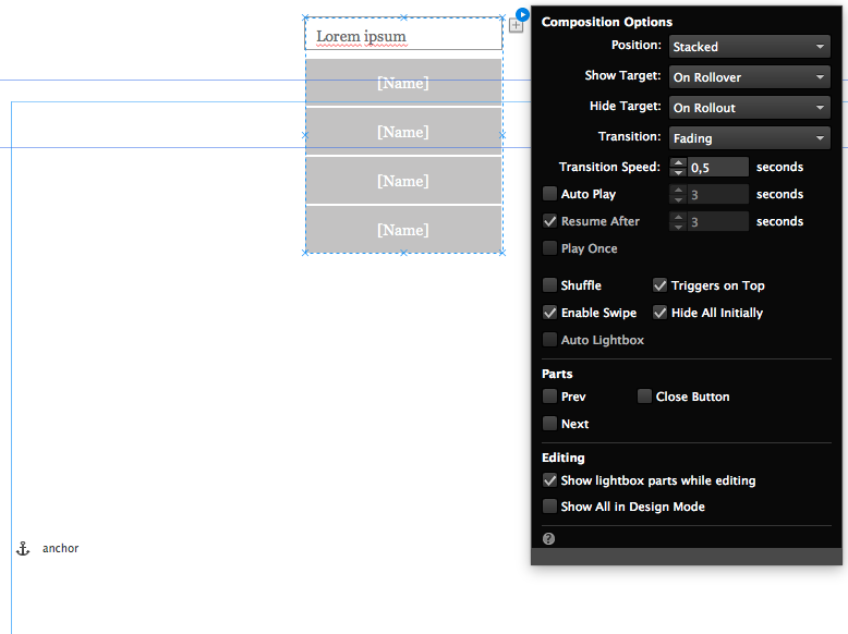
The difference with an accordion is that the featured news widget does not have a scroll effect when it opens and it always overlaps content below. The featured news widget has a fade transition.
I created a simple page with this widget as a mobile menu and some anchors to scroll to. You can try it here
Make sure to try it on a mobile phone.
I would prefer this solution for the mobile menu over an accordion that doesn't automatically close.
You can get my Muse File here if you want to play around with it
Copy link to clipboard
Copied
It works flawlessly on my phone, and it looks awesome!!
i will try it out and report back.
Thank you!
Copy link to clipboard
Copied
It did work on my phone but it doesn't work on a desktop browsers. It would be confusing since it hides the menu on rollout of trigger and if i choose to hide on rollout of trigger and target then it would break functionality on phones. it also isn't responsive 
I really hope adobe is working on a better menu widget that supports responsiveness and isn't "mickey moused"
Copy link to clipboard
Copied
Yeah I know it has issues on desktop and the "hide on rollout of trigger and target" breaks it for mobile, but that's why its a mobile menu. It should be hidden in desktop breakpoints.
I could live with it not being responsive. With Muse we have to work with what we have. If you want more we should resort to coding.
I think some third party widget creators have mobile menu solutions that work but Muse should have these natively. Anyway the application is still young, made it's first steps in responsive design and I'm confident Adobe's developers will come up with tons of good stuff in the future.
If you're an insider in the Adobe Muse prerelease community you would have known that adding responsive design to muse was under consideration for a long time. the demand was overwhelming and so they implemented it but they were not convinced at first and deemed it to be to complex for Muse's target audience. They were not wrong to think this if you look at the amount of questions on the web concerning responsive design in Muse.
Copy link to clipboard
Copied
i need this menu to appear on an iPad which is very close to a desktop and i cannot have a site that might work and might not depending on a viewport breakpoint guess
I Have been using 3rd party solutions
I am part of the prerelease "party" and have asked the same question there and submitted it as an idea as well but really a menu is a core part of a website and it should have been a priority
anyways, i have been working on a solution that doesn't use 3rd party solutions that i might post in a little bit.
Copy link to clipboard
Copied
awesome I'll be on the lookout for your solution.
Now that I have some more background on your intention I think a visibility feature that targets devices instead of breakpoints would be nice 
Something along the lines of "show on touch devices only"

Copy link to clipboard
Copied
I honestly think this IS the answer to the problem. Great job Michael! Worked perfectly for me on my site I'm building.
Typo Michael wrote:
I've been struggeling with this issue as wel. An autocollapse feature for the accordion widget would be nice.
But during my struggle I decided to abandon the accordion widget all together and started to play around with the featured news widget.
I use dit in a similar way as we do with the accordion widget.
I deleted all but one tab. Added a menu widget to the content area and used the following settings:
The difference with an accordion is that the featured news widget does not have a scroll effect when it opens and it always overlaps content below. The featured news widget has a fade transition.
I created a simple page with this widget as a mobile menu and some anchors to scroll to. You can try it here
Make sure to try it on a mobile phone.
I would prefer this solution for the mobile menu over an accordion that doesn't automatically close.
You can get my Muse File here if you want to play around with it


Copy link to clipboard
Copied
thank you so much, this technique was very useful as I had been struggling too many days with it !!
Copy link to clipboard
Copied
What I don’t understand:
Why not use a simply a "out of the box" menu widget, configured as "manual"?
The functionality has been modified since Muse 2015.2 and now it does all, what is required in this thread:
• Is is responsive
• It closes automatically, when jumping to an anchor or a link
• It closes on rollout
• It is highly configurable – even with image fills and/inline graphic
• You may use text, which differs from the link
• You even can use multi line entries with inline images
Just look at this example site after downsizing the window: http://menu-tap.businesscatalyst.com/index.html
You may download the .muse-file directly from the sample site.
Copy link to clipboard
Copied
Thx for Pointing that out Günter.
I figured out your file after a couple of minutes. You use two horizontal menus (one for the desktop breakpoint and one for the mobile breakpoint and each breakpoint only shows one of them.
The mobile menu uses the sublevels feature of the horizontal nav widget.
I guess the only issue designers might have with this standard nav widget is that it has no transition option or slide open effect. It simply appears instantly and disappears instantly when you click or tap on a link.
Designers started playing around with the accordion widget because it has a fancy slide open effect and my method with the compositions widget offers a fade in and fade out effect...
Maybe they should add a transition option to the menu widget so that the sublevels slide out or fade in..

Copy link to clipboard
Copied
could i please add a question: i am missing the hamburger icon, where the fill command "insert image" is showing my desktop only:
i want to create a simple menu, which shows on "normal" status the hamburger icon only. (small iphhone screen)
i ve been reading many answers here which go and end at this point.
1. create the menu widget or accordion widget
2. define states
3. to install a hamburger icon for state "normal", use the fill menu.
thats where the explanations are stopping.
i am in the fill menu now. but i cant find the hamburger symbol.
i think it has to be in "load image". i click on load image, and the popup window shows my desktop.
shouldnt it show the folder "muse assets" with the hamburger icon?
i am searching for the hamburger icon now...
thanks
Copy link to clipboard
Copied
you will need to create it or download it somewhere. You can create it with illustrator save it as a png and then use that image as the background fill.
The way I sometimes do it is by simply creating the hamburger icon in Muse itself, draw three rectangles - group them - copy the group.
Then select the text of the first tab and paste it.
Copy link to clipboard
Copied
thanks, i understand now.
it worked for me now, i ve downloaded a hamburger icon gif.
from the answers in the other topics here, i got it wrong, as they said, you will find the symbol in the fill-menu,
so i thought its there, but you have to create it first.
Copy link to clipboard
Copied
another thing please:
i used a simple menu widget, and i cannot change or edit the text in the menu. it uses the text from the pages of the site.
so i created an accordion menu (widget), and there i can change the text (rename).
i dont need the accordion feature, where there is a textbox collapsing on click, below the menu item.
it seems i cannot erase the textfield, is that right?
if i close the field to minimal height, there is still some pixels which are moving down on click.
got it: you have to set "manual" in the widget blue symbol palette!
thanks
Copy link to clipboard
Copied
Hey Peter. Check out the font called 'Font Awesome' which you can load.. .just google search. The standard alphabet is just bland but when you go to glyphs, there are TONS of helpful options.
Also make sure you are putting a menu widget INSIDE the accordian widget or news widget. A vertical menu widget alone won't really work for what you're looking for, as you can't 'collapse' all.
Copy link to clipboard
Copied
That is correct!
For me, personally, it is not important to have such eye candy. In my eyes, that is not design, but decoration, which changes with fashion. Not my world!
Copy link to clipboard
Copied
This was a great suggestion from Günter, and thanks to him for enlightening us!
I have applied this technique to a fully responsive one page site that I'm currently developing and it works a treat.
But I have discovered one slight problem with Muse 2017.0.2.60, which I'm using.
Personally I like mobile menus to be full browser width at smaller breakpoints.
So I specified the main menu item to auto resize and be full browser width, which it does perfectly
The error occurs with the submenu items.
As you will see from the attached screen grab, these do not automatically resize.
The result is that on some smaller devices, the menu items do not display correctly and it looks rather odd.
Yesterday I checked with the Adobe Muse team via Twitter about this problem and their response was:
"Hey, you are correct. submenus aren't getting to it. looks like a limitation. We will check on this. Many thanks. ^AR"
I'm sure the issue will be fixed and included in a future Muse update, but I simply wanted to make everyone aware of this issue now.


Copy link to clipboard
Copied
Isn`t it DerekDigital, that you can use a composition with a lightbox for your menu? That will be centered all time, won`t it?
This might be only a workaround as phone screens are small anyway.
Copy link to clipboard
Copied
On previous sites I've developed in Muse I've used accordion widgets which contain vertical menus for mobile navigation. These resize perfectly, type formatting is good, and the widget automatically closes if the menu items take a user to another page on the site. However, the site I was developing is essentially a one page site. I needed the menu navigation to jump to Muse Anchors and auto-close. Accordion widgets don't auto-close on single page sites. That's why Günter's solution worked for me… but I then uncovered the resize problem I mentioned earlier. I hope that makes sense!?

Copy link to clipboard
Copied
Hey DerekDigital, for the same reason I needed a "close button".
But for the problem with the sub-menu items not rezising: for me it actually works when I preview in browser. When I use the scrubber bar to resize, it does not resize. Dumb question, but did you try to preview this in your browser?
Copy link to clipboard
Copied
DerekDigital, can you tell me how you acomplished it to include the "close menu" button in the menu?
As you wrote, I also like to make a fullscreen menu for mobile devices. And I did this the "featured news way" and also the way Günter did it. Both solutions work for me in the way that they close automatically after clicking an anchor link. But this way I don`t have an option to close the menu if the user decides not to go for one of the anchor links. Or did you just use empty menu entry?
-
- 1
- 2
 AdChoices