 Adobe Community
- Home
- Muse (read-only)
- Discussions
- Adobe Muse Desktop und Mobil vermischen sich
- Adobe Muse Desktop und Mobil vermischen sich

Copy link to clipboard
Copied
Hallo, ich hoffe hier kann mir jemand helfen.
Meine Seite besteht aus Desktop Version und Mobil. Wenn ich die Mobilen Seiten im Vorschaumodus angucke, ist alles richtig. Gucke ich aber die Desktop Version im Vorschaumodus an, wird mir die Mobile Version auf Desktop Größe skalliert angezeigt. Ich kann also meine Desktop Seite nicht als Vorschau angucken. Wenn ich das gesamte Projekt im Browser anschauen will, wird ebenfalls nur die Mobile Version klein dargestellt. Nach ein paar mal durch diese durchklicken, springt es auf die richtige Browser Darstellung. Wenn ich das Projekt als HTML abspeicher und öffne, werden mir auch nur die mobilen Seiten angezeigt...
Ich bin über jeden Tipp dankbar! 


 1 Correct answer

Of course! The browser displays the actual page. And the actual page in this simulation is the phone page. Just look into the addressline! You made an adaptive site, with separated phone- and desktop-pages. The preview modes in browsers can’t switch between them!
Please read my post #3 and publish your site testwise to businesscatalyst. Then we can have a look. I assume, as will be ok in this case.
 5
Replies
5
5
Replies
5
Copy link to clipboard
Copied
Please give us the .muse file to have a look at. Try to eliminate all pages and elements, which aren’t related to your issue and follow these instructions: https://forums.adobe.com/docs/DOC-8652
Copy link to clipboard
Copied
Hier ist die Datei. Dropbox - Website_Box.muse
Copy link to clipboard
Copied
I can’t see any mixing of phone and desktop pages.
Could you please post a screenshot of such an issue?
And additionally: Could you publish your site for free at Businesscatalyst by using the „Publish“ button top right of Muse’s application window. As I said: At first glance I can’t see a problem.
If you are talking about the browser wide image on the page „Warum box?“, which appears, when simulating the page on Safari’s responsive mode: This is normal, because the image is set to browser width. It will be shown correctly, when published.
Copy link to clipboard
Copied
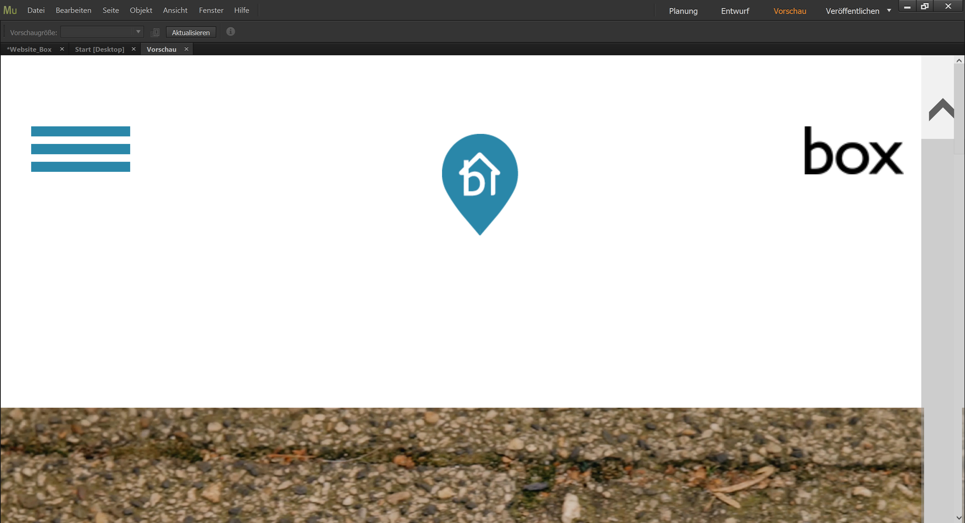
Dies wird angezeigt wenn ich die Desktop Vorschau öffne. 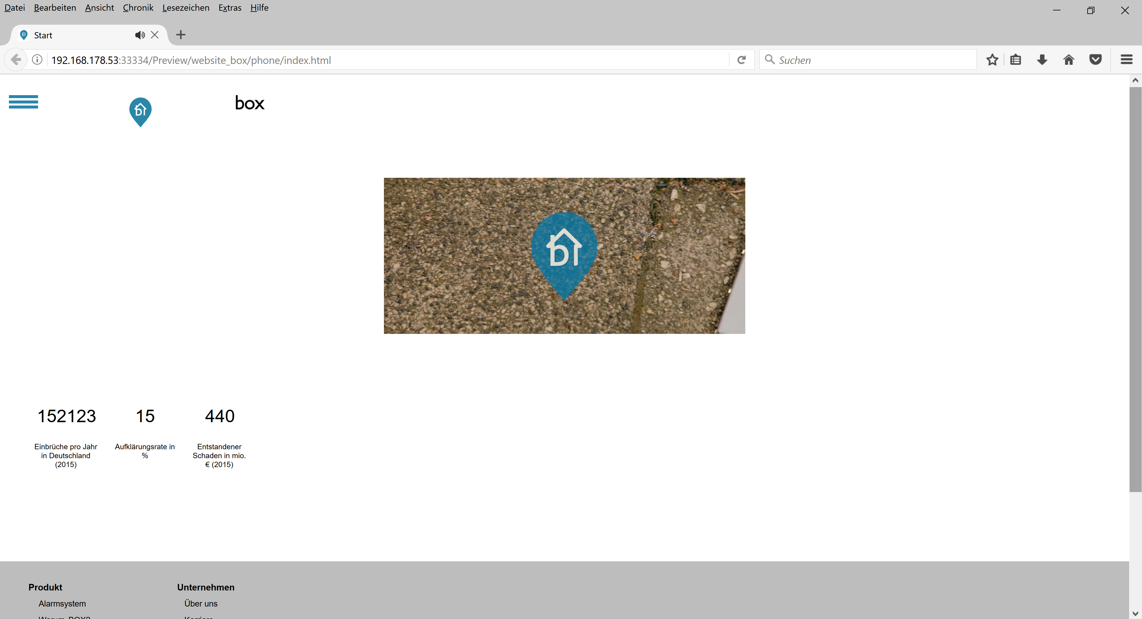
Öffne ich die Seite im Browser sehe ich das. Die Mobile Version, aber nicht die für den Desktop.
Copy link to clipboard
Copied
Of course! The browser displays the actual page. And the actual page in this simulation is the phone page. Just look into the addressline! You made an adaptive site, with separated phone- and desktop-pages. The preview modes in browsers can’t switch between them!
Please read my post #3 and publish your site testwise to businesscatalyst. Then we can have a look. I assume, as will be ok in this case.
 AdChoices