 Adobe Community
- Home
- Muse (read-only)
- Discussions
- Re: Adobe Muse (Responsive?) Text Box
- Re: Adobe Muse (Responsive?) Text Box

Copy link to clipboard
Copied
Okay so, I'm really going to need some help here with Muse 2018
Hours and hours of trying but I can't seem to get a textbox, containing the company's name and description, to look in proportion to the rest of the page in the preview browser.
The font I used is a self installed webfont. I've tried other webfonts from the adobe typekit and web edge fonts so I don't think it's the downloaded font that is the problem.
Only when I use a system font, it seems to be following the rest of the page. But because it's an image when using a system font, the resolution isn't quite pretty to look at.
I put the textbox both on the masterpage and the page itself but neither will work.
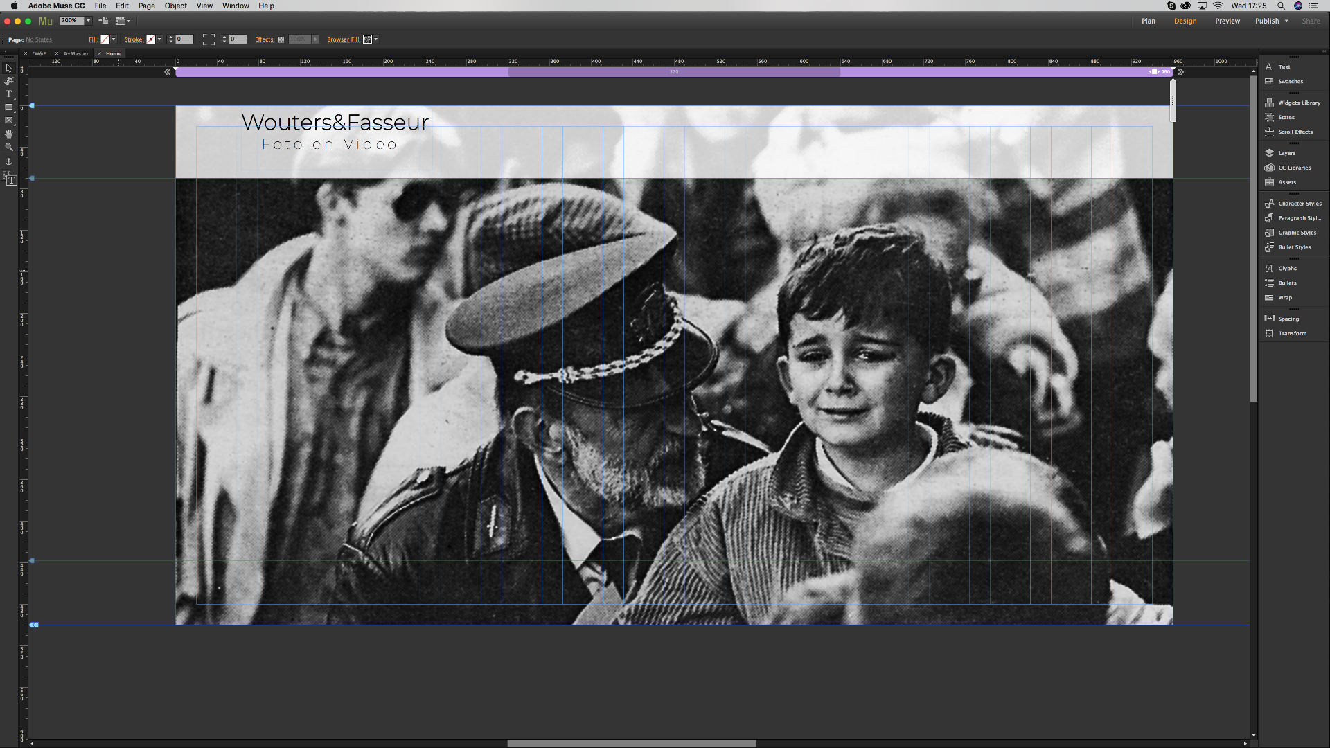
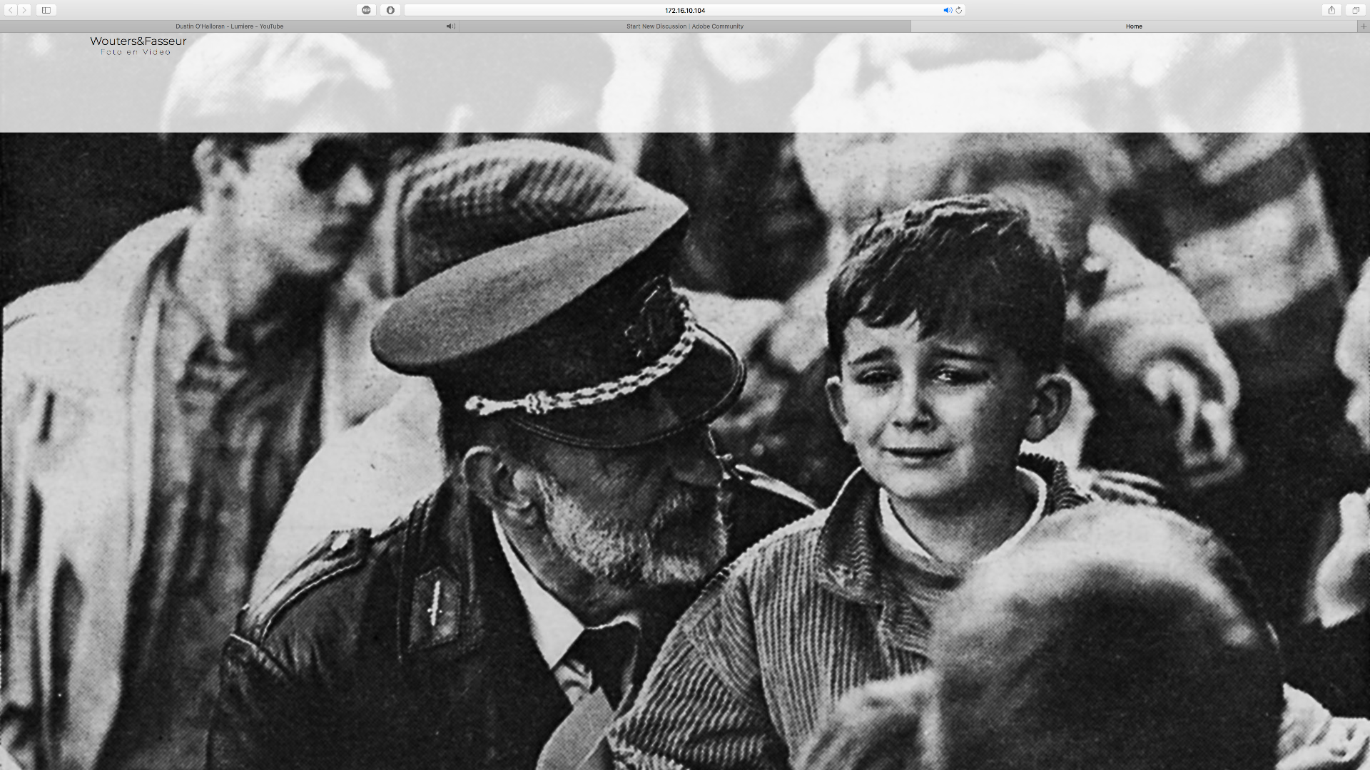
Here are the screenshots:
Here's my homepage in the design tap, looks, in proportion to the image and the header, like I want it to be.
But then, when I open it in a browser to preview it, it's much smaller. Completely blown out of proportion to the rest of the page.
Maybe the solution is quite simple, but I am totally lost...
Thanks anyway for anyone who might have an answer.
- Robin


 1 Correct answer

If I interprete your screenshots correctly:
- You are placing the text at a breakpoint of 960 px.
- You have told Muse, to stretch your complete page to browser width (the double arrows to the right of the breakpoint bar are pointing outwards)
- That means: The whole site zooms up to the size of the browser window.
- Text intentionally doesn’t zoom. Text size should be independent from screen size. A smaller screen shouldn’t cause a smaller font size. This makes text look relatively smaller when the complet
 2
Replies
2
2
Replies
2
Copy link to clipboard
Copied
If I interprete your screenshots correctly:
- You are placing the text at a breakpoint of 960 px.
- You have told Muse, to stretch your complete page to browser width (the double arrows to the right of the breakpoint bar are pointing outwards)
- That means: The whole site zooms up to the size of the browser window.
- Text intentionally doesn’t zoom. Text size should be independent from screen size. A smaller screen shouldn’t cause a smaller font size. This makes text look relatively smaller when the complete page is zoomed to browser width.
To change this behaviour you have several options:
- Choose a system font, which will be converted to an image during output. (bad solution)
- Create this text elements in Illustrator and place it as a SVG, then it will scale.
- Use this little .mucow file, created by the Muse team https://www.dropbox.com/s/w3rcwtr671ptvh1/ResponsiveTextSize.mucow?dl=0 and configure it with Muse’s standard tools. You may use menu „File/Place …“ to import this .mucow widget.
- Use this 3rd party widget. It works fine, but requires a one year subscription: https://www.muse-themes.com/products/scaling-text
- Or use this widget: https://musewidgets.com/products/fluid-text-scale I have to say, that I didn’t test this one.
Copy link to clipboard
Copied
Illustrator did it, didn't know you could do that
Vielen dank!
 AdChoices