 Adobe Community
- Home
- Muse (read-only)
- Discussions
- Re: Alignment is not right at design and preview m...
- Re: Alignment is not right at design and preview m...

Copy link to clipboard
Copied
Hello,
I am currently having some problems with alignment between design mode and preview mode.
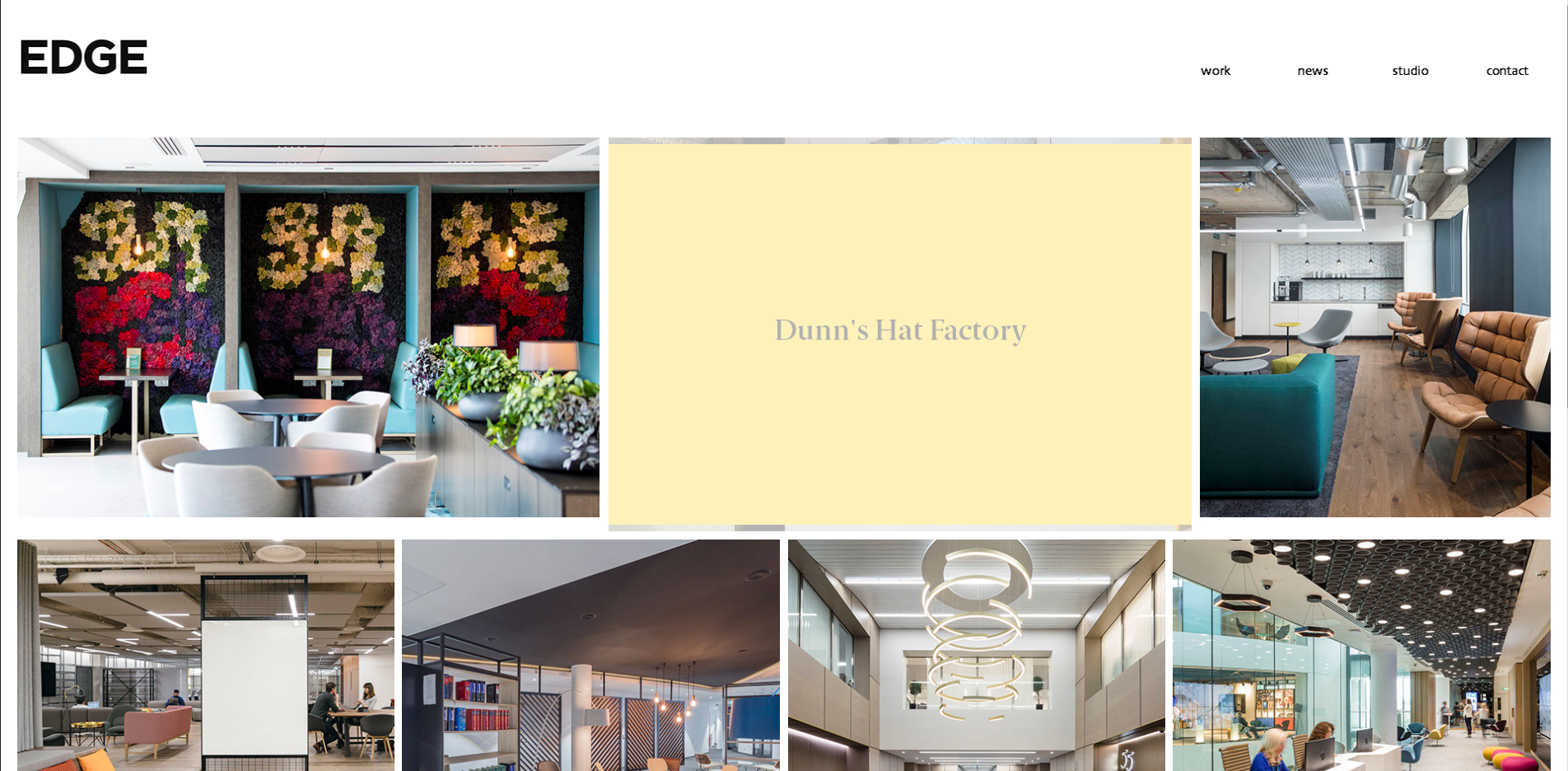
Everything looks in place in design mode
However, when I switch to preview, the image boxes is not right for the top 3 images, as shown in images below
Design Mode

Preview mode
Please help, thanks!
Regards, Wen


 1 Correct answer

Funny! Why do Muse users always put their finger into the deepest wounds? 
Short answer: It is possible, what you want to achieve, but is is not so easy. I’ll tell you why in seconds.
But first of all: The written law of all web designers: Don’t use system fonts! Why? Here (post 4) you find the answer: https://forums.adobe.com/thread/2357163. Use standard fonts or web fonts instead.
But now your issue:
Are you aware, why your tiles are running out of order in your sample site? The answer is simple:
... 4
Replies
4
4
Replies
4
Copy link to clipboard
Copied
I bet, the preview window hasn’t exactly the same size as the Muse layout view. So it is like resizing a browser window.
What happens to the text box „Dunn’s Hat Factory“, when you resize the window? Just test this in Muse, by dragging the scrubber (the grey, vertical handle top right of the breakpoint bar) slowly inwards. I assume the text frame is not high enough, and pushes down the „image“ when resizing the windows.
How exactly did you build these „images“? What is the yellow field: a rectangle, the textbox, a second image with rendered text?
Could you please delete all pages but one from your .muse file, and delete all images from this page except the first 2 rows, just as shown in your screenshot, and share this .muse file with us, using Dropbox, CC Files or a similar file sharing service?
Copy link to clipboard
Copied
Thanks for your reply.
The yellow box is a rollover effect by the way
Attached with the download link for my muse file
https://www.dropbox.com/s/0feiivtnhjrpxmb/help.muse?dl=0
I realised the aligned only changes when I put in a text frame or rectangle frame. Is there something that I have done incorrectly?
If I delete the yellow rollover box, the images are aligned perfectly as it seems in design mode.
Hope this is clear. Looking forward to your reply. Thanks! 
Regards,
Wen
Copy link to clipboard
Copied
Funny! Why do Muse users always put their finger into the deepest wounds?
Short answer: It is possible, what you want to achieve, but is is not so easy. I’ll tell you why in seconds.
But first of all: The written law of all web designers: Don’t use system fonts! Why? Here (post 4) you find the answer: https://forums.adobe.com/thread/2357163. Use standard fonts or web fonts instead.
But now your issue:
Are you aware, why your tiles are running out of order in your sample site? The answer is simple:
Your images are scaling in width and hight (proportionally), the text frame can’t scale proportionally, but scales in width only, and get longer, if needed, to keep the text visible. So, when you reduce your browser window, the images are shrinking, but the text box is growing in height and pushes down the elements below.
So, the reason is simple, but the solution for different reasons is not so easy.
The first thing, which simplifies the whole process, is not to use text, but a vector graphic. Using text, possible, but you would need many breakpoints to keep the text in the vertical middle of the image.
To design your button, use a „States“ button. A states button may contain many different elements. If the button is touched with the mouse, all elements within change their state. No need to hover over the single objects.
- So, create a states button in the size of your actual image.
- Place the image exactly into the states button.
- Place an empty image frame(!) of the same size into the states button, onto the image.
- Fill this image frame with a colour of your choice.
- Now set the normal state of this frame to "opacity: 0 %“ and the rollover state to „opacity: 70 %“.
- Place the „text image“ into the states button, above the 2 images elements.
- Use the crop tool to adapt the size of this image exactly to the size of the states button.
- Set the normal state of this „text image“ to "opacity: 0 %“ and the rollover state to „opacity: 100 %“
- The states button now contains all necessary elements for your self-made button. No grouping necessary.
Here you find a sample site. You may download the corresponding .muse file directly from this site:
https://button-with-centred-text.businesscatalyst.com/index.html
Copy link to clipboard
Copied
Perfect. Got it! This is very helpful!
Thanks a lot!
 AdChoices