I am not 100% sure what you did or what you want to see. You use adaptive weblayout, right?
Normally you keep with three different layouts, little to no breakpoints.
In my experience you do not need breakpoints and you shouldn`t use them at all.
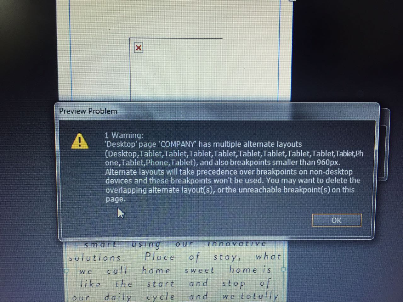
If you use breakpoints smaller than 960 on your desktop layout, how should muse or the browser decide wether to show th desktop version with smaller breakpoints or the tablet version.
This I found out in an earlier thread:
You could watch the whole thread here:Muse not redirecting to tablet version
the main decision from the beginning is, decide for
1) alternative layouts,
- then one must stick with fixed layouts for each device,
- keep with the smallest available size/default sizes
(desktop 960/1160 px, tablet 768 px, phone 380 px)
or
decide for
2) responsive layout
- choose between fixed or fluid design
- use screen sizes/breakpoints as you like
- keep this responsiveness from desktop to mobile devices
- use fixed width breakpoints, in order to work with scroll effects
- use fluid width breakpoints – try to work with responsive content as much as possible – no scroll effects
(it`s greyed out anyway with fluid width bp´s)
- alternative between scroll effects/fixed width bp´s or fluid width bp´s for desktop
(size taller than 960 px width) ...
- ... and fluid width for mobile devices (tablet, in this meaning is mobile device as well)
until the minimum size of 320 px width for phone is possible.
Best Regards,
Uwe


 1
Reply
1
Reply

 AdChoices