 Adobe Community
And it begins...

Copy link to clipboard
Copied
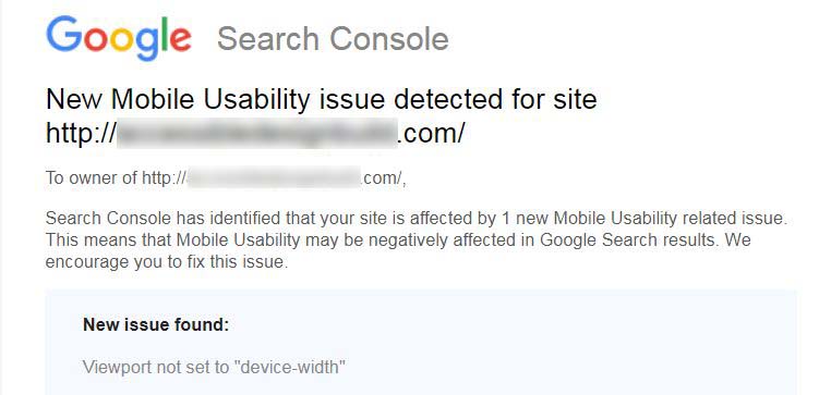
Funny thing is, it's not even one of my 'Phone' pages, but a 'Desktop' page. And yes, I know how to correct it - just showing how Muse will eventually begin failing.


 8
Replies
8
8
Replies
8

Copy link to clipboard
Copied
Well at least it's not a category 5 disaster. But I think it's odd that Muse doesn't add the viewport meta tag for you.
Alt-Web Design & Publishing ~ Web : Print : Graphics : Media

Copy link to clipboard
Copied
Take this with a grain of salt, because I have never actually used Muse, but I was under the impression it pretty much works with add-ons, or widgets, or whatever Muse calls them -- that Muse itself does not have the ability to make finished pages beyond the extremely basic, unless you use these add-ons. If that's the case, then it probably makes sense for the add-ons to add-in a proper viewport meta tag.
Copy link to clipboard
Copied
You don't need widgets to build web pages with break points in Muse. Widgets are optional and mainly provide features that Muse lacks -- Google maps, carousels, slideshows, lightboxes, etc...
I am guessing that when Muse came out in 2012, most designers were still building fixed width page layouts. Adaptive design options came much later.
Alt-Web Design & Publishing ~ Web : Print : Graphics : Media
Copy link to clipboard
Copied
Ah. Thanks for the info.
Copy link to clipboard
Copied
And that's what makes this even more curious.
The site in question is adaptive, not responsive. 'Adaptive design' involves separate pages for desktop and mobile with code designed to detect the viewport in order to serve the correct pages. This is one of the reason that I loved Muse so much, is that it embraced 'adaptive design', a much better paradigm than responsive, even providing for it in the interface, and later added 'responsive design'. Unfortunately, responsive won out in the development world, for obvious, or perhaps 'not-so-obvious' reasons.
At any rate, further inspection reveals that this has been going on for a couple of years, as similar posts have appeared here prior to mine.

Copy link to clipboard
Copied
The method of 'adaptive' design you refer to lost out to responsive years ago. Not just because re-directing the end user to the 'correct' page has proven to be completely unreliable due to the differences in how the site can be viewed, and the large number of viewport variations, but because maintaining such a site proved to be excessively time consuming.
One of Googles 'rules', (if you can call them that) is that all devices should have access to all content, so you should be able to view everything that any other user can view, no matter how they access the page. It should be only the presentation that changes, something that the 'adaptive' method often did not do, (even many rwd sites ignore the 'rule').
Copy link to clipboard
Copied
"maintaining such a site proved to be excessively time consuming"
Not necessarily accurate, especially in respect to tools such as Muse and it's 'linked content' functionality.
I'm in the process of recreating all of my Muse sites in WordPress, and the responsive design paradigm is much more difficult to implement/maintain that adaptive EVER was with Muse. I know that now because I am using both platforms side-by-side on a daily basis.
Page builders have at least 'attempted' to bring the Muse-style of development to the WordPress world - 'attempted'. Many requests for support on page builder forum sites begin with, "I'm not a developer, but...". My first thought is, "You soon will be."
"is that all devices should have access to all content"
Except for the fact that responsive design includes the built-in function to hide content on a particular viewport, and is a common practice. I have serious doubts that Google's algorithm takes into account whether certain content available on one viewport is also available at a smaller viewport. I'd love to see evidence of that - from Google.
"It should be only the presentation that changes, something that the 'adaptive' method often did not do"
Again, not as a rule. My Muse mobile pages were identical, content-wise, to their desktop versions. Only the 'presentation' was changed. Easily accomplished with adaptive design, and much more efficient. No need to port a 1150px wide image to a 360px wide screen.
Copy link to clipboard
Copied
I'd also like to point out that my company's adaptive Muse site consistently appeared in the top 5 SERP's for years. Immediately after recreating in WordPress, and keeping all content identical to the original, we dropped to the 21st position, and have not been able to recover.
Conversely, we were originally in WordPress when I switched to Muse. For the couple of years that our site was WordPress-based, we could never seem to break the 15th spot. 2 weeks after the Muse version went live, we jumped to 3rd. This was after being told over and over that Muse would kill our SEO.
 AdChoices