 Adobe Community

Copy link to clipboard
Copied
Heya, recently I posted a similar problem to this one - How to remove blank spaces in muse? , but here the case seems to be a bit different and I decided to start a new discussion.
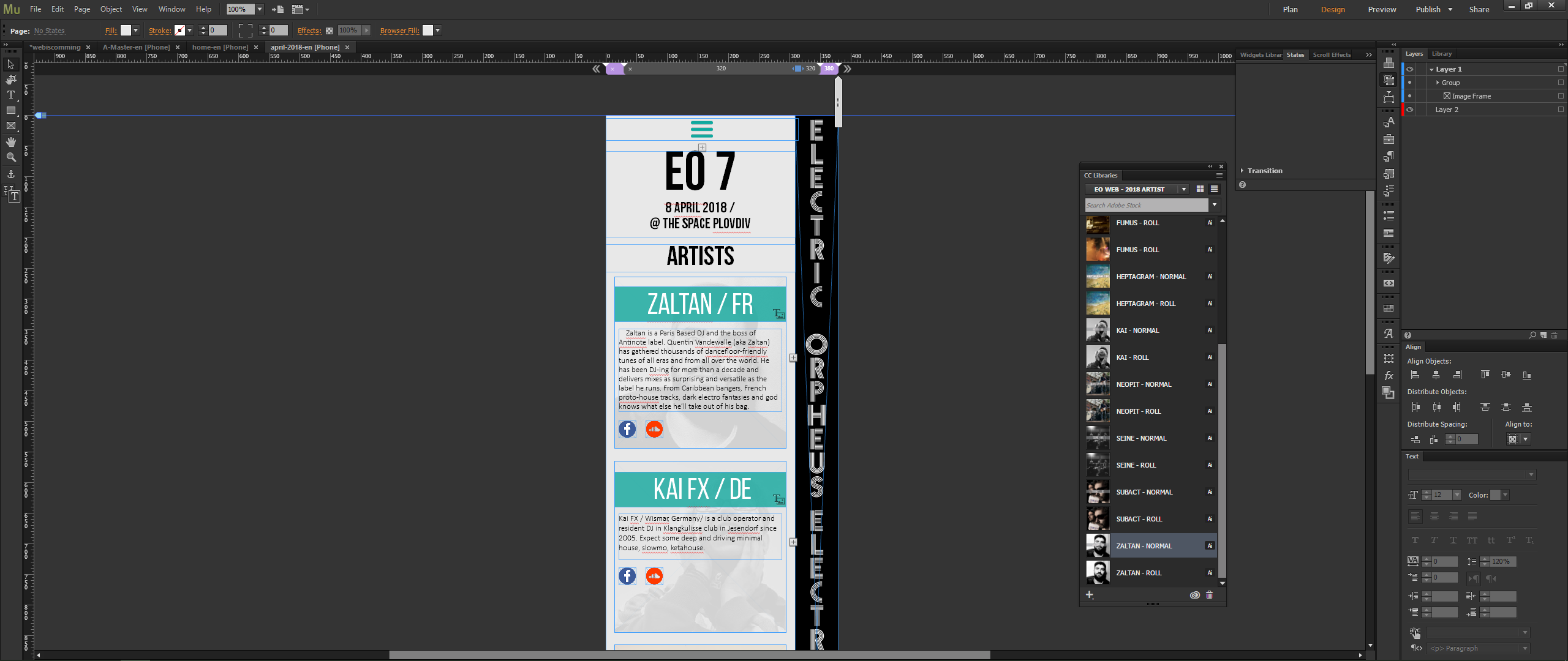
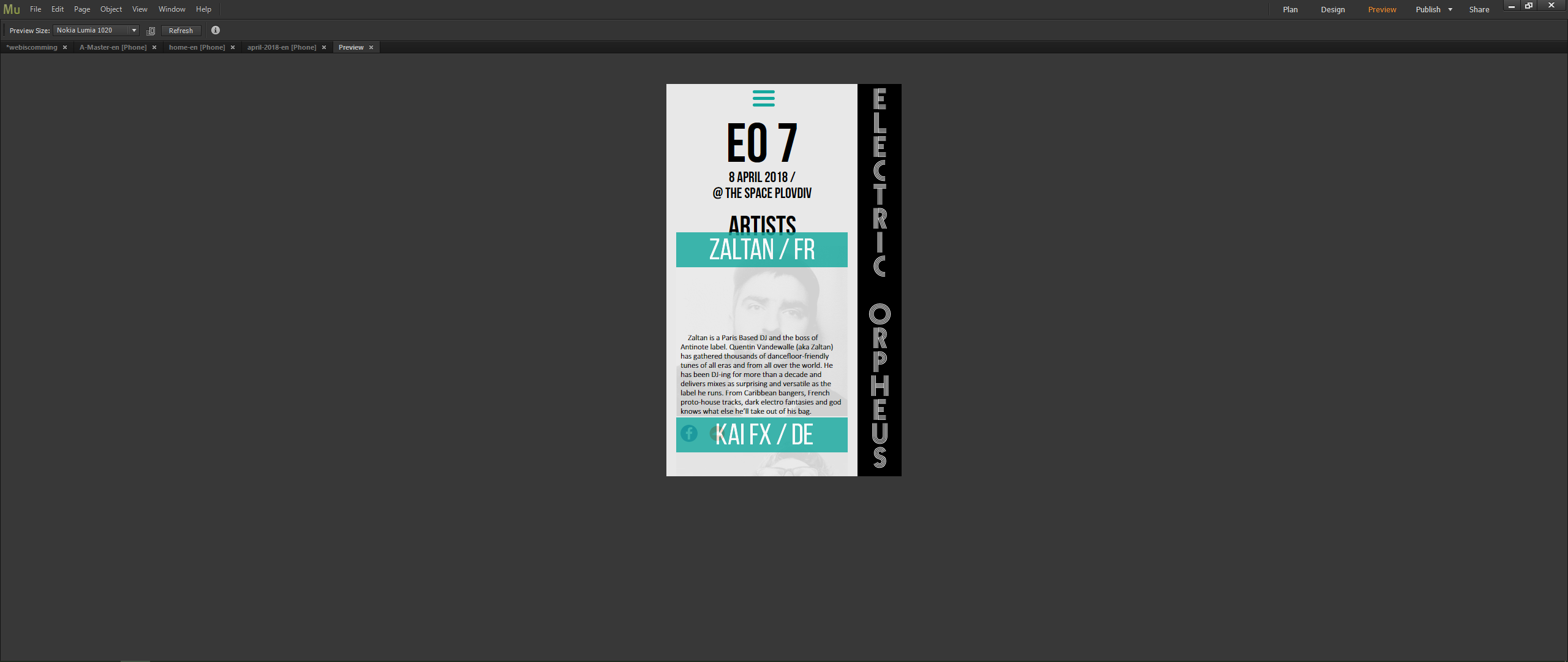
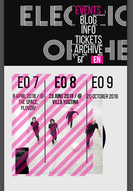
Long story short on the images below you can clearly see where the problem is. The content from those "galleries" I have created seems to fly away between different mo0bile devices. I have used only web fonts and I have also made the galleries not to resize and pinned them to the middle of the page. Please contact me as time is running really short and Muse is making it a bit frustrating sometimes for simple tasks to be done.
Here is the address: www.electricorpheus.com
Thanks in advance !


 1 Correct answer

Only one of your problems might be, that you used responsive AND adaptive design for your website.
I cannot reproduce your screenshots. Where can we have a look at?
If you use adaptive design, you should stick with fixed width, in my experience.
Sometimes, I know, we want to have both worlds but then you should strictly avoid that your desktop version and tablet version go smaller than 768. And then you should stick on mobile with on width only. By default it is 380, I recommend 320.
Maybe this is n
...
 1
Reply
1
1
Reply
1
Copy link to clipboard
Copied
Only one of your problems might be, that you used responsive AND adaptive design for your website.
I cannot reproduce your screenshots. Where can we have a look at?
If you use adaptive design, you should stick with fixed width, in my experience.
Sometimes, I know, we want to have both worlds but then you should strictly avoid that your desktop version and tablet version go smaller than 768. And then you should stick on mobile with on width only. By default it is 380, I recommend 320.
Maybe this is not a must as MAYBE the viewport shows automatically the right design for each 380 and 320?
This should not be possible – this is your desktop approach when one shrinks the browser window:
Your original question though might be answered by: Text should be set to responsive width on mobiles.
But before there´s a lot more to do, I guess.
BTW, it is not nice to put pressure on us
Best Regards,
Uwe
 AdChoices