 Adobe Community
Breakpoint/ responsive issue

Copy link to clipboard
Copied
Terribly sorry if this has come up before but I'm having a rather frustrating issue with a site of mine.
When resizing the browser on a desktop browser everything appears to change responsively as expected but on mobile (tested on galaxy S7 and iPhone 7) it still shows the site at it's desktop break point. Please could you have a look to see what I'm doing wrong/ what needs to be done.
There's also a very odd issue where the font seems to render in a simulated version in bold... I don't want this to happen but can't for the life of me find out how to prevent this. I'm wondering whether I need to start from scratch but that'd be quite annoying.
Here's the .muse file if necessary. I'd really appreciate some help. Many thanks.
APG.


 9
Replies
9
9
Replies
9

Copy link to clipboard
Copied
Hi Andy,
I had a look at your site, and it is definitely not responsive. I suggest your going through the tutorial on responsive design and then trying to understand where you issue lies. It shouldn't take you more than a couple of hours.
Create a responsive web page |
Thanks,
Preran

Copy link to clipboard
Copied
Hi APG,
This is happening because your site has been embedded in a frameset.

You just need to contact your host and ask them to remove the site from the frameset, and then it should work fine.
Regards,
Ankush
Copy link to clipboard
Copied
Hi there,
This is a domain forwarder from grimshawmusic.com to http://onlyjoe.co.uk/andy/index.html
Can a responsive muse site work via a domain forwarder?

Copy link to clipboard
Copied
- Choose a wider breakpoint for mobile devices. What you have now, is a responsive breakpoint at 320 px and a minimal page width of 318 px. That means: You have exactly an area of 2(!) px, where your page can react responsively.
- Move all these „MuseResources" widget on layout and master page to the left side out of the page area.
- Your hamburger menu bleeds outside the breakpoint width:
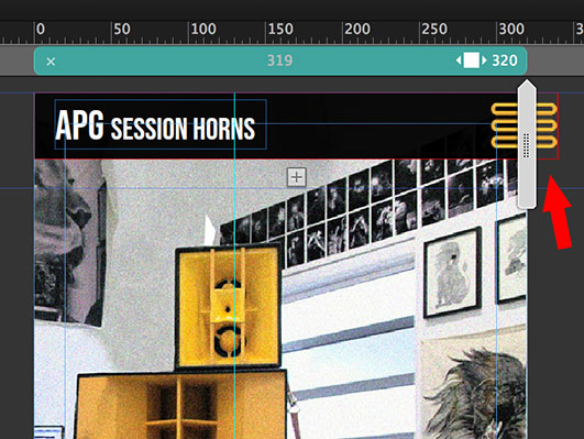
First open the accordion, reduce the width of the menu, and then reduce the width of the accordion to max 320 px, so that is is placed completely within the breakpoint boundaries.
Copy link to clipboard
Copied
Hi Günter,
Thanks for that. That seems to have helped for the most part.
I've stripped down the site / started building again to try and eliminate these issues.
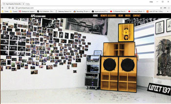
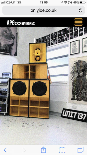
Everything appears to be working fine when resizing a desktop browser:
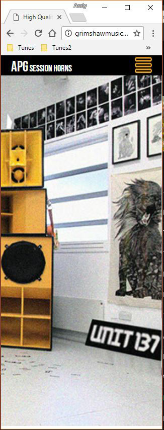
However on mobile it still shows like this:
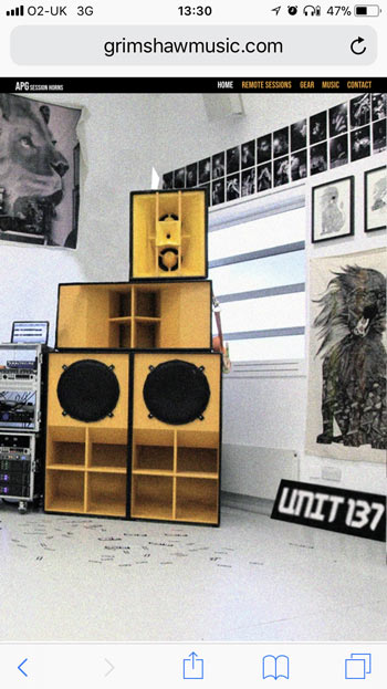
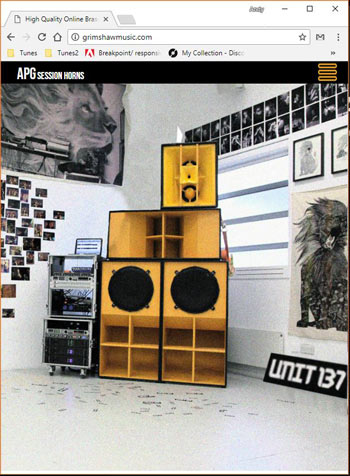
Interestingly, (below) if I view directly at the source of the site, http://onlyjoe.co.uk/andy/index.html on a mobile (i.e. not a domain forwarder from grimshawmusic.com), it displays as expected. Has anyone experienced this before and if so, what on earth do I need to do to rectify it?
Is it to do with the frameset tag Ankush mentioned? I spoke with my host, fasthosts yesterday and they seemed oblivious to the fact that this frames tag could affect my site. Is it a muse thing or a host thing?
This does seem rather odd considering it's working when resizing a desktop browser no?
In an ideal world, I'd have a number of domains pointing to the one source url but this doesn't seem viable at the moment.
Here's the new .muse if you need it.
Any help would be much appreciated. This is becoming a bit of a saga.
Thanks,
APG
Copy link to clipboard
Copied
Hey APG,
Exactly once you ask your host to point your site to the actual domain without forwarding it to a frameset, everything will go fine.
This is the host-based thing and they would know how to remove the site from a frameset.
I suggest you reach out to them and ask for same which could resolve your issue.
Regards,
Ankush
Copy link to clipboard
Copied
Thanks very much for your help Ankush. Much appreciate. At least we've actually established that it wasn't an issue with my site.
The frustrating thing is that on a desktop browser, everything works fine on both domains which says to me that it should be a simple fix. It just doesn't work in mobile.
However, my hosts (fasthosts) are refusing to help unfortunately. Do you suppose there's a simple way for me to get the information across to the succinctly?
I'm really having trouble with their customer service and trying to explain to them what seems to be a simple issue. Here's my most recent correspondence received from them.

Thanks again,
APG
Copy link to clipboard
Copied
I am out of answers now, however, the best option I think now is switching the host, as these minor settings should be easily carried out by them.
we don't have a fixed document on it as every host might operate differently and so are their settings.
Until now whenever we got such issue they were easily fixed by the respective hosts.
You may also ask them instead of putting your site http://onlyjoe.co.uk/andy/index.html in a frameset, they can simply point/redirect to your primary domain.
Hope this time they should be able to help!
Regards,
Ankush

Copy link to clipboard
Copied
I had the same issue!
Muse does not allow your site to work with a forwarder.
I think it's because they want you to buy their hosting. Using a forwarder gets around using their free hosting but with your own domain name. Adobe doesn't want that!
You'll need to host it properly somewhere. I did this and it's all sorted now.
 AdChoices