 Adobe Community
- Home
- Muse (read-only)
- Discussions
- Breakpoints and width problems i guess
- Breakpoints and width problems i guess

Copy link to clipboard
Copied
Hello guys, i have a problem wiht the phone optimalizing, but first i have to tell u im rly new user in muse and my english is not the best.
So lets see, i think i have a problem with the breakpoints, im not sure cuz what i learned i learn in videos with my english..
Im not sure what is the problem i just betting now. https://data.hu/get/10511634/Website-4.muse Here is my file, is all on my language.
So when i open my page on phone first problem is the size and then the backimage. I dont understand why the image at the back is moving and zooming?! Then why is so wide? not just the phone size may i gave a bad details for the page width ?
Thanks for ur answers and helps !


 1 Correct answer

Please tell us, which button(s) we have to press, if we want to download the file! 
Nobody wants to sign up for a newspaper subscription, or something like that!
 14
Replies
14
14
Replies
14
Copy link to clipboard
Copied
Please tell us, which button(s) we have to press, if we want to download the file! 
Nobody wants to sign up for a newspaper subscription, or something like that!
Copy link to clipboard
Copied
sure, here we go: https://drive.google.com/open?id=0BxO7Kmk25l2WN2VfWDFxaUZZdkk

Copy link to clipboard
Copied
From my point of view you should decide first, if you want to create an adaptive website with desktop, tablet, phone layout or responsive layout.
Although one can mix these two, it should be done only with fixed width breakpoints.
And, even worse  , you mixed it up totally, because your desktop layout is already down to 320 px. you would not need an alternative layout anymore.
I highly recommend this thread to you:
Muse not redirecting to tablet version
You should follow these rules. The following (let´s call it "chi chi") could be done later.
1) So I would start to delete the phone layout and start from scratch with your "sitemap" in plan mode.
2) one page in one breakpoint, your widest breakpoint, you already got the idea of master, I see
3) then add breakpoints step by step and in between we can help you all the way until you are finished.
Hope this helps
Uwe
Copy link to clipboard
Copied
Yes, fotoroeder is completely right! You site is so mixed up, that you should begin step by step. One more crucial problem: You are using system fonts, which have to be converted to images in the web. This causes huge problems on responsive pages. Please, use standard fonts or web fonts. A glance into Muse’s font menu will explain the difference. The categories all have an initial description.
My recommendation: Try creating a fixed width site first, before you dive into responsiveness.
Copy link to clipboard
Copied
Hi davidj25311139,
I gave some more realized suggestions (yes Günter Heißenbüttel, fonts are another issue – I didn`t had in mind that they, behaving as pictures, cause further issues ) into this: SUMMER of GAMERS LanInfoSUMMER of GAMERS Lan ,
deleted content ( I left some work for you  ), set the fonts for web (which you should change of course "Add Webfonts").
I put most of the work to your master. I hope you get the message and the idea behind.
Uwe
Copy link to clipboard
Copied
Why i should not use the phone layout ?
U mean u have to decide between phone layout and normal page breakpoints? if yes i would stay next to phone layout
Copy link to clipboard
Copied
davidj25311139 schrieb
For the webfont i can say, i used png. Tonight when i will arrive at home im going to check all ur suggestions and try to do these all:D thanks everyone (if i done i will let u know the result
You are here in a really great forum, believe me. Your font is not png at all, otherwise I would have not been able to change this font into "Freight Sans Pro Light".
Because you already layouted for mobile in your responsive design. If you want to use different content on mobile, you should either change this in breakpoint from 768 with fluid width breakpoints towards 320 or stop your desktop layout at 768 with fixed width breakpoint and create an alternative, yet, phone layout. Both would not be possible.
Where from should Muse or even the browser know, which layout to show, when you use two different layouts from 768 towards 320.
What you can do now: tell us what you want to achieve for each device. For now I don`t see a reason to not use a responsive layout.
It is good practice, referring to Pavel Homeriki, as shown in the thread from above, not to mix fluid width breakpoints with alternative layouts.
And because of this, if you anyway should use fixed width breakpoints, you can stay with responsive for the whole site.
Does this make sense?
Did you have a look to your modified muse-suggestion?
Uwe
Copy link to clipboard
Copied
im looking it now, yeah i realised later i said stupid thing sorry  , yes this forum is rly great with very good mates, im so glad for ur help
now i will delete the mobile layer, and i will build to ur seggestion, im going to start now
Copy link to clipboard
Copied
Go for it  .
.
Copy link to clipboard
Copied
Okay i got some original problems thats why i started to do the phone layout. I know is not the best way how i can show you but i should not take any long time with this.
http://www.kepfeltoltes.eu/view.php?filename=453IMG_0252.jpg
http://www.kepfeltoltes.eu/view.php?filename=868IMG_0251.jpg
Copy link to clipboard
Copied
What kind of links do you provide? I don`t know what to do with this.
Couldn`t you do screenshots?
Copy link to clipboard
Copied
with mobile it was faster and easier:D but now i just saw ur gift under of 765
(idn why is not opening the links)
Copy link to clipboard
Copied
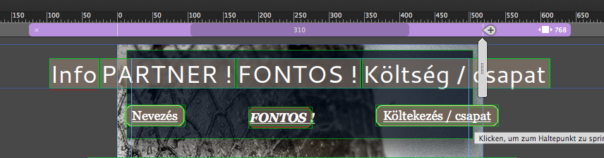
"From 767 / 768 you should change your menu into a mobile menu, I guess."
So if i press this breakpoint i can work just on this one ? -> pic added
edited: now the phone version is fine, but what with 1024-1280?:o
link for pic:
http://www.kepfeltoltes.eu/images/hdd1/2017/05/17/163asdfasdf.jpg

Copy link to clipboard
Copied
(This reply by fotoroederby mistake went in other thread), Please refer the below response)
Watch my …-suggestion file on its master. You have to move each element on each breakpoint to the place, where it should be until you hit the next breakpoint.
In this screenshot: the top one – the menu bar is inside these two thin blue lines inside – the outside lines are the
browsers edges, which you can follow in my second screenshot – if you reduce your browser you can easily realize where it "jumps" to the next layout on its second breakpoint.
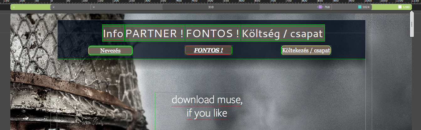
Most people like it, to have this menu background stretched to browser width to avoid these empty spaces between two breakpoints.
In your case, from my taste this is not necessary, your background image/browser fill is strong enough to keep it together, if you know what I mean.
If you now move the scrubber, nothing should ever leave the canvas, so you have to move and resize this menu background an everything in it, so it stays again in between these two blue lines – still there´s no pinning necessary ( for now - maybe later )

So now at the next breakpoint you must again decide whether to stretch the menu background to browser width what I suggest,
or keep this little space and set this rectangle to "resize to browser width:
but you realize, that you have to decide as well how to treat the menu – some people now hide this menu in breakpoint and replace it by a hamburger menu or, at least, with the wording "MENU" or some graphic element which lets users think, MENU-click me please.
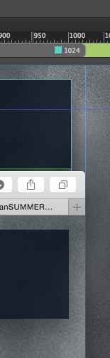
I uploaded again ( same name 😞 SUMMER of GAMERS LanInfoSUMMER of GAMERS Lan
Follow the master and check.
Uwe
 AdChoices