 Adobe Community

Copy link to clipboard
Copied
Hello, i start to create my website.
And when i'm on my Macbook 13", my website is good but when i take a screen like 30" my website is very small.
How i can adapte my website with different desktop screen's?
Thank you


 1 Correct answer

Yes, I know, I have watched your website. I still like the design approach over all.
If something should be missing in your opinion, either use the same approach as the following pages with the horizontal scrolling of pictures (maybe you find a proper way to show users what to do) or just create another, yet bigger picture gallery.
I would not use breakpoints in your case. It is simply not recommended to mix adaptive design with responsive design.
Why not give it a try with a fullscreen or fullwidt
...
 5
Replies
5
5
Replies
5
Copy link to clipboard
Copied
Would you mind to share a link with us so we could have a look?
How did you set up your website? Adaptive? Responsive?
Your website appears normally in respect to your design. So if you designed on 13" and everything fits in 13" the website shows 13", even on big screens  .
.
Best Regards,
Uwe
Copy link to clipboard
Copied
Yeah i have make my website in 13" but when i want make it in 15" by exemple, when i open my website on my 13" my website is too big for my screen.
I think i don't have active a setup but which?
My website: http://pierre-savadoux.com
Thank you
Copy link to clipboard
Copied
Hi Vannire ,
you my struggle with the fact that galleries are not fluid responsive yet. You must add breakpoints to design your needs to big screens and small screens.
As far as I can see everything is OK with the adaptive design.
Maybe you should pin your social media buttons as well on the landing page to the left:

I like your design, though  . If you want it bigger on your landing page, the only opportunity for your adaptive design would be to stretch the slideshow to browser width, if you want it to have a white border around, create one. Even more easy, set your pictures with a white frame in PS, so you have more control of what people can see from your pictures of milky way and Thailand and so on.
All other pages are scrollable sideways, aren`t they? This is unusual but interesting and looks great so far.
If you want some more content in height, you could add some text as a design element? Huge Bold Letters which describe page content.
Best Regards,
Uwe
Copy link to clipboard
Copied
Thanks for you answer, i go try to put breakpoint and try put responsive too.
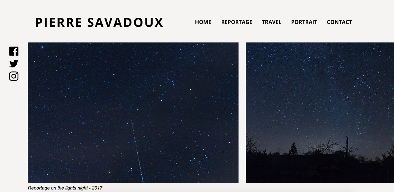
This how i see my website
Copy link to clipboard
Copied
Yes, I know, I have watched your website. I still like the design approach over all.
If something should be missing in your opinion, either use the same approach as the following pages with the horizontal scrolling of pictures (maybe you find a proper way to show users what to do) or just create another, yet bigger picture gallery.
I would not use breakpoints in your case. It is simply not recommended to mix adaptive design with responsive design.
Why not give it a try with a fullscreen or fullwidth slide show? This way you could just leave everything as it is, just change the gallery on the landing page.
Best Regards,
Uwe
 AdChoices