 Adobe Community

Copy link to clipboard
Copied
Any help with the following will be greatly appreciated. Thanks.
Issues include:
1. Resizing elements on smaller breakpoints affect or corrupt elements in other breakpoints.
My site has breakpoints at 1800, 1300, 960, 768. When a breakpoint is added for mobile, whether fluid or fixed, everything goes sideways.
2. Resizing type on smaller breakpoints with the single “T” tool selected randomly affects text boxes on other breakpoints. The only workaround I have found is a “perfect build” from scratch for each breakpoint, format once, no copy edits. No widgets except SEO.
3. Resizing or moving elements to fit on the mobile breakpoint is randomly moving elements on other breakpoints.
4. Hyperlink in menu will not link to another site page.
5. The “slosh” area on the left and right of the mobile view randomly shows a sliver of the slideshow which is at the top of the page. My workaround is to add a”bleed” on all the container boxes. I don’t know if this causes other issues.
6. Font missing/corruption on FTP transfer
7. Unable to view mobile version on iPhone “404 Not Found” error. Same for iPad
9. Added mobile breakpoint and tried to upload file changes and encountered multiple errors. Missing PHP files and PHP Muse errors on file transfer to webhost. Started over with new file with same name, uploaded changed files. Does not resolve issue. Started over with new file/name. Deleted all files out of the root and re-uploaded. Does not resolve issue. Error message does not identify what PHP elements are missing.
Buggy Widgets:
1. Right click disabler Mulib freezes vertical scroll, crashes Muse on preview.
2. Pop-ups Pro corrupts slideshow. This is unfortunate because I think it is the best option for design freedom and flexibility. After the Pop-up Pro elements are deleted, the slideshow does not revert, it is still corrupted. I can’t find a fix for the slideshow without going back to a previously saved version.
3.QooQee’s skill counter advertises a round option with a stroke. Once the stroke is applied the circle dimensions are uneven. This cannot be overriden by typing in dimensions in the H and W option in the Muse menu header. Duplicating the widget: each additional instance has a larger variance in pixels; width vs height so it is impossible to achieve a perfect circle.
4. reCAPTCHA causes unpredictable rendering of elements.


 1 Correct answer

You did a lot perfect and some others not.
1) your hero is set to not resize, and so with the fixed width breakpoint it leaves the canvas as soon as you use the scrubber: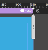
Set it to stretch to browser width on all breakpoints and this will work. The same to "Solution" at 768.
2) With your fixed width breakpoints nothing (and no text) must be pinned in your case.
3) Your breakpoint at 420 should be set to minimum width at 320. 420 will not work on some devices.
and finally
4) your fixed width breakpoint
...
 15
Replies
15
15
Replies
15
Copy link to clipboard
Copied
1 to 5 seems like a layout issue.
For 99%, when hyperlinks are not "working" some other elements overlap this menu item.
6, 7 and 9 needs some investigation.
Buggy widgets: Ask muse.themes.com and qooqee, what they think about their own widgets.
Muse-themes has a warning for some of their widgets not to mix them with widgets from other vendors.
It is not recommended anyway to mix 3rd party widgets.
But without a link w could hardly help.
Best Regards,
Uwe
Copy link to clipboard
Copied
Thanks, please see other response with link.
Copy link to clipboard
Copied
Maybe we can help but with what? My first post was just guessing, reading your issues I assumed that 1 to 5 looks like a layout issue.
As long as we don`t see any link or screenshots or maybe later, a .muse what should we say?
In my first post I asked for a link, is it confidential that much?
If you provide a .muse please follow these rules, as we are not willing to create complete websites but are willing to help step by step.
Please Provide a .muse File to Help Us Fixing Your Issue!
InDesign screenshots do not help as we work with muse, this is by far very different from Indesign.
Best Regards,
Uwe

Copy link to clipboard
Copied
10 posts and not even a chance to enable us to help!
Give us clear, small example .muse files to demonstrate your issues. If not, it seems to be pointless to follow this thread further.

Copy link to clipboard
Copied
I too am beginning to think Muse is not my responsive solution. I am spending way too much time on projects fire-fighting the bugs, crashes and weird behaviours.
My muse projects are taking me 2-3 times as long as my older 'fixed width' program. I'm not even trying to do anything complicated, nor am I using widgets and third-party widgets.
Muse is really testing my patience. Does anybody have experience with other WYSIWYG programs?

Copy link to clipboard
Copied
Apologize for your frustration. Please wait a bit until the next update is announced in which the team has fixed most issues with the previous update.
Thanks,
Preran

Copy link to clipboard
Copied
Hi Preran,
Any exact date for latest update?
Thanks

Copy link to clipboard
Copied
Can you please tell us WHEN we can expect an update? "Soon" is not an answer.
Preran, I understand this is not a problem you created, but your superiors are asking you to clean up their mess. Please pass along to them that the way the whole update to Muse was completely bungled would be embarassing to me if I were an Adobe designer, engineer, or executive. As a long standing paying customer of Adobe, I expect to be treated better than this. At the very least, Adobe's Public Relations staff needs some changes.
Copy link to clipboard
Copied
The update is now live. Did you get a chance to try it? Let me know.
I apologize for the delayed response. i am at the Adobe MAX conference, and will be more regular with my presence here from next week.
If you continue to have issues with the latest update, send me a private message. Click my picture and use the Message button.
Thanks,
Preran
Copy link to clipboard
Copied
Thanks for responding. Yes, I updated Muse which didn’t seem to help any issues but I have not rebuilt the file. Here’s some additional input.
1-3. Unsure what a “layout issue” means. Please clarify. Also, I‘ve been using wow.js fade-ins. Could it be a possible conflict? To be specific: non-resizing pinned visual elements skew. Type rebreaks on smaller breakpoints affect larger breakpoints.
4. Fixed hyperllink. Thx!
5. I saw a different post and fixed the sideways “slosh” by making the content boxes the exact width of the browser. Going outside the breakpoint width was a work-around fix for another issue; a flash of a slideshow image from the top of the page when scrolling past content sections on an iPad. It worked but resulted in the slosh issue. The slideshow is set at “size to browser width” and not pinned. The slideshow also shows under the footer which doesn’t stay fixed at the bottom of the site.
6-9. Font issue fixed by logging out and back into Adobe Cloud. But still have issues with missing files: Some files are missing or incorrect. Clear browser cache and try it again. If the problem persists, please contact website author. #404 Clearing the cache doesn’t help.
10. New issue-hamburger menu only works correctly on 1 breakpoint. Using embedded html <i class=”fa fa-navicon”></i>
I did contact the widget providers. No response. It’s the wild west!
Please see this link:
https://indd.adobe.com/view/af4a5310-62e0-482b-a9da-63281b2ef018
I appreciate the help:)

Copy link to clipboard
Copied
I use wow.js animations in some of my demo sites and have not come across any conflicts yet... I have about 30 pages of them and 5 of those are on the new 2018 muse build if thats any help

Copy link to clipboard
Copied
Hello Graham,
I think Muse is a disaster. 'Trying my patience' would be an understatement. As an experienced pro with InDesign I thought this was the way to go for responsive sites. These are hailed as a shortcut for designers, but so far whole chunks of my life have been stolen without any worthwhile result. I could have designed a dozen fixed sites in the time it has taken me to achieve absolutely nothing in Muse. Save time? They must be joking. We are all told we need responsive sites, but in my experience it's just an exercise in designing a site, and then see how many steps you can destroy it in.
I have reverted back to my previous software for site design, Freeway. I think it is only for Macs, but I could be wrong. So far I have made far more progress than with Muse, but it is still difficult. The hardest thing to try to keep in your head, is that your end user will see only one version of your site, which you hope will fit their device or desktop, whereas you and I are looking at potentially dozens of them. It's a confusing nightmare for sure but I wish you well in your search.
Copy link to clipboard
Copied
Copy link to clipboard
Copied
And now tell us exactly, where, „resizing elements on smaller breakpoints affect or corrupt elements in other breakpoints.“ as you have written.
Copy link to clipboard
Copied
You did a lot perfect and some others not.
1) your hero is set to not resize, and so with the fixed width breakpoint it leaves the canvas as soon as you use the scrubber:
Set it to stretch to browser width on all breakpoints and this will work. The same to "Solution" at 768.
2) With your fixed width breakpoints nothing (and no text) must be pinned in your case.
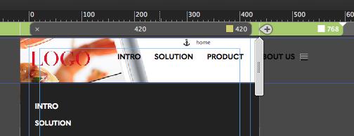
3) Your breakpoint at 420 should be set to minimum width at 320. 420 will not work on some devices.
and finally
4) your fixed width breakpoint at 768 should be set to fluid width instead of fixed width or you have to change your layout so nothing leaves the canvas:
I understand you want to keep with this scroll motion, but not all devices show those scroll motions as intended.
So in your case I recommend to change to no scroll motion from 768 towards the minimum width of 320.
Your two column approach might be changed to a one column layout – this makes it much easier to handle text and images.
Of course you could also stay with fixed width breakpoint and take care that everything fits into 320 minimum width and it should be ok as well.
Let´s see, …
Best Regards,
Uwe
 AdChoices