 Adobe Community

Copy link to clipboard
Copied
Hello!
I'm trying to create a site that will look good on most devices with as few breakpoints as possible.
As I have trouble with objects being unpredictable in fluid breakpoints, I followed a suggestion from a comments section somewhere, as I've been scouring the internet for something to help me with this.
3 fixed breakpoints:
480 - Portrait Phones
768 - Portrait tablets and landscape phones
1400 - desktops and laptops
This sounded almost too good to be true, as I've been struggling with trying to juggle 8 or so breakpoints in previous attempts and it's WAY too much to handle.
I made a page to test and it looked and behaved as I predicted it would on my computer, but when I uploaded to business catalyst and took a look on my iphone 6, ipad mini and iphone5, things are weird and I can't figure it out.
The main image doesn't seem to change to the tablet or mobile version, or is just missing, and there are some white gaps..
here's the link: Home
Let me know if there's anything else you need!
Hope someone out there can help me!
Thanks in advance 
Kelsey


 1 Correct answer

You struggle with your fixed width breakpoints? Watch this file: Adobe Creative Cloud
This is a screenshot, how I understood your post:
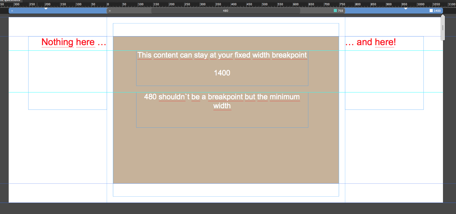
It is recommended to use breakpoints not for special devices but for your design purposes.
You see, that between 1400 and 768 there´s a big space, which should not be filled with content, except it is set to stretch to browser width, which you didn`t set up like this.
Using the scrubber and watching the guides may help you in better understanding of fixed width br
...
 4
Replies
4
4
Replies
4
Copy link to clipboard
Copied
You struggle with your fixed width breakpoints? Watch this file: Adobe Creative Cloud
This is a screenshot, how I understood your post:
It is recommended to use breakpoints not for special devices but for your design purposes.
You see, that between 1400 and 768 there´s a big space, which should not be filled with content, except it is set to stretch to browser width, which you didn`t set up like this.
Using the scrubber and watching the guides may help you in better understanding of fixed width breakpoints and how to use them.
Best Regards,
Uwe
Copy link to clipboard
Copied
Hi
Thank you so much for your reply.
I understand what you are saying but the most confusing part to me is WHY do I only have 768px to work with in my 1400px breakpoint?
If I keep all my content within those guides, then my site is extremely narrow.... unless I add numerous breakpoints and then it all gets way too difficult to maintain.
I haven't been able to find any information explaining why this works this way... And even watched a video of the Muse product manager trying to explain it and getting confused by the exact same thing.
My site is actually looking pretty good now after tweaking some little things, re-publishing and re-freshing.
So far the way I have it set up right now has given the best results on all devices I've checked. My design looks good and functions well
My macbook
ipad mini
iphone 6
iphone 4
samsung SH
Nothing is being cut off from not remaining within those guides, though I am keeping the most important info within them to be safe.
If I follow your recommendation, then I'll either have a very skinny website with a lot of extra space on the side, or have a whole bunch of breakpoints to maintain.
Is there any reason you can give me why this would be a bad idea to proceed with?
Thank you!!!
Copy link to clipboard
Copied
kelseyholden schrieb
I understand what you are saying but the most confusing part to me is WHY do I only have 768px to work with in my 1400px breakpoint?
You can add breakpoints between 1400 and 768, of course.
Quite common sense is it to use 1200, 960, 768 but try to think not too much on this numbers but on your design and when it starts to fail. With your fixed width breakpoints though, you can keep with these numbers and you are on a save side.
Normally you start with the highest resolution like 1200 fixed width, this will end in a layout with 1400 and the minimum width of 1200.
Now you place your element as desired. Keeping an eye on tablets you add a breakpoint at 960 and realize, that now the minimum width has changed to 960 while the first "real" breakpoint appears at 1200. You rearrange/resize the elements as desired inside the guides of this 960 minimum width, of course.
Now watching out for mobiles you add a breakpoint at 768, still fixed width, rearrange/resize like you did in 960. Now in between the guides of 768. Now it is recommended to add a breakpoint with fluid width at 768 as well – now you have to add the minimum width by yourself – most people use 320. You don`t need another breakpoint at 320 as there are no smaller devices than 320.
Most important when adding breakpoints: finish your design as completely as possible at the current breakpoint before you add a new breakpoint.
Feel free to watch the screencast (THX to Pavel Homeriki,  )
)
Best Regards,
Uwe

Copy link to clipboard
Copied
Sorry for jumping on the thread but I’m also confused about breakpoint in fact they drive me crazy!
can someone post a guide to what should be fixed and what should be fluid
 AdChoices