 Adobe Community

Copy link to clipboard
Copied
I have converted my own old site is to responsive. It works fine, but in the head in the program there is still the three buttons for desktop, tablet and phone. Can I just let it be or should I do something?
The adress is


 1 Correct answer

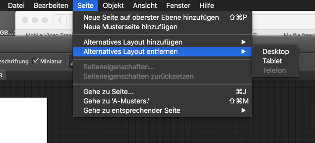
If you have converted your desktop layout to responsive, it will be shown on desktop. Tablets and phone will use „their“ layout, if available.
So, if you have a working responsive site based on your ddesktop layout, you may delete the other ones.
 6
Replies
6
6
Replies
6
Copy link to clipboard
Copied
If you have converted your desktop layout to responsive, it will be shown on desktop. Tablets and phone will use „their“ layout, if available.
So, if you have a working responsive site based on your ddesktop layout, you may delete the other ones.
Copy link to clipboard
Copied
Hello and that you for the answer.
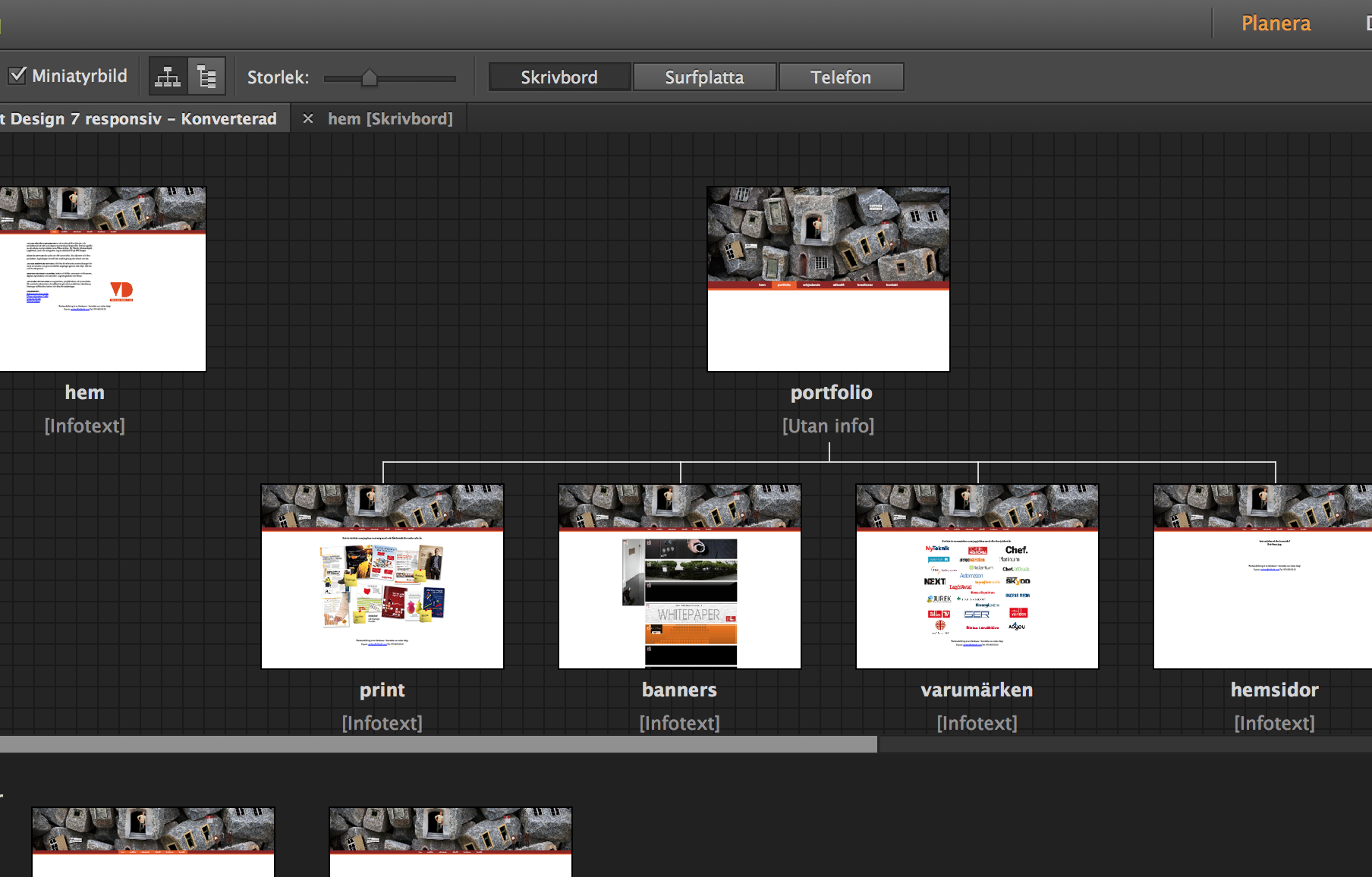
This is how it looks. When I go in to one of the pages it looks as it should with just "one" layout. In this window I have (swedish) Desktop, Tablet and Phone. If I go in to Tablet or Phone I get there layouts. Does that disturb the site? How can I delete them? Or can I convert the site so they disappear? Or should I do the site all over again? Well – the site is working as it is now.

Copy link to clipboard
Copied
Uwe
Copy link to clipboard
Copied
Save your file as a backup, just in case you need any elements in your responsive site.
Uwe
Copy link to clipboard
Copied
It sound almost too easy to be true, but I go for it.
Thanks a lot.
Copy link to clipboard
Copied
Please do so  . BackUpBackUpBackUp
Uwe
 AdChoices