 Adobe Community
- Home
- Muse (read-only)
- Discussions
- Re: Display Submenu to the left of Menu in Accordi...
- Re: Display Submenu to the left of Menu in Accordi...

Copy link to clipboard
Copied
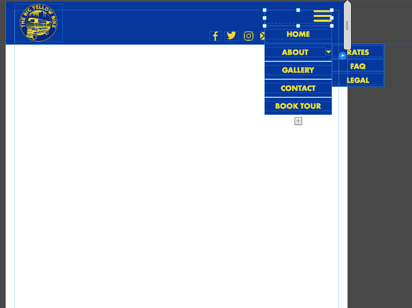
I am making a responsive website, and I have breakpoints in place for mobile devices that have an accordion tab/hamburger menu versus the horizontal menu displayed on the desktop version. I need the submenu pages to display to the left of the menu, but it keeps populating on the right (which ends up out of the browser). I can move it by changing the x value, but when I close the accordion menu and reopen it always moves back to the right. I'm guessing this is due to the states because I cannot seem to isolate that part of the menu in the active state for the accordion. I hope that makes sense! I just want to be able to access the submenu on mobile devices without it running off the browser.
Here is what is happening:
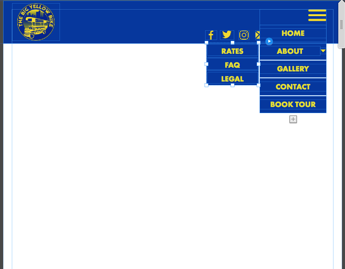
Here is what I want to happen, but disappears and goes back to previous picture.


 1 Correct answer

Again the question: Why not using a standard menu and configure it this way. The only thing, you will miss, is the cool "slide out“ effect.
But if you love eye candy more than streamlined functionality … 
Look at this screencast:
Here you find the corresponding .muse file: https://www.dropbox.com/s/izwo6yduudu4bnx/Left-side-menu.muse?dl=0
Try to figure out, how it is done.
One important hint: You should try to place the submenus to the left side after you have done all other customisations, because
...
 12
Replies
12
12
Replies
12
Copy link to clipboard
Copied
Yes, this is a glitch.
But why do you need this accordion? Is it only because of this sliding eye candy, when opening?
If you simply use a manual menu, you can place the submenus to the left. This should be done, after having done all styling, because otherwise the submenu container tends to snap back to the right side. But, nevertheless, once set up, the submenu container remains in its correct place.
Copy link to clipboard
Copied
I have the accordion menu only set at breakpoints for mobile devices. If I don't have the accordion, the menu buttons overlap the logo on the right. If I could make the submenu populate below the menu, or menu item, that would work too. I just need it to display inside of the browser. Most of the users will be accessing via cellphone or desktop.
Copy link to clipboard
Copied
Getting the vibe that this is a known thing and theres nothing I can do about it?
Copy link to clipboard
Copied
Again the question: Why not using a standard menu and configure it this way. The only thing, you will miss, is the cool "slide out“ effect.
But if you love eye candy more than streamlined functionality … 
Look at this screencast:
Here you find the corresponding .muse file: https://www.dropbox.com/s/izwo6yduudu4bnx/Left-side-menu.muse?dl=0
Try to figure out, how it is done.
One important hint: You should try to place the submenus to the left side after you have done all other customisations, because some settings cause the submenus to snap back to the right, and you have to re-position them again.
Copy link to clipboard
Copied
Gunter I already answered that question about an hour after you asked it the first time and you did not reply. This is for functionality and not for eye candy, it is specifically for mobile device navigation. If you think you have a better way for me to use a standard menu without it overlapping other buttons, links, and navigation in my header (while still being big enough to select with thumbs), then please explain. Otherwise, I am not sure what point you are trying to make. I don't care about the slide out effect, I care about my end users being able to easily navigate our website from their phone so they stop calling me 15x a day.
To be honest, I have an open ticket on another issue that breakpoints are causing with our booking software widget (it disappears at any breakpoint--even if there are no settings or formatting applied, simply just inserting a breakpoint). Adobe tech support cannot seem to figure out the issue, so if you think theres a better way that would avoid breakpoints altogether PLEASE post it here. At this point, these issues are costing us money.
Thank you for the file, that is exactly what I want for mobile. How do you do it? I tried formatting a menu then putting it into the container and it automatically goes back to default formatting when I do. I have tried just about every muse theme menu widget as well.
Copy link to clipboard
Copied
Frankly spoken: I don’t understand a word.
Why do you want to „put it into a container“?
Copy link to clipboard
Copied
because that is how the accordion tabs are set up in muse. that little box under your hamburger button is a container, no?
Copy link to clipboard
Copied
And I don't know what you are not understanding...
Copy link to clipboard
Copied
No, there are no containers at all and no accordion too!
I placed a rectangle spanning the page, to have a header strip like in your screenshot and a simple standard menu, configured in the way, I saw on your screenshot. Both elements have nothing to do with each other.
If you are talking about the first menu entry (yes, it is one!), containing the hamburger icon: This is simply „filled" into the menu item using the „Fill“ command in the upper control strip. You may fill every state of every menu item with different images, if you want.
Copy link to clipboard
Copied
I will have to take a closer look. I watched the video, but I am mobile now, so haven't been able to view the file. How do you configure a normal menu to work this way? I've been searching high and low on Google and Youtube and have not found anything showing how to do this without the accordion.
Copy link to clipboard
Copied
Look at the file later on and ask again! It is THAT simple!
Copy link to clipboard
Copied
Man I feel like a dummy! It really was that easy. I should have you look into my booking software issue, since Adobe can't seem to figure it out!
 AdChoices