 Adobe Community
- Home
- Muse (read-only)
- Discussions
- Re: Everything go left on mobile landscape view
- Re: Everything go left on mobile landscape view
Everything go left on mobile landscape view

Copy link to clipboard
Copied
Hello there
I have an issue with my new designed website using Adobe Muse which I‘m new to it.
Everything works well on desktop & mobile view, but when I change orientation of my iPhone 6s & HTC One S to landscape, everything go a little to left, cause some of my texts & images go beyond view, zooming out also doesn’t fix it. I also searched forum a lot, some people fixed it by removing their unwanted hidden boxes on the right but I never have such thing in my designing page of Muse.
it’s really getting weird please help.
here is my site:
Just view it on landscape orientation of your smartphone & u see the issue.
thx


 19
Replies
19
19
Replies
19
Copy link to clipboard
Copied
Update:
I managed to fix that “shift to left” issue but now I have some other issues, for example some of images are now covered my texts & they are not in their right place just like portrait view.
any tip? Thx

Copy link to clipboard
Copied
FlashPoint1985 schrieb
Update:
I managed to fix that “shift to left” issue but now I have some other issues, for example some of images are now covered my texts & they are not in their right place just like portrait view.
any tip? Thx
Greta, that you fixed the left shift. The other issue may have to do with the latest most current version of muse and the bug, released with it.
Which version do you use? Could you provide a .muse? Please follow this instruction:
Please Provide a .muse File to Help Us Fixing Your Issue!
Best Regards,
Uwe
Copy link to clipboard
Copied
Watching quick, it could be that it could be solved with grouping text and images, but maybe it´s a bug.
Give us some more detail, so we could investigate.
Uwe
Copy link to clipboard
Copied
As I’m new to muse, is “grouping texts & images” same selecting them and for example use pin to page?!
Copy link to clipboard
Copied
Thx for help.
it’s version 2017.0.3.20
Let me clear my current issue again: “landscape view on mobile has many issues such bad position of items.

Copy link to clipboard
Copied
Hi flashpoint1985,
We are unable to access your site.
Can you please recheck the URL and let us know the correct one, so we can have a look at it?
Thanks,
Ankush
Copy link to clipboard
Copied
It needs, the www, means : http://www.mehmoonitv1.ir/ , I found out.
Uwe
Copy link to clipboard
Copied
is my .muse file with all assets useful? If yes I can upload them all sonewhere for u to investigate.
Copy link to clipboard
Copied
Please Provide a .muse File to Help Us Fixing Your Issue!
I guess, we don´t need assets. Try to reduce your issue to one page.
You can share via CC. Watch the above mentioned link.
Best Regards,
Uwe
Copy link to clipboard
Copied
Ok here is my file:
Copy link to clipboard
Copied
Please share via CC or dropbox. Your "4share" likes to install flash and calls for every browser. I don`t want to do that.
Uwe
Copy link to clipboard
Copied
Ok here u r:
Copy link to clipboard
Copied


Copy link to clipboard
Copied
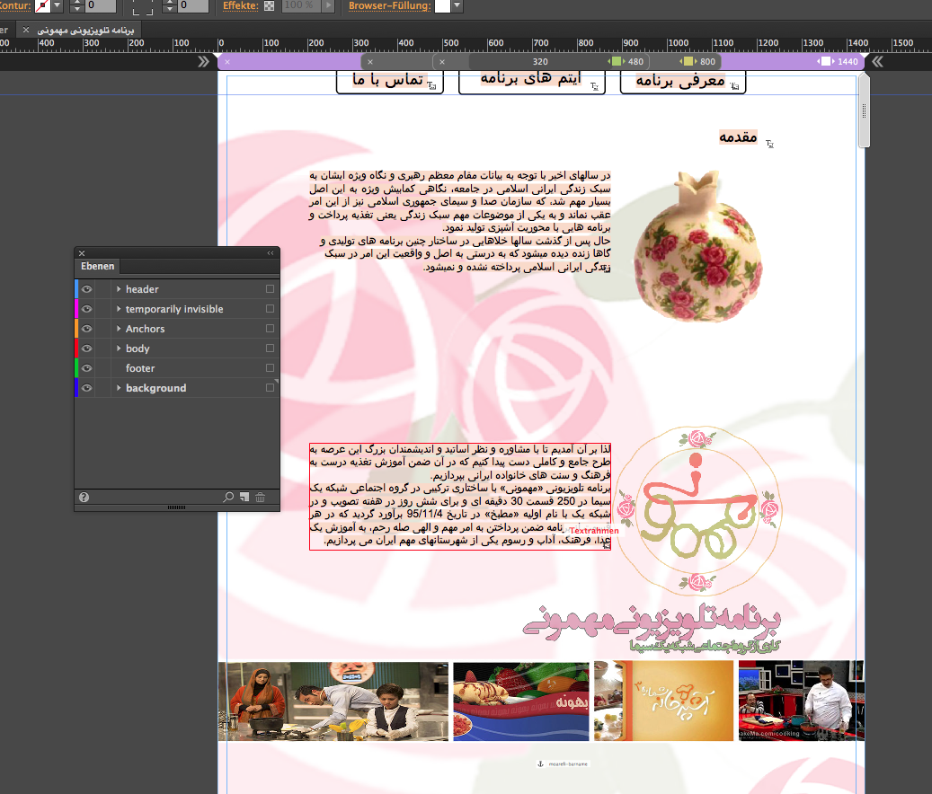
Using the developer tool from Safari I see there´s some layout problem in your mobile design.

Your design forces the mobile browsers to left align, I guess.
Your decision for breakpoint setup is, frankly speaking, interesting:
For at least the mobile breakpoint at 480 you should use a fluid width breakpoint as you already use at 800.
I also recommend to use in your case fluid width breakpoints for 1440 and 1366 as well.
This could lead to less breakpoints, but … take care of pinning:
This object on the right hand side is pinned to the left hand side of a container.
Different elements are placed in different layers, which is in your case difficult to keep track of.
Your elements need some ordering – these two elements are at the very bottom and placed in the header-layer.
This makes maybe necessary grouping quite unpredictable.
I organized a .muse : Your menu buttons are set to "resize - None".
I reduced your site in the way, that I made most elements invisible:
You may have a look at the file I provided here: Adobe Creative Cloud .
Watch, how I changed the menu at 960. You may use a different approach like hamburger menu or the word "menu" in your language.
I also grouped the top three objects, but didn`t group them at 960. You may see the difference and learn from it.
No pinning necessary – very important, I used version 2017.1. Might be a little work for you but give it a try. I don`t see any buggy issues at the moment.
Grouping is not the same as pinning: one of your questions are answered now, too.
Let me know, if you understand, order your element step by step …
Best Regards,
Uwe
Copy link to clipboard
Copied
Thank you so much for time you spent.
I will try your tips step by step & report result.
Copy link to clipboard
Copied
Ok “grouping” was an important feature that I missed & thanks to you, I used it & now no more miss position in my landscape view; but about layers, I sent those ”pomegranates” to header layer, because I wanted to make them overlay on my pinned menus just like this:
2017-09-26 12.04.31
https://www.dropbox.com/s/eutyooat8os2cfj/2017-09-26%2012.04.31.png?dl=0
It gives a nice effect, isn’?! but my current problem is that because of grouping this image & text, which solved my landscape issue, now the text box is also on top & overlays on my menu like this:
2017-09-26 12.05.10
https://www.dropbox.com/s/j40smh0cgtnurnn/2017-09-26%2012.05.10.png?dl=0
and as u see it doesn’t provide a nice effect.
so how can I only overlay image while keep image & text both in one group?!
thx
Copy link to clipboard
Copied
Watching the second link, I suggest to use the master for this.
Place your menu on master on the top layer. Don`t put anything in this top layer (I would call it "head" or "header") on any page except on master and only if you want to achieve that all content scrolls below/under the header.
If you want to improve readability, give this header a color fill or image fill or what ever you want.
If you need some more help, let me know
Uwe
Copy link to clipboard
Copied
Thanks for reply but if I even put pinned menu to master page, still I can’t “overlay only my pomegranates on menu” because it’s grouped by it description text too & link 2 (https://www.dropbox.com/s/j40smh0cgtnurnn/2017-09-26 12.… ) will happens again.
nevermind bro, I gave up & now removed all responsive checks, it‘s a little weird or maybe I started my first site in a wrong way & need more practice.
For now I want to know what is your suggestion for starting a project with what kind of breakpoints? Me chose these:
Device breakpoints:
Smartphones (iPhones):
320
Tablets (iPads):
768
PC:
1366
Do u suggest them too or different ones?
Copy link to clipboard
Copied
You could stay with 1366 and 768. Maybe you want to add 960 for tablets?
320 shouldn´t be a breakpoint but the minimum width.
Best Regards,
Uwe
 AdChoices