 Adobe Community
- Home
- Muse (read-only)
- Discussions
- Fixed Breakpoints Cannot Have Own Page Widths?
- Fixed Breakpoints Cannot Have Own Page Widths?

Copy link to clipboard
Copied
I am really confused.
I am creating a site for a client. It was going to be responsive; but, we have a large slideshow right at the top which, as of this writing, cannot be responsive.
So, I changed the width (at 1200 px) to Fixed.
Now, I want to make a Fixed breakpoint at 768, for a vertical iPad mini. Muse won't let me of that. The message says that beak points cannot be created within 25 pixels of each other, or smaller than the minimum page width. So, I right-click on the Breakpoint Bar and change the Page Width to 768. Now, I can make a break point at 768; but!, when I switch back to the 1200 px break point, the page and margins and columns are showing for a 768 page?
How can I see I have a page at 1200 and a page at 768? What am I missing?
Also, I would like to have Persistent Navigation at the top of the page. What is the best way to go about this? I tried enabling scroll effects and setting the parameters to zero; but, I have trouble when switching to the different break points. The smaller breakpoints seems to inherit the larger properties even when the program tells be that scrolling will be disabled when I switch to responsive.
Fairly frustrated here, as you may guess.


 1 Correct answer

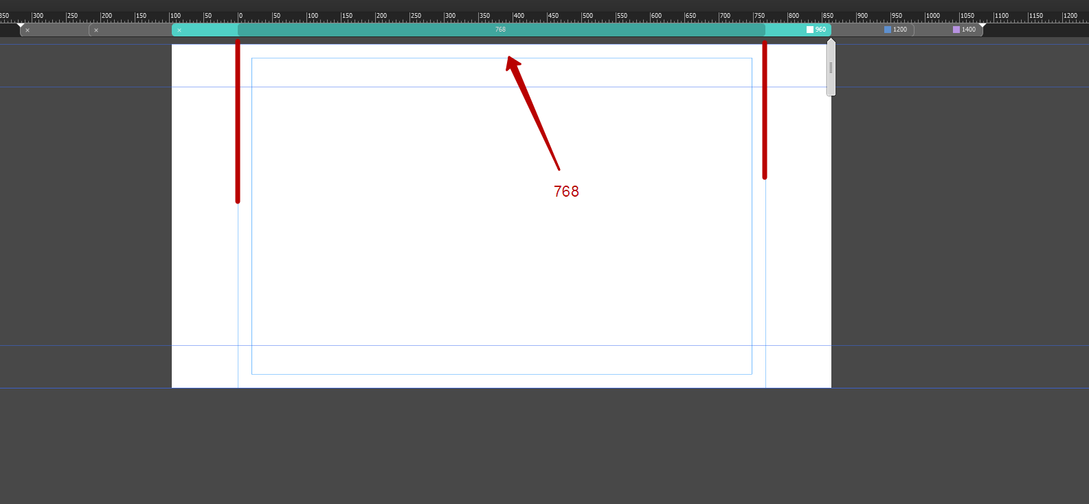
I agree with you - it is misleading. But if you try to understand in a new project, you will realize that the is fixed breakpoints are not the same as fluid breakpoints. It consists of two segments - the canvas and the page width.
1200
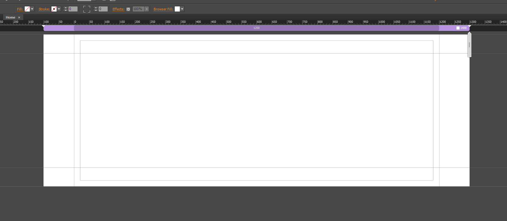
Then we need 960. Adding and get 960. Canvas= 1200, but page width = 960. Page width - this is important.
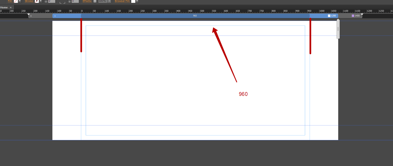
768
 22
Replies
22
22
Replies
22

Copy link to clipboard
Copied
So you know nothing about website design and a client wants you to build responsive layout... Have you published anything we can take a look at yet?
Copy link to clipboard
Copied
Uss, why would your write such a comment? I did not say I know nothing about website design. Your comment seems awfully mean-spirited.

Copy link to clipboard
Copied
Just stay cool and let’s stick to the problem! 
As far as we know UssNorway, he certainly has no intention to offend somebody personally. He probably is astonished about the fact, that there are many users around, creating Muse sites "for clients" and really don’t seem to have the necessary knowledge about this application. Not dare to think, if an electrician, a hairdresser or an architect would act like this ("I tried for hours to get your baking oven working, but now it would be better to immediately call the fire brigade!")
Regarding your problem: I will have a closer look tomorrow. Hope I’ll be able to help!
Nevertheless, it would be very helpful, it UssNorway and mshom chime in, because the presentation of breakpoints/min width and browser background representation in fixed width layouts really seems to be a little bit ambiguous. You are not the only one stumbling in this situation!
Copy link to clipboard
Copied
Thank you, Mac. I am looking forward to your reply tomorrow.
In the meantime, I will answer Uss's request.
I used to hand code basic sites in Dreamweaver using HTML and CSS; but, I am an old designer and find Muse's visual approach more appealing. Plus, I never learned JavaScript, so I cannot really work in code anymore.
Here are some Muse sites I have created:
http://bobfaulknerphotography.com
Here is something I notice now:
When first creating a site, if I choose Fixed Width in the New Site dialog box, everything works as the Test file you sent. But!, if Fluid Width is chosen in the New Site dialog box, all bets are off.
Switching between Fluid and Fixed break points in the Break Points bar works well when the site was initially set up as a Fixed site; but, larger pages seem to inherit the page size of the smaller break points when changing from fluid to fixed in the break points bar when the site has been initially set up as a fluid site.
Further, changing the overall site to Fixed by choosing File > Site Properties does not restore the behavior to what it would be if choosing Fixed initially in the New Site dialog box.
Copy link to clipboard
Copied
JustBob wrote:
In the meantime, I will answer Uss's request.
I used to hand code basic sites in Dreamweaver using HTML and CSS; but, I am an old designer and find Muse's visual approach more appealing. Plus, I never learned JavaScript, so I cannot really work in code anymore.
- No offence was intended... I believe you first need to spend some time getting to understand Muse and in particular the different types of responsive layout i.e, fixed breakpoints vs fluid breakpoint and what are the pit falls when changing them
Recommend demo video from max that imo covers fluid V fixed well = https://images-tv.adobe.com/avp/vr/f9a22e0b-df84-4fab-95fd-82db9072a993/29d290fd-8ddd-4581-baa4-61a2...
Another video from max that is good for Muse users to learn = https://images-tv.adobe.com/avp/vr/f9a22e0b-df84-4fab-95fd-82db9072a993/8899f4b9-f47f-4929-b75e-2637...
- When I asked "if you have published anything we can look at yet" I'm referring to the site you are working on now and the 'publish' option in Muse makes a temporary site on Adobe bc however you have given us the .muse file now so that's better... I'll try to look at it tonight
Copy link to clipboard
Copied
The site I am working on is at:
http://paulhoffman.businesscatalyst.com
(The slideshow's photos are too small and I don't want to enlarge them because any change to the slideshow sets the photos back to the small size. It is not worth it as the client will hopefully be sending new photos, soon. The page looks very nice with properly-sized images.)
And, yes, I am familiar with the different between fluid and fixed break points.
There either seems to be a bug in the program or an inconsistency in execution. As I mentioned to Mac, if Fixed is selected as the site type when first creating it, Muse seems to create separate pages for each break point; but, if Fluid is selected when setting up the site, then changing a fluid break point to fixed destroys the page properties for that break point, forcing us to use the page size from the next smaller break point. Further, selecting File > Site Properties and choosing Fluid there, as if setting up a new site, does not fix this problem.
Also, I feel that my file is either corrupted, or possesses some oddity…I set up a break point at 480 px. I can choose 1, 2, or 3 columns as guides for that break point; but, if I choose 4 columns, Muse displays 12 for that 480 break point instead of 4. I tried this in a new site and it allowed me to specify 4, 5, etc. columns. So, there is something odd with the file, page, or break point in this file.
Copy link to clipboard
Copied
Maybe a couple of screen shots would illustrate the problem…
This is the page with Fluid Width selected as the Break Point at 1200 px.
This is the same 1200 px break point changed to Fixed:
If you click on the images to enlarge them, I think you will see the problem. (Maybe I had better contact Adobe directly about this.)
Copy link to clipboard
Copied
Given, that I understood correctly: I don’t hit the issues, you are describing.
Look at this demo file https://dl.dropboxusercontent.com/u/7046655/Test.muse
There are different (minimal) page sizes and different scrolling setups per breakpoint (these configs don’t make any sense; it is only to demonstrate that it works).
And: you know, that scroll effect currently aren’t available for responsive breakpoints?
Copy link to clipboard
Copied
mac_heibu написал(а):
And: you know, that scroll effect currently aren’t available for responsive breakpoints?
And scroll effect and pinning can not be used for mobile devices, fixed breakpoints pointless to use for mobile devices. For mobile devices may well be enough just one fluid breakpoint 768.
JustBob, so Ussnorway is partly right that you know nothing about website desig. But this requires clarification - you know nothing about responsive website desig. This comment does not aim to hurt you. But the goal is to prompt you that you need more knowledge in this sphere. So please do not be offended.
Copy link to clipboard
Copied
>>>fixed breakpoints pointless to use for mobile devices
But, aren't fixed break points what Muse was using for tablets and phone layouts just a few months ago? They seemed to work fine.
Copy link to clipboard
Copied
JustBob написал(а):
>>>fixed breakpoints pointless to use for mobile devices
But, aren't fixed break points what Muse was using for tablets and phone layouts just a few months ago? They seemed to work fine.
There is a difference between an alt layouts and layouts with breakpoints. And I did not say that it is impossible. I said it is pointless. You simply mount to yourself a lot of unnecessary work.
Copy link to clipboard
Copied
Mac—
Thank you for the Test Muse file. That is what I want to achieve. I seem to be unable to do that with the site I am working on. Would you mind taking a look at the file I am working on? I'll leave it on my Dropbox for a few days:
Here are some of the issues I am facing:
1) See that 1200 Break Point? If I right-click on it in the Break Points bar and de-select Fluid Width to turn it into a Fixed break point, the break point inherits the Minimum Page width of the next break point down plus one pixel; so, 768 + 1 = 769. It does not seem to behave like the file you posted. Wherever I change the break point from Fluid to Fixed, the page size becomes the size of the next smaller break point. (Be sure to view the page with Guides showing.
2) Dani Beaumont is always saying that pinned objects do not always work on tablets and mobile devices, so I thought I would uses scroll effects to pin the navigation to the top of the page. That is another reason for wanting to use Fixed break points (at least until Adobe makes the slideshows responsive.) I got this to work once on this site, but cannot seem to make it happen again.
3) Even though we cannot use Scroll Effects on Responsive pages, if I set the widest width (1400 px) to Fixed (yes, I know that break point should be fluid) and setting scroll effects to zero for the navigation items, the nav bar does not respond if I make the 1200 pixel break point responsive. Is that they way it should behave, or is this something Adobe overlooked?
4) Since we cannot use Scroll Effects on Responsive pages, and the Responsive pinning icon in the tool bar only allows for centered left, right, and center attributes; how would I go about pinning the navigation items to the top of a Responsive page? (Oh! I notice that the small, three-point responsive pinning icon is not available for items set to stretch to the browser's width in a fluid break point. As that is not an option, how would we pin that to the top, assuming that Dani is correct that regular pinning does not work on tablets?)
Thank you so much for your help!
Bob
Copy link to clipboard
Copied
JustBob написал(а):
2) Dani Beaumont is always saying that pinned objects do not always work on tablets and mobile devices, so I thought I would uses scroll effects to pin the navigation to the top of the page. That is another reason for wanting to use Fixed break points (at least until Adobe makes the slideshows responsive.) I got this to work once on this site, but cannot seem to make it happen again.
The same applies to the pinning using scrolling effects. It is better to abandon the idea completely.
Copy link to clipboard
Copied
>>>I said it ispointless.
So, you are saying that it is not a good idea to try to lock navigation to the top of the page anymore?
Copy link to clipboard
Copied
JustBob написал(а):
>>>I said it ispointless.
So, you are saying that it is not a good idea to try to lock navigation to the top of the page anymore?
It was never a good idea.
JustBob написал(а):
When first creating a site, if I choose Fixed Width in the New Site dialog box, everything works as the Test file you sent. But!, if Fluid Width is chosen in the New Site dialog box, all bets are off.
This is something that you should choose, in most cases, even if you need to create responsive site. Muse is still not very perfect.
When you switch the breakpoint from responsive to fixed the breakpoint becomes the boundaries of the canvas, and the area for the content becomes smaller breakpoint. Thus, you need to reformat the content manually.
Copy link to clipboard
Copied
If you have in mind, what mshom said, II think, your site works quite well, if you convert the breakpoints to "fixed".
Of course you have to reposition and resize elements in this case.
… and using scroll effects set to "0" works fine in your site as well ( if you reposition/resize the elements, which overlap the breakpoint boundaries) . By the way: For my part, I never experienced any wrong behaviour, when using scroll effects as a pinning method for menus.
Copy link to clipboard
Copied
mac_heibu написал(а):
I never experienced any wrong behaviour, when using scroll effects as a pinning method for menus.
Problems arise not on all devices and browsers, but they arise and fairly often. And that's enough that would eliminate the use of scrolling effects on mobile devices.
Copy link to clipboard
Copied
My practice - a copys of the menu instead of pinning
Copy link to clipboard
Copied
Of course, the Muse Product Manager has been a big fan of "persistent navigation" in fixed-width sites; so, I guess it is a matter of preferences.
Copy link to clipboard
Copied
>>>Thus, you need to reformat the content manually.
I am afraid you and Mac have missed my point. (Don't worry, I'll call Adobe; I realize no one here is Adobe staff—it's okay…)
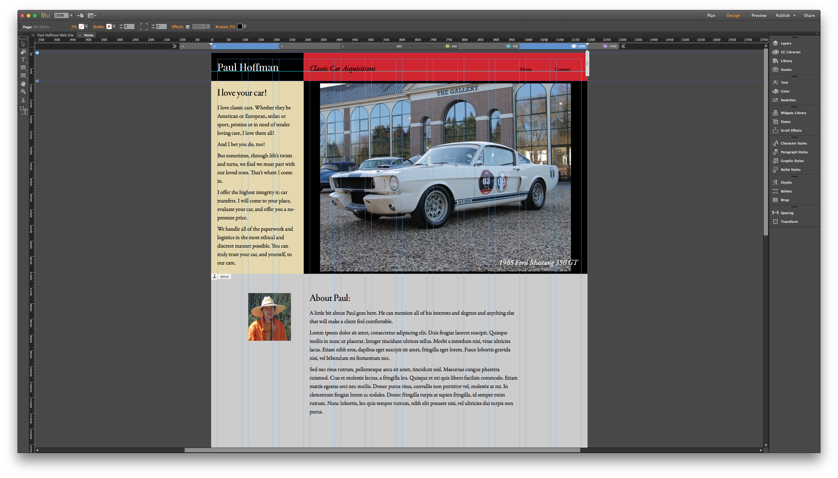
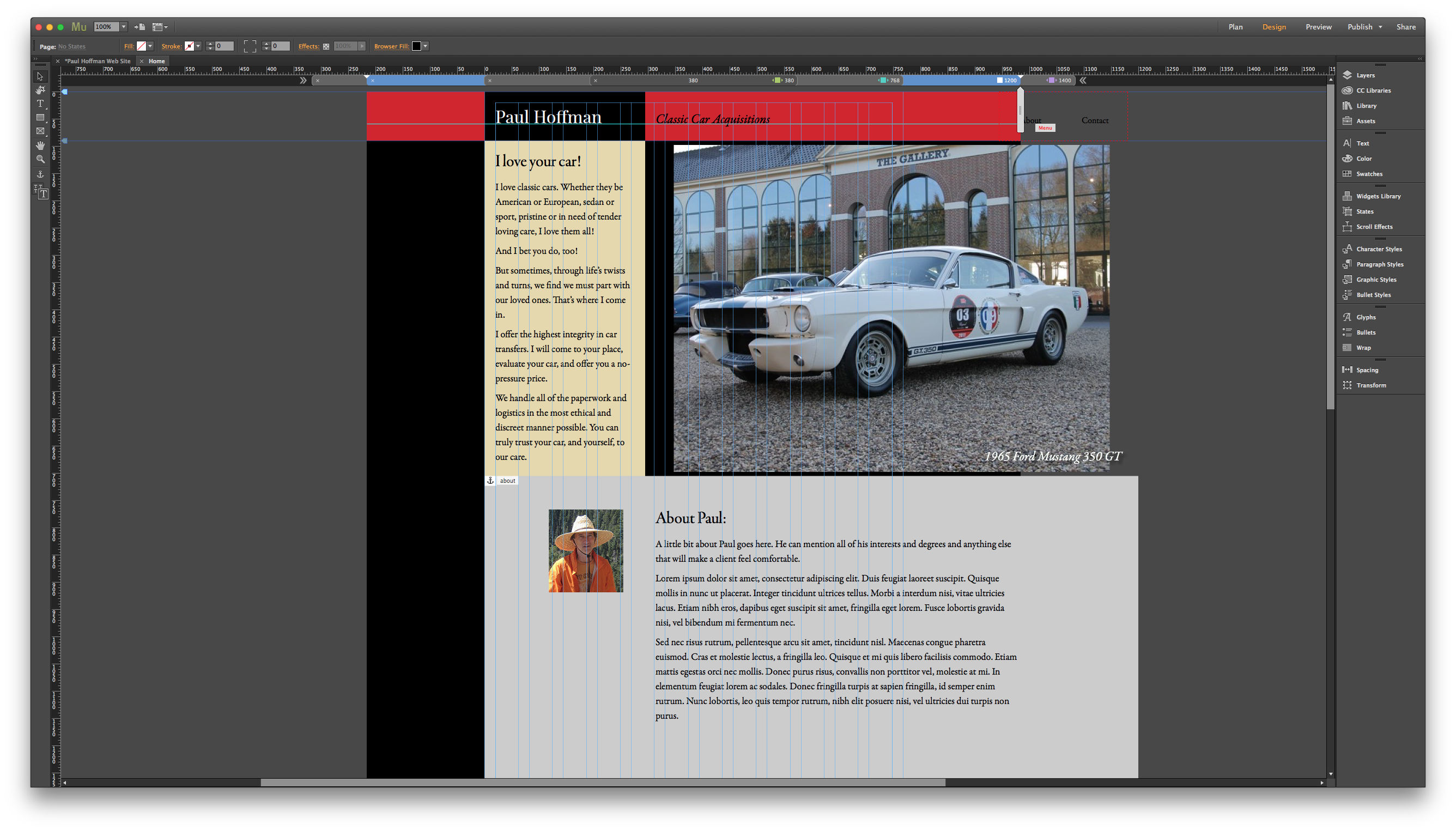
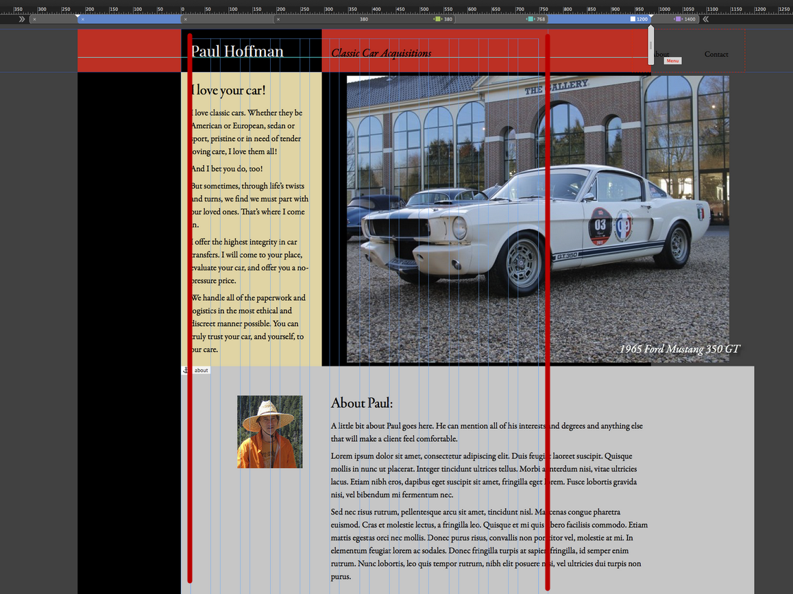
See that screen shot where you have drawn a bold red line down the page at the 768 break point? Yes, I know, I would have to resize everything for that break point; I understand that. But, look at the break point bar. The breakpoint for 1200 px is selected, not 768. Look further at the page boundaries and the column guides; they are showing for 768 px even though the 1200 px break point is selected. That is my problem.
Copy link to clipboard
Copied
I agree with you - it is misleading. But if you try to understand in a new project, you will realize that the is fixed breakpoints are not the same as fluid breakpoints. It consists of two segments - the canvas and the page width.
1200
Then we need 960. Adding and get 960. Canvas= 1200, but page width = 960. Page width - this is important.
768
Copy link to clipboard
Copied
So, you are saying that, for a Fixed breakpoint, a browser at 1200 px will show a page, in this case, that was designed for 769 px (one more pixel that the 768 breakpoint).
I really don't like this way of thinking. Pages usually shrink to the viewport of the browser window—something like that. I mean, most web content will shrink so the page fits nicely within the browser. This just makes content meant for a smaller screen to show in a wider browser.
BTW, a separate, but somewhat related issue…Whether I choose 380 or 480 as the breakpoint for my phone layout, the page always displays a bit too wide on my iPhone 5s. I have to pinch it in for it to snap to the proper width. The phone breakpoint is set to Fluid width, but I think it does the same for fixed.
 AdChoices