 Adobe Community
Fixed width responsive quirks

Copy link to clipboard
Copied
I tried building a fixed width responsive layout and things didn't seem to work as expected. So I built a little test file to see if I could understand things better.
Based on my test file, the intended breakpoint's viewing area is limited to the width of the next breakpoint down. Now I understand how Muse treats fixed width responsive layouts I actually don't understand why it does it this way.
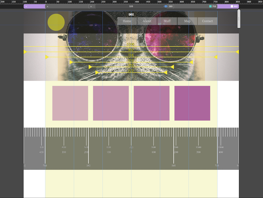
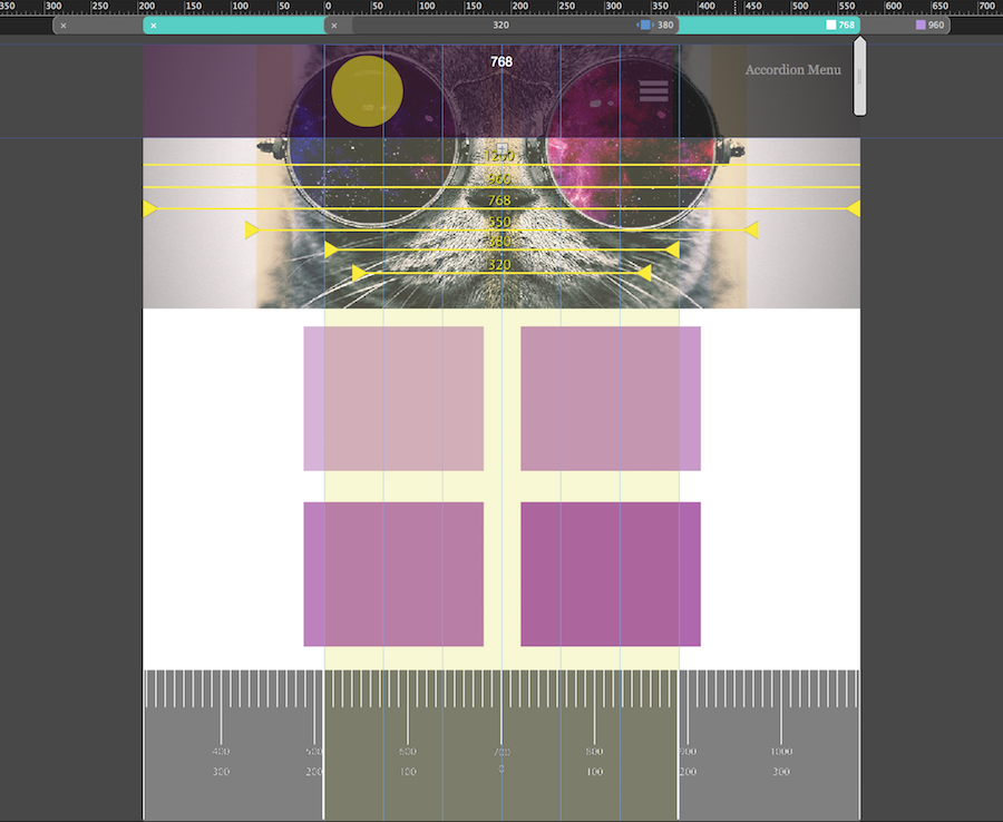
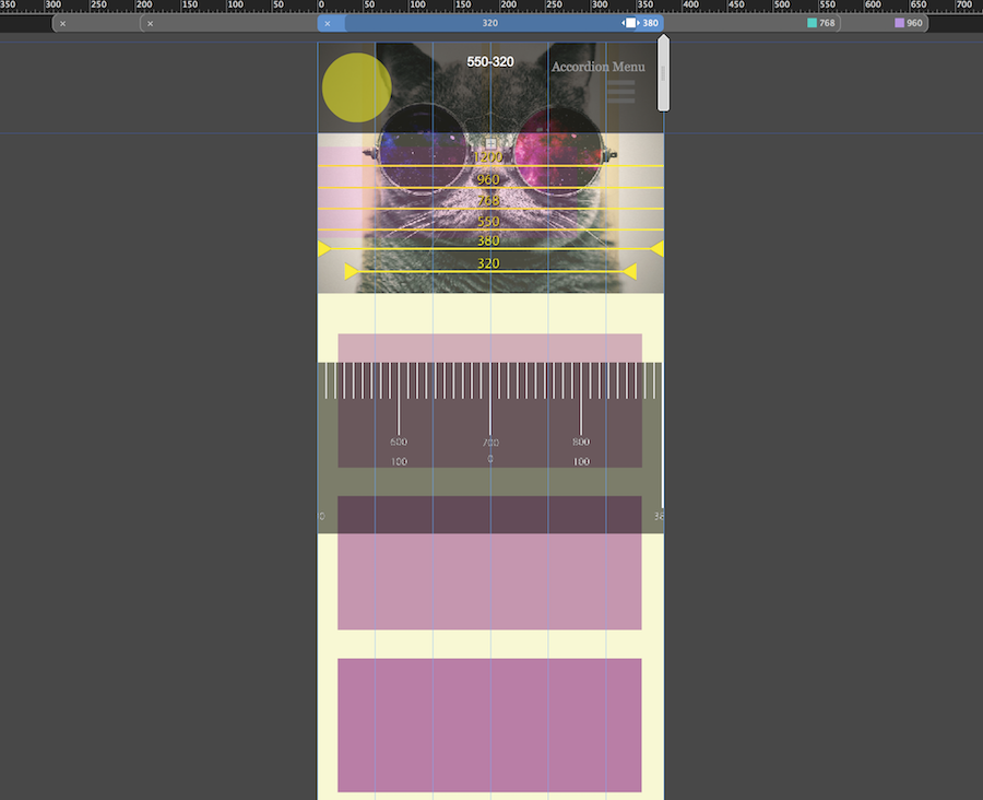
Example: A Fixed Width Responsive site with 3 breakpoints 960px (fixed), 768px (fixed), 380px (Fluid)
If you work on a 960px breakpoint in Muse, it's layout width is restricted to the next breakpoint down, in this case 768px. The 768 breakpoint width is restricted to 380px.380px in this case is set to fluid width so no problem there.
So, when viewed in the browser:
980px breakpoint will display the 768px layout (Desktop layout displays tablet width layout)
768px breakpoint will display the 380px layout (Tablet layout displays phone layout)
This seems kinda weird.
Questions:
Why does Muse handle fixed with breakpoints this way?
How can make it that if I’m working on a:
- 960px breakpoint that I have a 960px width area to work with
- 768px width breakpoint that I have 768px width area to work with and so on


 6
Replies
6
6
Replies
6

Copy link to clipboard
Copied
At first glance this seems(!) quite confusing, but has its good reasons. Have a look at this video jam session, where @dani_beaumont tries to shed light on this behaviour: https://www.youtube.com/watch?v=XWUnSNHrd5w
Copy link to clipboard
Copied
Yes I did watch that video for the 2nd time a few days ago.
Bless Danny Beaumont, Product Manager of Adobe Muse, for her efforts.
Unfortunately that Muse Jam Session clearly revealed she was confused by the same situation and got stuck each time she attempted to replicate the sample web site.
Danny couldn't achieve her goal of replicating a fixed width web site in an hour.
In fact she couldn't even replicate one page in an hour as she continually got confused with the way fixed width breakpoints work in Muse.
And because of the way fixed width breakpoints work in Muse she could not replicate the 'standard way coders approach fixed width responsive sites', as per the open source demonstration site.
I spent 5 hours pausing, rewinding and watching repeatedly each attempted explanation.
I also attempted to take notes in order to write instructions for myself.
After 5 hours I had no notes to work from because Danny couldn't explain how fixed width breakpoints in Muse work.
She did however, manage to explain how confusing it was.
If there are good reasons for the way fixed width breakpoints, than what are the reasons?
No one so far can seem to explain it.
I have also watched the guys over at Muse Themes demonstrate their Fixed Width theme, Build, (more than once) and downloaded the theme myself and played with it to familiarise my self with the fixed width concept.
Their 'Build' fixed width responsive theme presents the same problem. Their design approach does a reasonable job of masking the problem however in all practicality it poses some real roadblocks when it comes to modifying it for real world purposes.
The main problem being when the clients asks, 'Why is the page width so skinny and can you make it wider?'
The solution would seem to be to just add more breakpoints, which I have experimented with, but it really doesn't work. At the vey least it's impractical to just keep adding breakpoints.
Here's my attempt with 6 breakpoints: Home
So my questions still remain:
Why does Muse handle fixed with breakpoints this way?
How can make it that if I’m working on a:
- 960px breakpoint that I have a 960px width area to work with
- 768px width breakpoint that I have 768px width area to work with and so on
And now I would like to add another question:
What are the good reasons for fixed width breakpoints in Adobe Muse working the way the do?

Copy link to clipboard
Copied
Hi Christo14,
you get stuck in the same issue than most users, me included. I finally try to work as much as possible with fixed width breakpoints (bp) and with elements, resizing set to none. In your Home you have fixed width BPs and your header picture (let´s call it hero  ) is set to stretch to browser width, right? I really don`t know why your rectangle (3rd from left) jumps down at 960.
From a common sense, if your bp at 960 should take care towards the next bp at 768, everything must fit in between the 768 bp.
Otherwise you must set everything to fluid width, responsive width and heigth – we know that this leads to issues.
There was a really, for me, enlightening thread:
Re: Muse not redirecting to tablet version
where it got quite clear what to do.
I guess, most of us, me included, start way too early with resizing the browser window.
Read the last two paragraphs (about the bug and finish your design at 1200 completely, before ...)
Of course you are allowed to maximize your biggest screen to whatever you like, until you keep with fixed width bps as long as possible, I guess.
There´s one last question to Pavel and/or Guenter about the bp in 768 that could be fluid and fixed at the same time???
I first thought it was written wrong, but Pavel answered no – both is possible at the same time???
fotoroeder написал(а)
I realize two times 768 px, one time fixed and one time fluid with 320 px min. I think both is not applicable at the same time?
They are quite applicable simultaneously.
I already asked in that thread about this. As for now I could only think of doing fluid on master and fixed on normal
pages or vice versa.
9. Re: Muse not redirecting to tablet version
Pavel Homeriki 16.03.2017 03:55 (als Antwort auf: Uwe Roeder)
fotoroeder написал(а)
So, if I understand you right
the main decision from the beginning is, decide for
1) alternative layouts,
...
or
decide for
2) responsive layout
...
Yes, you understood perfectly correctly.
Is it that, what you recommend?
For a responsive site with breakpoints, I recommend only one approach. In connection with the great performance problems that Muse has, this approach is the best and will work in 99% of cases:
You create a site of 1200 pixels of fixed width (this is very important), since on a site with fluid width, scaling on mobile devices does not work properly for fixed breakpoints (this is a bug).
After your design is ready completely, you create three more breakpoints and format the content in them.
1024 fixed, 768 fixed, 768 fluid with 320 min W. That's all you need. You will cover 90% of tablets and 100% of phones. The exception is monsters such as iPad Pro in portrait mode, Asus Memo Pad in portrait mode and some other large tablets. But you do not have to worry about them, otherwise you will have to do mobile optimization from 1366 pixels width.
This technology is shown in detail in the video:
Here follows the link to the video mentioned by Guenter, that you already watched twice.

Copy link to clipboard
Copied
Hi Christo14
Not sure if you are still active on forum
I had followed up on your comments from last year Fixed width responsive quirks and the other Fixed Breakpoints Cannot Have Own Page Widths? plus watched both of Dani's video's on fixed width responsive.
I posted my own version. I thought the query seemed a clear request to me..but others did not...see thread trail here.
Not sure if you resolved any further.
I have my work around for the smaller sized breakpoints
(a) I make the BP fluid – but do not wish to due to complexity of elements or (b) create another BP 25px less, but then this creates a lot of extra BP's.....(C) go back to alternate layout..
Re: Adobe Muse breakpoints vs page size on tablets & mobile
all the best
sqpeg
Copy link to clipboard
Copied
Hi sqpeg,
Still on the forum but I put this issue to the side and let myself think about it for a while.
I did come up with my own way of building a fixed width site with minimal breakpoints, which has some of the concepts from some of the suggestions above.
However, this was with Muse CC 2017.0., I skipped Muse CC 2017.1+ for obvious reasons.
With Muse CC 2018.0 new bugs have entered play and that method no longer works - unless I build a site in 2017.0.
I have tested now strategies to compensate For Muse CC 2018.0 but in reality they are just convoluted workarounds - more like time wasting unreliable hacks which should not need to exist in the first place.
One major bug is with the Accordion Widget in Fixed Width Breakpoints.
There are other bugs that are clearly a result of the update but I won't digress.
I look forward to looking at your solutions when I have a moment
I appreciate your post very much, thank you.
Christo14
Copy link to clipboard
Copied
Thanks Christo14
Yay I am not crazy.
Yes I trialled the work around of a 25px less breakpoint for the tablet/mobile sized pages that get 'pulled in' / media queried or choose your own term here to mean displayed. The main point I kept banging on is that with the fixed width breakpoints the page realestate on the tablet and mobile is narrower, due to the inclusion of the compulsory browser canvas that is applied with fixed width breakpoints. Which on the desktop does not mater but on the smaller screen... it would be great not to have.
Also I have started to utilise the 'fluid' after 768 as well to get around issues but as expected creates more work.
ahah yes i spent some time on the rascally accordion widget.
I had a similar post on the 'Muse themes' forum and sent an email to Dani Beamount.
all the best and see what comes up..
sqpeg
 AdChoices