 Adobe Community
- Home
- Muse (read-only)
- Discussions
- Re: fluid width page design & pinning inconsistenc...
- Re: fluid width page design & pinning inconsistenc...
fluid width page design & pinning inconsistencies?

Copy link to clipboard
Copied
I've been struggled with this for some time, and only now started some serious testing to figure it out, but am stumped. Is this a Muse bug?
When I create a page/site which has a min and max width, then drop responsive objects on them, I have a very good understanding of how they align and resize to grids etc.
However, whenever I choose to pin some groupings to the browser top (or bottom), the newly pinned object seem to follow different fluid rules. Basically I'm finding that they no longer follow the min width restrictions.
See the visual example below;
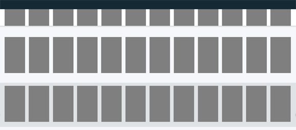
In the above example all blocks align to the grid, and stay that way when the browser is resized. Great.
- The first row of blocks are free floating in a full width button, which itself is pinned to the top/center of the browser (intended to represent a pinned page header)
- The second row of block are free floating on their own
- The third row of black are free floating in a full width button, this time not pinned
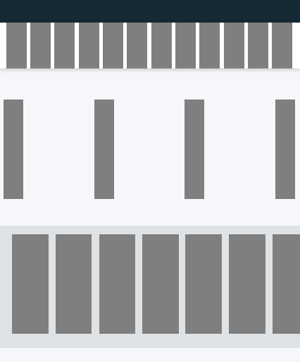
Now see what happens when the browser is sized below the page min width;

Notice how the 2nd & 3rd rows stopped resizing once they hit the page minimum size (as expected), yet the 1st row continued to shrink (including the margins!)
Does anyone know why this is? Can anyone advise how I can create a pinned page header which stays true to the preset columns?
If anyone is interested in tinkering with the above set up, you can find the file pinning-fluid.muse at the following cloud.


 8
Replies
8
8
Replies
8

Copy link to clipboard
Copied
Hey marcelt2t,
I tried setting the block in the header to a responsive width and that looks like doing what you are intending for.
I suggest you also do the same, or if this is not what you think too achieve please help us with an example site for reference and we can advise much better.
Regards,
Ankush
Copy link to clipboard
Copied
Thanks for looking Ankush,
You probably didn't notice, but when you set the block to responsive, it "deselects" the pinning option automatically;
True, when you do this it works, but my goal is to leave the block pinned to the top. Unfortunately when this is re-selected it fails again.
As an fyi, even when the block is set to "Stretch to browser width" and you remove pinning, it also works. The one factor that breaks the grid is the pinning.
Maybe it's a bug that needs addressing?

Copy link to clipboard
Copied
Perhaps I misunderstand something completely, but at first glance, all works as expected:
The first row of elements is nested into a browser-wide state button – and the elements are reacting like this (relative to the parent element) – they are inheriting the browser wide behaviour from the rectangle „below“.
The second row has no „browser-wide“ identity and stops scaling, when the minimal page width of 768 px is reached. If you set minimal page width to 320 px the resizing will happen later.
In short: For me all works fine. If you set all elements to page width (not browser width) all seems to work as you expect.
If not for you, please give us a simpler example and explain exactly and in short, simple words, what you want to achieve: A sentence like: „… a header, which stays true to the preset columns“ can be understood in may ways.
Copy link to clipboard
Copied
Günter,
Please notice the third row of elements. It is also nested in a browser-wide state button, but since it is not "Pinned", only it stops sizing at the browser minimum, unlike it's pinned cousin. This is the behavior one might expect when a page minimum is reached.
In simplest terms. I would like to create a fluid page header which is pinned, and the page header elements should stop sizing at the page minimum page width (as all the other elements do). <- This is the only true way to keep consistent grid.
I did additional testing, when I take a row which is not contained in a full width button, and pin it, I get even stranger results! You can try this yourself with the second row of element.
There is no way this is the expected behavior?
Footnotes:
Incase you wonder, I am sort of a rules person. When I create a grid/columns I expect everything to obey the grid as a rule. I find Muse is making this very difficult for me.
See below. The blue lines indicate the determined columns. At 100% width, all elements follow the columns, and all elements are set to responsive:

But when I size the window width smaller, suddenly no object stays true to the fluid columns. Worse, when Pinned, they seem to live on a planet of their own 😞

I appreciate all your help and patience as I work through this!
Copy link to clipboard
Copied
This is doable, if your state button only stretches to page width (not browser width, and you place a rectangle, stretched to browser width (same height, same colour as the state button) behind the state button.
By the way: This seems to be related to an old bug, which I reported in prerelease forum one year ago: https://forums.adobeprerelease.com/muse/discussion/comment/19715#Comment_19715
Copy link to clipboard
Copied
Günter.
I tried your scenario before, but again, the moment the foreground objects are again pinned to the browser, full width or not (even outside of state buttons) the problems arise again.
If you have an example file where it is working (with pinning) I would love to investigate.
thanks!
Copy link to clipboard
Copied
You are completely right …
Did you consider, to use a fixed width breakpoint instead of the minimal page width? Or a fixed width breakpoint together with a minimal page width, which is identical to the fixed width breakpoint? Look at this example file: https://www.dropbox.com/s/frtlu93ro7anf5u/marcelt2t-sample.muse?dl=0
Copy link to clipboard
Copied
Günter.
Much thanks! This is a great workaround as a short term solution!
It doesn't solve the larger issues with grid alignments, and adds some extra steps for breakpoint management, but at least it allows me to move forward with my current project 🙂
I'm hoping that some staff are still paying attention and work to solve the bigger problem (I believe if flagged as bug's, we might still get some action);
- Grid irregularities with PINNED objects
- Column to object matching when using fluid layouts (related secondary observation reported above)
If you readers don't mind NOT flagging anything here as the 'correct answer' we might still get some longer term action.
 AdChoices