 Adobe Community
- Home
- Muse (read-only)
- Discussions
- Re: Footer is not working on mobile device
- Re: Footer is not working on mobile device

Copy link to clipboard
Copied
Hi Guys,
I’m working on a mobile version of a website, but the problem is that the footer is not lined up at the button (iphone 6s),
it is cut off.
Does anyone know a solution?
Thanx for your help!
Wolfram


 1 Correct answer

In my case it should be more "sodele" 
You didn`t set your footer. On both master pages. Click the far left arrow:
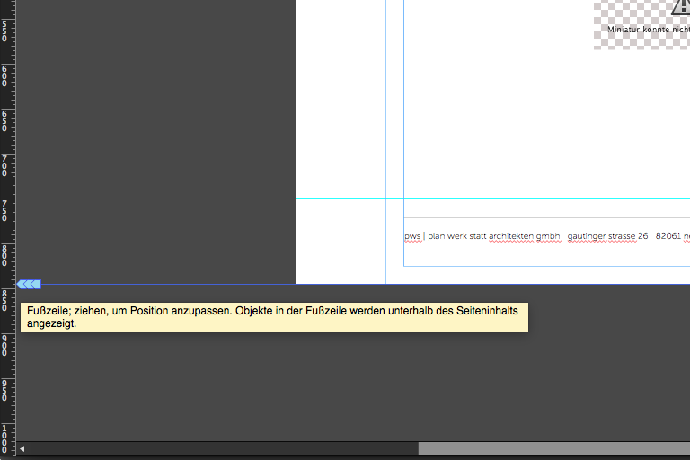
Drag it up to your "Hilfslinie", or whereever you need it:
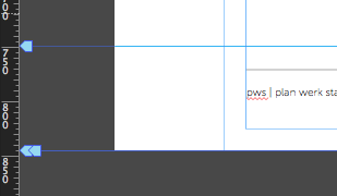
and your footer object gets this check marker:
This should solve it.
I didn`t check all pages now for any design features. I don´t have iPhone 4567 – watch out.
Hope this helps
Uwe
 15
Replies
15
15
Replies
15

Copy link to clipboard
Copied
Hi Wolfram,
I have tested your site and found that misbehaves only in Safari browser of Apple.
Not sure if this is a device specific issue.
Regards,
Ankush
Copy link to clipboard
Copied
On Android the footer is available.
I realize some strange, maybe "Android-behaviour" , the menu closes immediately after showing up.
Almost no chance to click something.
Also on desktop, the mobile footer is available.
Copy link to clipboard
Copied
Thank you as wel! is that a android-muse bug?
Copy link to clipboard
Copied
Thank you very much! Do you know a solution for this problem?
i tested the safarI-browser on PC, and it worked
Copy link to clipboard
Copied
Well, the Android bug has already been resolved in the Muse 2017.0.2 update.
Which version of Muse is using?
If you have a previous version then please update Muse or else you can also try fixing it by the solution mentioned here - Accordion widgets collapses when viewed on Android OS
Regards,
Ankush
Copy link to clipboard
Copied
I installed muse CC 2017 now, but the in the mobile Safari browser still exists.
Copy link to clipboard
Copied
Do you now have an issue with footer or menu (collapsing too fast)?
In both cases we would ask politely for a .muse? Reduced to one page with your issue – Master and one page.
Thanks
Uwe
Copy link to clipboard
Copied
Dear Uwe,
thank you. I posted only the footer-problem, but someone reported me that collapsing-issue on an android device.
Unfortunately I have not an android device so I cannot proof whether ist solved or not.
Copy link to clipboard
Copied
So, quickly pass a .muse via dropbox, let´s check what´s up. Or upload a new version and let´s check if we could see the issue as well.
I searched on my Android and found that collapsing menu.
As I cannot check iPhone 567, on desktop and under "Entwickler" it looks good.
Did you pin your footer? Pinning should be avoided on mobiles.
Uwe
Copy link to clipboard
Copied
so here is the link:
Copy link to clipboard
Copied
In my case it should be more "sodele" 
You didn`t set your footer. On both master pages. Click the far left arrow:
Drag it up to your "Hilfslinie", or whereever you need it:
and your footer object gets this check marker:
This should solve it.
I didn`t check all pages now for any design features. I don´t have iPhone 4567 – watch out.
Hope this helps
Uwe
Copy link to clipboard
Copied
Hi Uwe,
thanks for you screenshots. It's funny, because you sent me the screenshot of the pc-version.
But I had problems with the mobile Version. In the "phone"-version the footer was set correctly in the master page?!
Anyway, I set the footer now in the pc-masterpages as well and now it works.
Do the desktop settings affect the phone settings, also when I am not creating a responsive page?
Strange, but anyway thanks!! 😉
Copy link to clipboard
Copied
This is really strange, though. If it helped, great. To be honest I just watched the desktop version, I didn`t know, it affects the mobile version as well. Now it works perfect?
Best Regards
Uwe
Copy link to clipboard
Copied
yes it works on iphone 6 🙂
Thank you!
Copy link to clipboard
Copied
Like it.
 AdChoices