 Adobe Community
- Home
- Muse (read-only)
- Discussions
- Form Widget: Submit Buttons look strange
- Form Widget: Submit Buttons look strange

Copy link to clipboard
Copied
The text in my submit buttons do not look right. If I preview only the Master Page, they look fine. If I preview the layout page,
the text in my submit button is not correclty aligned. I have this issue since the update from CC2015 to CC2017.
Any ideas? I already tried adding the same form widget by deleting the old one ... with no result.
Muse project was saved under a new file ... with no result.
THANK YOU


 1 Correct answer

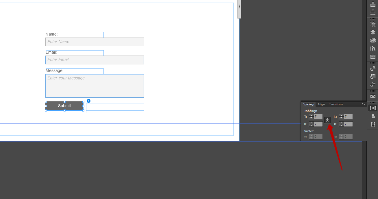
This is kind of possible if with graphic buttons. Like this:
You may realize, that the textbox at the bottom behaves not as intended but as expected. This is text inside a rectangle.
Even because these two are grouped it is not getting properly smaller.
The middle box works as intended and expected. This is a placeholder rectangle, filled with the button as maybe desired.
This works in Designmode, preview and published.
 19
Replies
19
19
Replies
19

Copy link to clipboard
Copied
I would publish it to a temp Adobe BC site for testing
Copy link to clipboard
Copied
Could you reduce your issue to the form and give us a .muse? Only the contact form. Maybe some padding set up issue?
Copy link to clipboard
Copied
That's not the problem, the problem is the Master page or the embedding into the layout page.
Copy link to clipboard
Copied
The padding was set to zero for top, bottom, left, right. It occurred after a Muse Update. I can't remember which version exactly.
Copy link to clipboard
Copied
And what exactly is strange about it? Is it, that the typo is well vertical centered on the master page and in preview the typo is sinking down? Did I get it?
Copy link to clipboard
Copied
I found this:
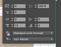
set to "13". Put this to "0". Looks strange in Design Mode looks perfect in Browser.
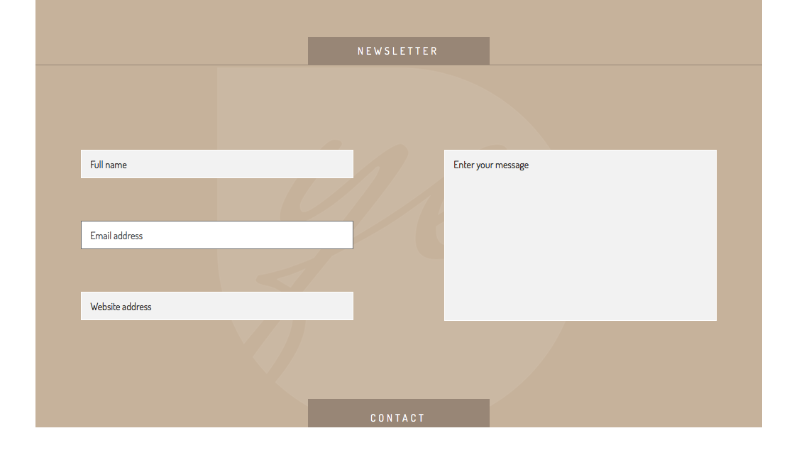
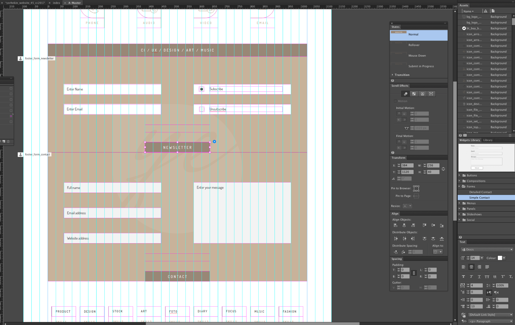
You may realize, NEWSLETTER is perfect, CONTACT need some reset as above and then looks like this:
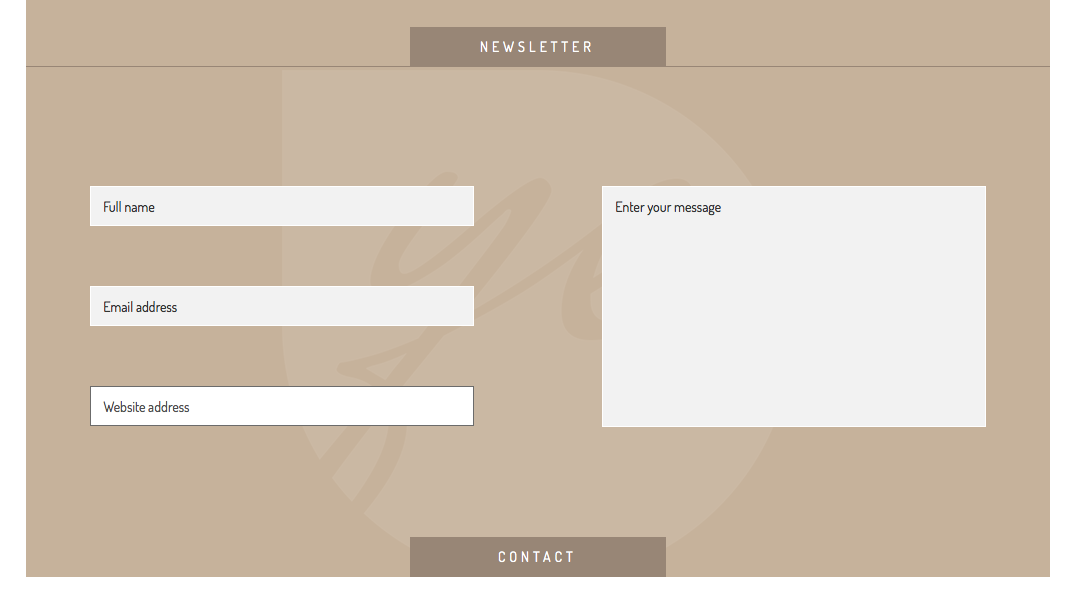
Does this help? I hope so.
Uwe
Copy link to clipboard
Copied
If you want to see in Design Mode what you wanted you should not use the : Distance before (in German: Abstand davor) but the distance between lines ( in German: Zeilenabstand)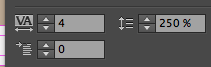
Then it looks perfect in both areas: Design Mode and Browser.
Uwe
Copy link to clipboard
Copied
And what exactly is strange about it? Is it, that the typo is well vertical centered on the master page and in preview the typo is sinking down? Did I get it?
Correct. The typo glitch occurred after the Muse update (latest version 7.x.x --> CC2015)
Copy link to clipboard
Copied
But now, when you do as I said, it must be OK on your side as well, isn`t it?
You might also watch this: Working with text and text frames in Adobe Muse
As far as I translate, you were working in the control panel and not (but much better) in the text panel.
And in Text panel you must set the number for LEADING ( I set it to 250, you must check for your needs) instead of SPACE BEFORE ( was set to 13 in your file-must be 0)
Your part would be this for text panel:
Space Before and Space After
You can use these settings to control the amount of space (in pixels) that is displayed before or after a hard paragraph return. These settings enable you to display more or less white space in between a set of paragraphs that are in a single text frame.
Copy link to clipboard
Copied
Aligning text vertically has always been a dirty workaround.
When I started using Muse, I was using padding to adjust the vertical space by creating a paragraph style and a separate
graphic style.
After some time and website maintenance, I thought, it's about the text and not about the button.
I started removing all paddings and used the paragraph style to adjust the vertical position.
In both ways, not the padding nor the leading is a proper solution for this purpose. I rather would like
to see three buttons (just like in InDesign) in my text palette:
Align Text: Top, Middle, Bottom
PS: Ok now we have the vice-versa solution. (It looks good on the pages, but not on the master page.)
Copy link to clipboard
Copied
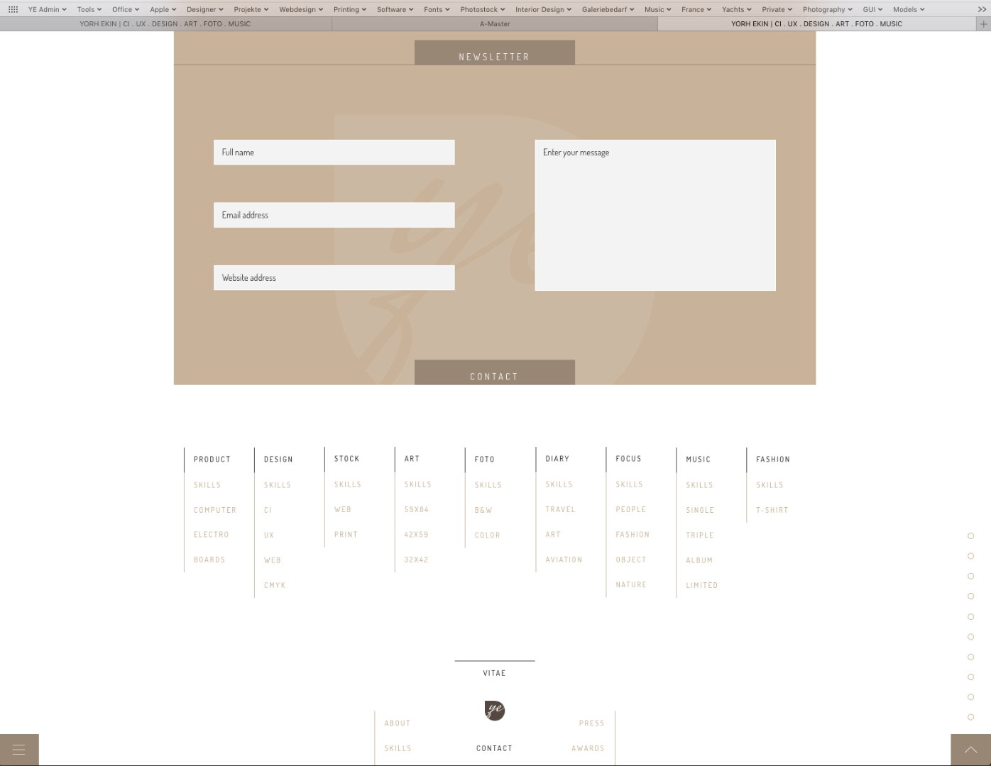
Check this out: YORH EKIN | CI . UX . DESIGN . ART . FOTO . MUSIC , download the file, I set up correctly and it looks perfect in either Master, Normal Page and uploaded, trust me.
Uwe
Copy link to clipboard
Copied
Sorry, there was a misunderstanding ...
I was using the SPACING panel ==> No RESULT
I was using the SPACING BEFORE setting in the text panel ==> No Result
The LEADING with 250% looks good now on the master page and layout page.
However, I doubt that one can use the LEADING attribute to center a text vertically
within a box that has a great height.
Copy link to clipboard
Copied
Yes this might be tricky. For this I would suggest to use a rectangle button with some text in it instead of an ONLY TEXT BUTTON.
As far as text is not always 100% pixel perfect this might the be a better solution.
Good to hear that you got it, finally.
Happy Easter
Copy link to clipboard
Copied
Thanks for your time to solve the problem.
I was referring to the basic setting in Muse. If you drag the form widget into the layout it uses the SPACE panel
as the default setting to adjust and align the text. That's Adobe's suggestion.
In any case, (SPACING, TEXT SPACING BEFORE or LEADING) ... it should work in all cases.
For this I would suggest to use a rectangle button with some text in it instead of an ONLY TEXT BUTTON.
The big problem till now in Muse is as follows:
One can only put a layer over another layer.
I was thinking of a solution where you can put a layer into another layer by holding the alt-key.
If you do so, you can pin the inner text rectangle in relation to the outer rectangle. (top, middle, bottom + left, center, right).
No matter how you resize the outer rectangle, the inner rectangle always stays in middle, center position.
That's the best solution ... maybe in Muse CC2018 ... or maybe someone develops some kind of button widget until then.
Copy link to clipboard
Copied
This is kind of possible if with graphic buttons. Like this:
You may realize, that the textbox at the bottom behaves not as intended but as expected. This is text inside a rectangle.
Even because these two are grouped it is not getting properly smaller.
The middle box works as intended and expected. This is a placeholder rectangle, filled with the button as maybe desired.
This works in Designmode, preview and published.

Copy link to clipboard
Copied
I too have found the submit button text on the forms widget was behaving very strangely. Text alignment was my biggest issue, what looked right in Muse was too high/low in preview, and mis-aligned completely differently when uploaded. I've long give up trying to change padding etc it will never be satisfactory.
Now I create the text to my exact requirements as an SVG file and then insert the SVG as a fill. No issues at all with this method and my submit buttons now match my CTA's perfectly.

Copy link to clipboard
Copied
Encountered the same problem as above with the submit button text alignment looking OK on the master pages but not on the actual page when previewed. I now create my submit button in Photoshop with the required states as layers. They seem to import as "Add Image" in the fill box in the same way as "Place Photoshop Button" does, you can select each layer as you add to each state.

Copy link to clipboard
Copied
Encountered the same problem as above with the submit button text alignment looking OK on the master pages but not on the actual page when previewed.
The solution is very simple - just set the same padding depending on the height of your button. By default, this is not configured correctly. I can not understand why the Muse team does not fix this for more than a year
Copy link to clipboard
Copied
Thank you very much for help, worked a treat.
 AdChoices