 Adobe Community

Copy link to clipboard
Copied
Hi there,
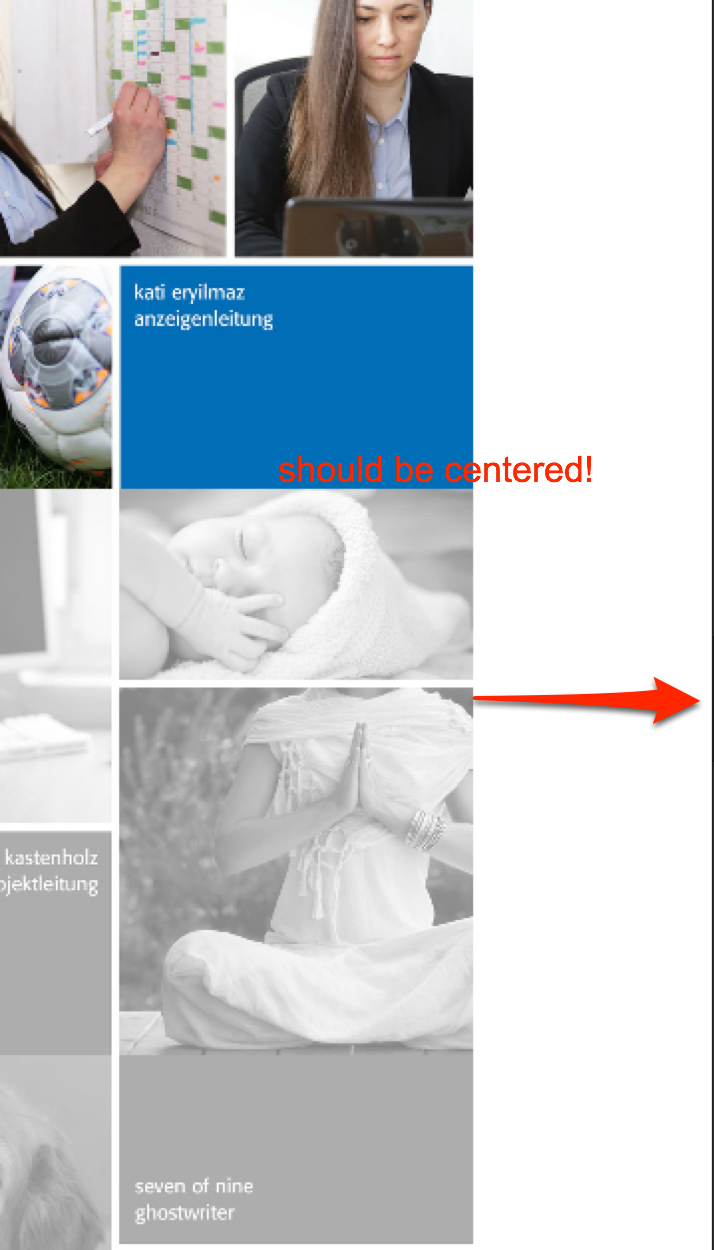
I use some fotos with mousover on a page. They are set to grow proportionaly.
They are pushed to the side on some browsers in mobile devices. Only when viewed smaller than 480 px - 319 px ( 320 is ok because of new bp)
Error on:
Android: Firefox, Chrome, Opera, edge, brave
iPhone: 6,7,
Ok on:
iPhone: 5, SE,
Do you see this too?
How can I solve this? My client wishes a proportional scaling and NOT a narrowing down of the fotos.
I did remove all extra widgets but with no luck.
https://manner2018.businesscatalyst.com/index.html
Do have any idea how to solve this?
Thank you very much!


 1 Correct answer

My iPhone 6 didn’t show the error. But perhaps I overlook it. No wonder: If you want us to easily inspect and debug a site: Reduce it, reduce it reduce it, reduce it! So we have to scroll downwards for several kilometers, before we even detect the issue. And for testing reasons we have to wait and wait until the page is completely rendered in browser. Why not delete everything except one of these image tiles? Then investigating the site would be very easy – perhaps you even would have found the
...
 8
Replies
8
8
Replies
8
Copy link to clipboard
Copied
This issue and the other one (hamburger menu), you mentioned in a different thread, isn’t solvable without having a look at the .muse file.
So, please, delete as much pages and objects as possible, so that only the „critical“ elements are still present, save this .muse file under a new name, and upload it to Dropbox, CC files or a similar file sharing service. Then we will have a look.
Copy link to clipboard
Copied
Copy link to clipboard
Copied
Please excuse my late answer, but I had to wait for the iPhone 6 of my wife.  .
.
I had a look at you sample site and couldn’t discover an error.
It is the same as Ankush answered to your other thread regarding non centred menu: The site behaves correctly on any device I tested, included an iPhone 6, iPhone 5, iPad mini, iPad 2, iMac, MacBook
No horizontal shifting at all:

Besides that, there are 2 issues to mention:
- The responsive breakpoint at 320 px is really unnecessary. First, there is no actual device, which has a smaller screen width, and second: What should this breakpoint effect, as the minimal page width is set to 320 px as well? You say: "React responsively at 320 px and smaller", but tell your site at the same time, not to scale under 320 px width.
- The menu entries of your hamburger menu lead to not existing pages of the site.
Copy link to clipboard
Copied
Hello Günter,
thank you so much for your testing and your answer.
I suppose the menu error is ok now.
From the devices that you tested (iPhone 6, iPhone 5, iPad mini, iPad 2, iMac, MacBook is only the iPhone 6 is relevant.
The error occurred only in the Android: Firefox, Chrome, Opera, edge, brave and iPhone: 6,7, as long as I tested it this morning. Not in iPhone 5. Tablets and bigger are not relevant. These are other breakpoints.
My question: Did you test it at your testdomain or used my actual testdomain?
I will come back to this thread tomorrow when I checked the whole stuff again. I am afraid cannot do it right away.
But first I have a very big concern, I never ever post websites/domains/infos from clients in any online forums. I do respect the privacy and I dont like it for me too. You mentioned the domain. Can you please delete it somehow. That would be great. Thank you very much.
Talk to you tomorrow and thank you again.
Hanna
Copy link to clipboard
Copied
I used your link for testing, and it works fine. If it doesn‘t on your side, I assume, there is a caching issue - if not on your machines, then on provider‘s side. I‘d recommend to contact your provider and ask for clearing the server-side cache (if there is any).
(I deleted the url in question.)
Copy link to clipboard
Copied
Good morning,
I have tested the "wrong fotos" again on 3 fresh Android mobiles (android - Chrome, FF, Opera) and used the origin mobiles in which I deleted the cache (in phone and browser) before and it is definetly not working! The fotos are still pushed unnaturally to the side. I even see this in the google webdeveloper tool for FF.
Error on:
Android: Firefox, Chrome, Opera, edge, brave
iPhone: 6,7,
Ok on:
iPhone: 5, SE,
The testsite is hosted with businesscatalyst and I uploaded again all files.
I am a bit surprised that the case is marked solved, unfortunatly it is not.
I hope that we can find a solution together and thank you very much for your help indeed. At this stage I cannot sell this website to the client although it is finished in general and the client is waiting.
One alternativ is to exchange the fotos to grafik items that scale within the frame and not proportioanally, which is supposingly not the clients choice,
Thanks again, Hanna
Copy link to clipboard
Copied
My iPhone 6 didn’t show the error. But perhaps I overlook it. No wonder: If you want us to easily inspect and debug a site: Reduce it, reduce it reduce it, reduce it! So we have to scroll downwards for several kilometers, before we even detect the issue. And for testing reasons we have to wait and wait until the page is completely rendered in browser. Why not delete everything except one of these image tiles? Then investigating the site would be very easy – perhaps you even would have found the issue by yourself.
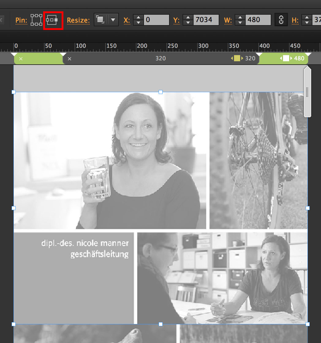
But I see, that the image tiles at breakpoint 480 are pinned to the right.
Unpin it, and all works fine.
Copy link to clipboard
Copied
Hello again,
I am sorry when I did not prepare the file as useful as you liked it. Next time I will do better. Promised.
Of course you are right, to reduce the pages.
Sometimes and this is my experience that items at top of the page cause unnatural behaviour to items that lay more at the bottom.
And the origin state of the fotos was unpinned, than the behaviour of the mobile menu appeared as that from the collages. I did change some things than tried this and that. In the end I am very happy that the site works well (till now), thanks to you guys.
Thank you again! This was most helpful.
Hanna
 AdChoices