 Adobe Community
- Home
- Muse (read-only)
- Discussions
- Full page width not working in wider breakpoints
- Full page width not working in wider breakpoints

Copy link to clipboard
Copied
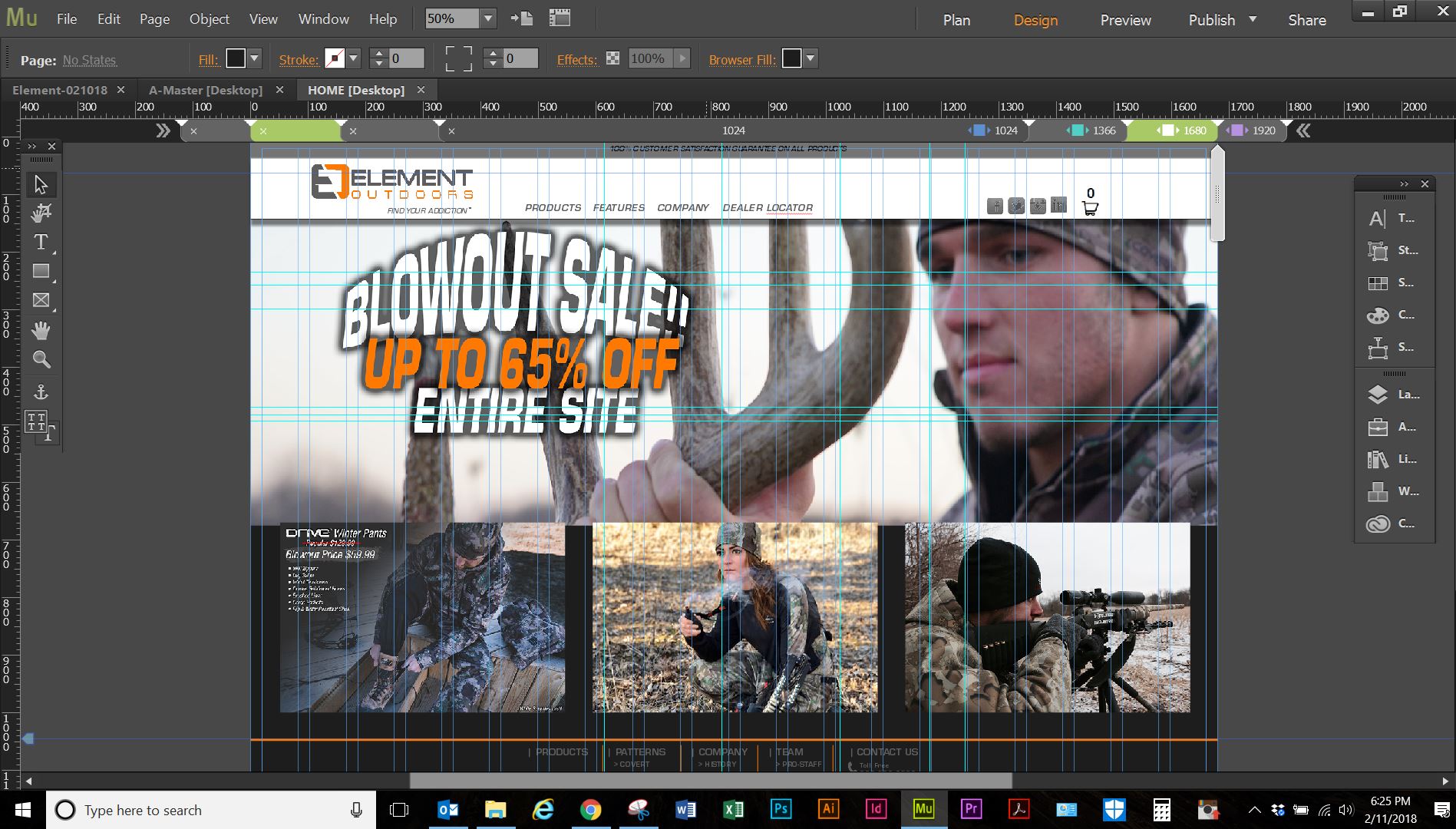
Guys I am pretty new to design and have been using muse for about a year. I have my site designed with 4 page breakpoints 1024/ 1366/ 1680/ 1920, in the wider breakpoints it cuts off the left and right side of the pages zoomed at 100% if I zoom out it shows the sides. I have nothing hanging out there past the sides and I am lost about whats going on.
I have tried multiple searches to fix this but I am sure it is going to be something I have overlooked.
Thanks in advance for any help!
Chrome at 100%


 1 Correct answer

The elements are set to „Resize: None“. So they have no choice but to bleed outside the breakpoint width. This of course causes a „clipped“ page view:
Set the composition target to „Resize: Responsive Width“ and the images below to „Resize: Responsive Width and Height“ and all works fine. Do this in every breakpoint, because the „Resize“ options are working breakpoint-wise.
Just keep in mind: No element on layout or master page is allowed in no breakpoint to be placed outside or overlap the page/b
...
 4
Replies
4
4
Replies
4
Copy link to clipboard
Copied
Might be the same or a similar issue as this one: https://forums.adobe.com/thread/2450223
If this doesn’t help, please share your .muse file with us. But delete all pages but one and on this page all elements except the „misbehaving“ image. Upload this .muse file to Dropbox, CC Files or a similar service and post the link here.
I think, the issue will be quite simple to understand (what not necessarily means, it is simple to fix).
Copy link to clipboard
Copied
My problem isnt an image, but both sides of the page getting cut off.
Here is the link to the file
https://www.dropbox.com/s/896dsm6mjv71qm7/Element-Test.muse?dl=0
Copy link to clipboard
Copied
The elements are set to „Resize: None“. So they have no choice but to bleed outside the breakpoint width. This of course causes a „clipped“ page view:
Set the composition target to „Resize: Responsive Width“ and the images below to „Resize: Responsive Width and Height“ and all works fine. Do this in every breakpoint, because the „Resize“ options are working breakpoint-wise.
Just keep in mind: No element on layout or master page is allowed in no breakpoint to be placed outside or overlap the page/breakpoint width.
Befor you follow these recommendations, please read this document and try to reproduce it with your file. This will clarify a lot:
https://forums.adobe.com/docs/DOC-8953
Additionally: It would be very helpful, if you delete the phone and tablet versions of your site, before sharing it (actual file size: 114 MB; without tablet and phone site: 6 MB). So, downloading your file lasted much, much longer than fixing it. Be aware, that not everybody has a fast internet connection.
Copy link to clipboard
Copied
Thank You SO MUCH!! This has been the problem all along, it works great now!!!
 AdChoices