 Adobe Community
- Home
- Muse (read-only)
- Discussions
- Re: Getting Manual Menu Text to Align Correctly at...
- Re: Getting Manual Menu Text to Align Correctly at...
Getting Manual Menu Text to Align Correctly at Small Fixed Width Breakpoints
Copy link to clipboard
Copied
I've hit a bit of problem using Adobe Muse when I create menus that will appear at small fixed width breakpoints.
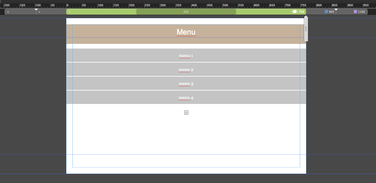
As a great fan of one page sites, I often create a Manual Menu and nest it within an Accordion Panel to enable visitors to jump down to anchors.
This system seems to work well, and everything always looks great in Adobe Muse.
However when I Preview the site in a browser, the menu content always appears too far to the left, and is never centred.
So I'm hoping that someone can advise me on what I'm doing wrong when I construct my mobile menu, or can tell me how to fix this problem.
This video - which I created for the Adobe Muse team on Twitter - shows how I currently construct my mobile menus and the challenge I face getting text to remain centred in the menu.


 8
Replies
8
8
Replies
8

Copy link to clipboard
Copied
First of all you don`t need the breakpoint at 320. There´s nothing to break anymore.
It is recommended to use fluid width breakpoints for mobile so in your case it would be a fluid width breakpoint at 768 and the minimum width of 320.
Then it should work fine.
I´m not sure, if fixed width breakpoints will even work with mobiles.
Your issue poinbts to this, too, I´m afraid.
Hope this helps
Uwe
Copy link to clipboard
Copied
I should have made this clear that I want to use Adobe Muse Scroll Effects in the site.
If I use fluid breakpoints then I can't use Adobe Muse Scroll Effects 

Copy link to clipboard
Copied
Ok, do it! 
Did you inspect my sample site? Please, forget it! As I noticed, this unfortunately is no viable solution.
If you use fixed width breakpoints, resize your elements breakpoint-wise and be careful, to introduce a new breakpoint, before your elements hit the page limits.
Copy link to clipboard
Copied
Ok. I'll be careful. Thanks for your advice
Copy link to clipboard
Copied
- You have a page with fixed width breakpoints.
- You place an accordion and set it to „Stretch to browser width“, what is not the same as "stretch to page width“, what you achieve by dragging the edges to the left/right to the page/breakpoint boundaries.
- You now place an manual vertical menu into the accordion, define it as „Responsive Width“ and drag the edges of the menu container to the left/right page/breakpoint boundaries
- The problem is: Your accordion is set to browser width and the menu is set to page width (browser width isn’t available for menus on fixed width pages.
Solution:
- Set your accordion in every single breakpoint(!) to „Page Width“ (define it as „responsive width“, and drag its edges to the breakpoint edges.
- Set the menu in every singkle breakpoint(!) to „Page Width“.
Look at this sample .muse file: https://www.dropbox.com/s/jneasa666d9h31r/fixed-width-menu-issue.zip?dl=0
Nevertheless: You have a page with fixeg breakpoint, what means, that normally your element are fixed and don't scale as well. I'd strongly suggest, not to use scaling elements in fixed width breakpoint. One these pages you normally resize your elements manually breakpoint-wise.
Copy link to clipboard
Copied
Hi Günter, thank-you for your reply and the file, which I've downloaded and had a look at now.
I understand where I have been going wrong and what I should do
Copy link to clipboard
Copied
For anyone following this thread, I'd like to make the following points.
1. ankushar40215001 - an Adobe employee - marked Günter's response to me as correct and not me. I am of the opinion that only the person with the original question should have the ability to do this and no one else.
2. If I can build and construct a mobile menu that behaves exactly the way I want it to in Adobe Muse, but it then doesn't preview or render correctly, that suggests to me that there are serious flaws in the engineering and QA of the product cycle. If Adobe don't want us to create this kind of menu then it shouldn't have been enabled or built into the product in the first place.
Copy link to clipboard
Copied
My final point on this UNRESOLVED ISSUE is that in basic terms Muse's Accordion widget is simply a container. This means that it should "contain" any content placed into it, regardless of whether the breakpoint is a fluid or a fixed one. Certainly when constructing elements in the application, it does this perfectly - see the video in my original post. However, for some reasons menus are allowed to breakout of the Accordion container when the site is previewed or uploaded. Again this points to a massive software engineering hole in the app which Adobe seem reluctant to address and fix.
 AdChoices