 Adobe Community

Copy link to clipboard
Copied
I may be misunderstanding, but I thought the idea of grouping things was to keep them together.
I have several photos on a page and want to add a frame with each persons name. I thew a few photos on the page to see what problems would arise. I grouped the name and photo together, but that frame moves off the photo and down the page as the browser width varies. Is this because one frame is varying by width and the other by width and height? Is there a way to keep multiple frames overlaying each other?


 1 Correct answer

No, this doesn‘t matter in this case.
One more information: Overlapping elements are a real problem in responsive web design — not because of Muse, but because of the way, HTML is working. Please have a close look at this screencast and you will see the reason and a way, how to handle these kinds of issues:
What makes it especially difficult: Text elements don‘t resize like images. They scale in width, but — other than images — grow in height to keep the text within visible. Perhaps you should thi
... 7
Replies
7
7
Replies
7

Copy link to clipboard
Copied
Hey brian704,
For you design requirement i would suggest using a thumbnail slideshow widget or a third party widget whichever you can find suitable from here - https://www.google.co.in/search?ei=qlz8WpLqJ8rerQGorpj4Dw&q=create+an+thumbnail+image+gallery+in+Mus....
You may also try filling a frame with the photo instead of placing it.
Regards,
Ankush
Copy link to clipboard
Copied
We aren't after a slide show, just the field of photos
Copy link to clipboard
Copied
This should work fine, if you place the images in a precise(!) grid without any overlapping:
Additionally, use a standard font or a web font for the headline instead of a system font and stretch the text box so wide, that it has the same width as the image grid below.
In your layout, the headline has to be converted to an image and therefore scales like an image. Additionally this „text image" only causes the images directly below it to react dynamically.
(The reason for text-to-image conversion in your case: Read my answer 4 in this thread: https://forums.adobe.com/thread/2357163)
Copy link to clipboard
Copied
I'll give that a try. Does it matter what order the items are in the layer list?
Copy link to clipboard
Copied
No, this doesn‘t matter in this case.
One more information: Overlapping elements are a real problem in responsive web design — not because of Muse, but because of the way, HTML is working. Please have a close look at this screencast and you will see the reason and a way, how to handle these kinds of issues:
What makes it especially difficult: Text elements don‘t resize like images. They scale in width, but — other than images — grow in height to keep the text within visible. Perhaps you should think about placing the text as a vector graphic and treat it like shown in the screencast.
Copy link to clipboard
Copied
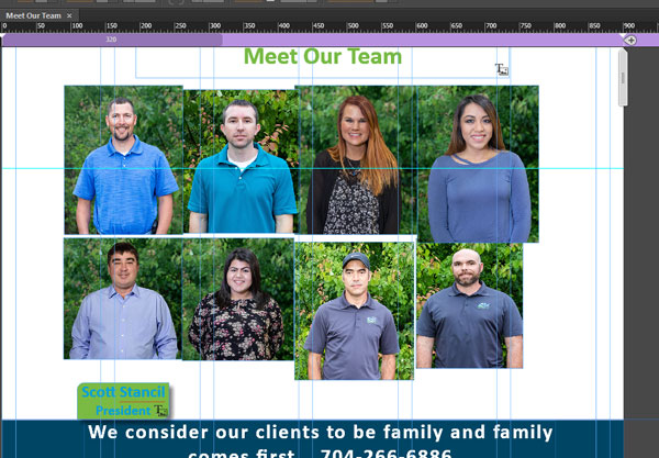
This is better, but the name still slides down. I can see why the problem happens. I'm not sure I understood how the added frame helps the situation. In this shot the name is a placed Illustrator file, but the same thing happened with an SVG and a Muze text frame. I guess it may be easier to just add the names to the photos. The size would shrink, but they would stay together.
Rewatched the video - i missed a step - I'll give that another try

Copy link to clipboard
Copied
After watching the video again I see that I missed a step. After I grouped the "ghost" frame only to the name, it worked correctly. The extra frame does need to extend from the top of the picture to the top of the name frame in order to work, however.
Thanks! Problem solved.
 AdChoices