 Adobe Community
- Home
- Muse (read-only)
- Discussions
- Re: grouped items not staying together
- Re: grouped items not staying together

Copy link to clipboard
Copied
How do you get grouped items to stay together across breakpoints? I have 5 elements in a group and have pinned them to the left at 1200 but when I go to 1100 and other breakpoints, at least 2 or 3 of the items have moved way down the page.
I thought grouping elements meant that they would always stay together, as if they were 1 element? Am I wrong? How can I get them to stay together?


 1 Correct answer

In addition:
You shouldn’t ask, how I managed it, that the elements are placed correctly, you should ask, why you yourself didn’t align them precisely. 
Look at this screenshot of your layout at breakpoint 1200 px, compared to the browser rensering:
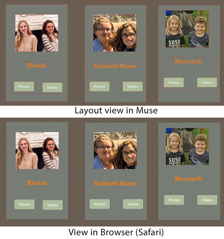
- The grey boxes aren’t placed at the same y-position.
- The images are placed at different y-positions.
- The text boxes are placed at different y-position and have different height.
- The buttons are placed at different y-positions.
Would you really expect, that
...
 20
Replies
20
20
Replies
20
Copy link to clipboard
Copied
Grouping in Muse is primarily a layout tool, not a way to keep element together on a web site (HTML doesn’t support this kind of grouping.)
Nevertheless, grouping may be very useful in responsive layout, but in a different way. Just read this thread:
https://forums.adobe.com/thread/2271454
In order to make this very clear for your specific situation, please share a simple, small .muse file (only one page, only some „misbehaving elements) with us, using Dropbox, CC Files, ….
Please follow these instructions: https://forums.adobe.com/docs/DOC-8652
Copy link to clipboard
Copied
OK, I've uploaded a very small version to Dropbox. And I only have about 5 breakpoints.

Copy link to clipboard
Copied
Is it the misalignment of the items in this group at 1100, and narrower, that you are asking about?
To begin, the spacing and distribution of the grey background rectangles, the image rectangles and the text boxes are mostly off.
Select that entire group and ungroup. Left group is ungrouped but the middle and right are still grouped.
Use guides or the Align tool to get the alignment and spacing correct.
At each breakpoint realign them as you wish for that size and so on and so on . . .
Copy link to clipboard
Copied
the Photos and Videos buttons are way down below on other breakpoints. And the pictures move off center on other breakpoints. Isn't there a way to keep them all together and aligned on all other breakpoints once I get them fixed and grouped on the 1200 breakpoint?

Copy link to clipboard
Copied
Grouping helps for elements to "stay together" in between breakpoints when you use fluid responsive layout. At breakpoints you have to /are able to change layout.
Let me add, that it is good practice to finish your design at one breakpoint completely before you start to use the scrubber (on the top right hand side, grey vertical tool for watching responsive behaviour).
You should create a new breakpoint as soon as the design starts to fail not earlier. 1200 to 1100 should not be a distance between two breakpoints.
Altogether you should avoid to use too many breakpoints – in an optimal fluid site you won't need any  , but of course with menus and so on you might need at least one breakpoint. Overall I recommend to use as little breakpoints as possible – 3 to 5 should really be enough, while 5 is really a huge amount of breakpoints. Too many Breakpoints make your site quite heavy.
Best Regards,
Uwe
Copy link to clipboard
Copied
I've gone back from using responsive with breakpoints to the original 3 size layouts (Desktop - Tablet - Phone) and just let the device's CSS do the job.
Copy link to clipboard
Copied
I would be happy to do that too if that works. I hate extra work. But I also want the elements to line up correctly on all devices. Does your method actually work on all devices?
Copy link to clipboard
Copied
Yes - Each device asks the server for the layout for itself.
Example: I, just this minute, make this as a way of showing you:
Go to http://troyforbes.com with your desktop then go to http://troyforbes.com/phone with your phone.
The latter just has a low opacity image there but you can see the layout is automatic.
Copy link to clipboard
Copied
It seems like we had the desktop-tablet-phone layouts for many years, then they were replaced by breakpoints, ostensibly because the older layout method didn't work well enough. Isn't the purpose of the new responsive design method to fix the problems of the older method?
Copy link to clipboard
Copied
Yes, but your site isn‘t responsive at all. You are using fixed breakpoints and your elements aren‘t set to be „responsive“. That is one reason for your problems.
Copy link to clipboard
Copied
I get confused by all the experts giving different advice. Dani Beaumont, who works for Adobe on Muse, advocates fixed widths for responsive sites but you're advocating fluid. What is an end user supposed to do with all this conflicting advice?
Copy link to clipboard
Copied
Never Dani adviced this! She only prefers to have one — the widest — breakpoint fixed, because this allows scroll motion effects. The other breakpoint remain fluid.
Since you don‘t intnd tohave scroll motion effect on your widest breakpoint, it would be no problem to revise your page using fluid breakpoints.
Basically, the difference between fixed and fluid breakpoints is, that in fixed layouts, the page keeps its width, until the the browser width, reaches a certain limit, what causes showing up a different layout, created for this width. Fluid layouts adapt the relative page width continuously, and are in some respects more difficult to set up.
Copy link to clipboard
Copied
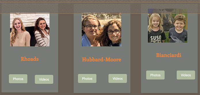
Here a very quick and dirty(!!) „reconstruction“ of your sample site in responsive mode, nailed together in some 15 minutes: https://www.dropbox.com/s/aicbeoqvyb81xa0/family-2017-small_Mod.muse?dl=0
If you compare it with yours, you will see the pros and cons. A responsive site is much more tricky to built, but – if done right – you don’t have to reposition the single elements breakpoint-wise.
Copy link to clipboard
Copied
Thank you!
How did you get the Photo/Video buttons to stay in the same place? Did you have to manually place them in each breakpoint? They went all over the place, mainly much lower, when I went to smaller breakpoints.
Copy link to clipboard
Copied
These buttons don‘t stay in their place, they shift upwards/downwards just according to the image‘s resizing.
Copy link to clipboard
Copied
In addition:
You shouldn’t ask, how I managed it, that the elements are placed correctly, you should ask, why you yourself didn’t align them precisely. 
Look at this screenshot of your layout at breakpoint 1200 px, compared to the browser rensering:

- The grey boxes aren’t placed at the same y-position.
- The images are placed at different y-positions.
- The text boxes are placed at different y-position and have different height.
- The buttons are placed at different y-positions.
Would you really expect, that these layout issues aren’t present in browser view?
You say „They [the buttons] went all over the place, mainly much lower, when I went to smaller breakpoints“.
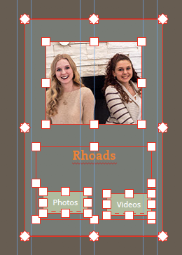
No doubt: You inadvertently repositioned the buttons and totally messed up grouping your elements in this case! Just look at this small screencast:
Ungroup, sort and reposition the buttons in each breakpoint, and you’ll see, that all will work. Not every upcoming issue is a Muse issue!
Disregarding these user-caused problems, it is correct, that objects normally have to be repositioned breakpoint-wise. Why?
First, breakpoints are – and have to be – independent from each other. If you place an element in breakpoint A it should not move in breakpoint B. And since the only reason for the existence of breakpoints is, to change the layout according to different screen sizes, elements, which are placed in one breakpoint, are waiting for you to be repositioned in another breakpoint. Muse isn’t allowed to do this, because, as already said, the layout of one breakpoint has to be independent from the layout of other breakpoints. So, this is unavoidable work, which remains left for you. For more informations about this, read my answer here: https://forums.adobe.com/message/8749608#8749608
You can use the right click commands „Copy size and Positions to …“ to help solving these kind of difficulties, but it will not help in any situation, for example:
- if you already have repositioned some elements in other breakpoints or, – and that is the case in your layout –
- if your elements are set to fixed width. In this case, they are not allowed to adapt the expected size in other breakpoints. (Little hint for fixed width pages: The „responsive width“ option in fixed width layouts, doesn’t cause the elements to shrink, when the browser window is reduced – this is not possible in fixed layouts by definition –, but causes the elements to adapt its relative size in other breakpoints.)
Finally: Before creating websites, it should be very clear, that web layout is not the same as print layout. Web layout is dynamical in more than one way, and the „art“ of web layout is to combine the necessities and restrictions of HTML with the creator’s intentions.
Web layout won’t work, if one uses the Muse layout like the canvas of a print layout application like InDesign, because a size-variable browser window is not a fixed size sheet of paper.
Copy link to clipboard
Copied
I noticed you got all the elements in each box to stay together by using State Buttons. That will help to solve my problem.
I wish Adobe or Lynda.com would offer a sort course in "Best Practices" for Muse for people who want to be as efficient as possible without having to re-design complicated layouts for each and every breakpoint.
Copy link to clipboard
Copied
The states button isn‘t there for solving the problem with your heavily misplaced buttons. This definitely happened due to a unintentional action on user-side.
If you create a Muse site by creating the largest breakpoint (and no other one!) first, design it, and add the other breakpoints, when you are almost ready, the repositioning of element isn‘t necessary any more in most cases.
Copy link to clipboard
Copied
I did indeed design for 1200 but when I went to the smaller breakpoints many of the buttons moved to all sorts of crazy places, which is what my original post was about.
So again, I'm trying to avoid repositioning tons of elements on each and every breakpoint. I want them to stay together. The State Button seems to be a viable answer.
Copy link to clipboard
Copied
As I said: No, it isn’t. Don’t mess your layout, that is my first advice. All of your issues are „home made“. But I already told.
If you think, the „States“ button is a "life saver" in this context, it is fine! Just go on …
About moving objects, there is not more to say, than I already did.
 AdChoices