 Adobe Community
- Home
- Muse (read-only)
- Discussions
- Re: Header in Plan view messing up layout
- Re: Header in Plan view messing up layout

Copy link to clipboard
Copied
I am trying to create a kiosk style html file that will be used on an iPad.
I want the page to be exactly 1366x1024, no bigger no smaller.
I don't want the page/site to be Responsive. (notice the site properties)
Here is what I have so far. Sorry about the blur but I had to sign a NDA.
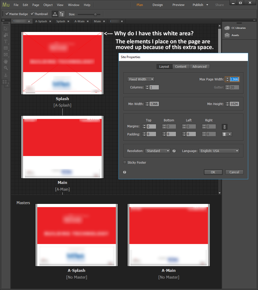
I think I removed the header and footer but I still see a white bar on the top of my pages in the "Plan" view.
It doesn't show up in the design view but any elements I add to the pages are push up when I preview.
Also you can see in the "Splash" page the full screen Red X... that is a full screen rectangle I am using to create a link to another page.
In "Design" it starts at the top of the red box and goes to the bottom of the page but in "Plan" it is pushed up to include the extra white space at the top.
Please help, this is a very time sensitive project!
Thanks!
Kevin


 1 Correct answer

If I understand correctly,
- you need fixed pixel dimensions for a kiosk system.
- you are using an iPad with a pixel resolution of 2732 x 2048 px and a logical resolution of 1366 x 1024 px.
If this is correct, you Muse page should be fixed width with the same dimensions (1366 x 1024 px). And exactly this is, what you did.
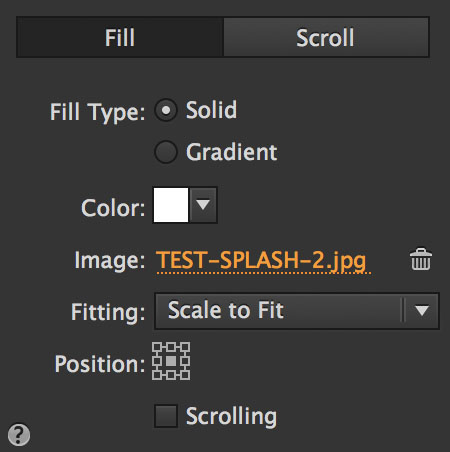
The error is, the definition of your image behaviour:
You used the image, which is correctly sized, as a browser fill and defined it as „Centred“ and "Scale to fit“:
So, if you preview
...
 10
Replies
10
10
Replies
10
Copy link to clipboard
Copied
No way out: Please make your site anonym, if it is under NDA, reduce it to only one page with only the elements shown in your screenshot, and share this .muse file with us. You may upload this .muse file to Dropbox, Creative Cloud or a similar file sharing service and post the download link here.
Copy link to clipboard
Copied
Günter,
Thank you for looking into this for me.
I have no experience with Muse so any help would be greatly appreciated.
Once again the problem I am having is with scaling and positioning of elements.
I need every thing to be in a fixed scale and position.
Here is a Google Drive link to my file:
https://drive.google.com/file/d/1RZ-rpdqsvpv3xI-yZqLKHAtSfw1NJDHu/view?usp=sharing
The site will be running as a kiosk on an iPad Pro 12.9 (native resolution 2732 x 2048)
but I wanted to keep the file size down so I was building the site half that resolution at 1366x1024.
-Kevin

Copy link to clipboard
Copied
You used browser fill to create a website. Your browser fill is an already finished image. This will not work.
I created a rough and dirty "layout", how your site might work.
Be aware of the fluid width breakpoints instead of the fixed width site.
I guess you should watch some muse tutorials first before starting to create website.
That your site might be "Time sensitive" makes me shiver, to be honest. It is, btw, not nice to load your pressure to us.
If you want to design tablet size website only, you should not start with 1366 breakpoint.
My example is not as a tablet site, instead I used your settings.
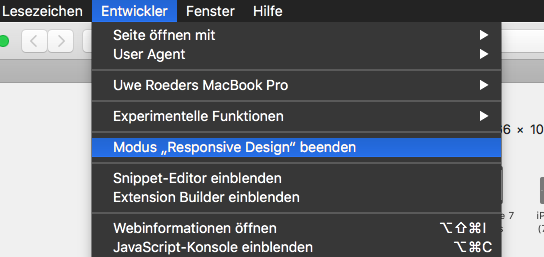
You may watch with tools like "Developer" how screen resolutions work:
This is a link to your SPLASH: Adobe Creative Cloud if you like.
I recommend to take the pressure out of your project and watch these: Adobe Muse tutorials | Learn how to use Adobe Muse CC
Best Regards,
Uwe
Copy link to clipboard
Copied
Uwe,
Thank you for your response.
I will look into the links you sent.
As far as the tutorials I went though most of what I could find about a year ago. I will go back and review but since this is not my main area of work my projects are far and few between.
My main area is After Effects and Premiere.
I am sorry about the Time Sensitive issue, it had not been my meaning to put the pressure on you and this forum. Just needed for people to respond quickly if they had an idea to offer. I need to have a working model by end of next week. My problem not yours.
I honestly thought this would be a relatively easy project for a novice and was just looking for a little guidance, my bad.
Thanks again,
Kevin
Copy link to clipboard
Copied
kevindennis schrieb
I am sorry about the Time Sensitive issue, it had not been my meaning to put the pressure on you and this forum. Just needed for people to respond quickly if they had an idea to offer. I need to have a working model by end of next week. My problem not yours.
I honestly thought this would be a relatively easy project for a novice and was just looking for a little guidance, my bad.
Thanks again,
Kevin
Not that big deal. If you follow my "NEW …" master pages you will see how muse "works" I guess.
The main issue was, that you used "browser fill". This is normally used for (don`t laugh) – Browser fill  .
.
This could be a colour or a pattern or a gradient. And of course you could fill the browser with an image.
You put the main content into browsers fill, that was the main misunderstanding on your side, I guess.
Now, that we all know how to play the game let´s check how we can help.
Could you explain a little deeper the "kiosk style"? And why your website should only be available on iPad/tablet.
Anyway:
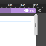
My suggestion, create a fluid width site with the "by default" dimensions of 960 and set the minimum width to 768.
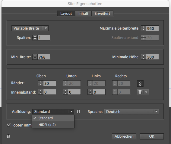
Take care of the elements that should appear on all pages, use the scrubber and go for it.
Best Regards,
Uwe
Copy link to clipboard
Copied
Uwe,
Thanks for your understanding.
I don't understand why you would use a fluid width.
Here's my setup:
The "site" will only be "hosted" locally on the actual iPad it's running on.
The iPads will have no internet access and will be used at a trade show for a vendor to display their materials.
The iPads will be "locked" with this file running.
We're using iPad Pros 12.9" display resolution of 2732 x 2048.
Browser window will not be able to be scaled as it will be locked in full screen mode with no browser menu or url access.
Hope this makes thing more clear.
Kevin
Copy link to clipboard
Copied
So, obviuosly you wouldn`t need anything else. But be aware that screen resolutions are not the same as resolutions/dimensions in web design. Watch this:
Best Regards,
Uwe
Copy link to clipboard
Copied
If I understand correctly,
- you need fixed pixel dimensions for a kiosk system.
- you are using an iPad with a pixel resolution of 2732 x 2048 px and a logical resolution of 1366 x 1024 px.
If this is correct, you Muse page should be fixed width with the same dimensions (1366 x 1024 px). And exactly this is, what you did.
The error is, the definition of your image behaviour:
You used the image, which is correctly sized, as a browser fill and defined it as „Centred“ and "Scale to fit“:

So, if you preview this page in a browser with a window size, which doesn’t match exactly your page dimensions, the background image will scale accordingly to the middle. This is the case, because you told the image to scale with the browser window in order to always display the whole image. In other words: When the browser window is smaller than 1366 px, the image scales down accordingly and shows this white „gap“ at the top and the bottom.
• The solution ist simple: Tell the image not to scale and set it to „Original Size“:
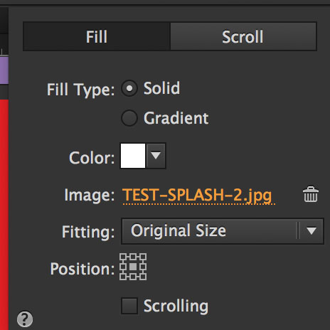
Now, your issue should be fixed.
- Annotation 1: As an alternative, you may switch to a HiDPI site (-> menu: File/Site Properties/Resolution: HiDPI). In this case, your images should have exactly(!) the double pixel dimensions (= 2732 x 2048 px) and you have to place (not fill) the background image onto your page. Additionally you have to use the „Transform“ panel to resize this image manually to 1366 x 1024 px. Muse places the image smaller to avoid inadvertently placing oversized images, which may extend the loading time of a page significantly.
- Annotation 2: On some of your pages you are using system fonts. This is not a good idea! You should use standard fonts or web fonts.Why? These fonts have to be converted to an image during output, and therefore don’t behave like text any more, but just like an image. To learn, why this behaviour is necessary, please read my post 4 in this thread: https://forums.adobe.com/thread/2357163
Copy link to clipboard
Copied
Just wanted to say thank you both for helping with this project. I have used ideas from both of you and the pages seem to be laying perfectly.
My test iPad arrives today so I can see how it will work on the same device as we will be using at the trade show.
Wish me luck!
Thanks again for your help and patients.
Kevin
Copy link to clipboard
Copied
No luck necessary, only Muse skills! 
 AdChoices