 Adobe Community
- Home
- Muse (read-only)
- Discussions
- Header - Pinning objects to top, makes them move o...
- Header - Pinning objects to top, makes them move o...

Copy link to clipboard
Copied
I have a site which is setup with a fluid breakpoint at 1340. It has the double arrow device on breakpoint window facing inwards.
I have in the header a 1) logo 2) menu.
I would like these to stay pinned to top of page (For scrolling) - yet also I would like them to be pinned to edge of breakpoint, so that they move in unison together with unpinned items - as you would expect.
However, when you pin an object to top of page, it has its own reference point which is no longer related to the rest of the unpinned content. That is to say it does not align horizontally.
All I want is the logo and menu bar to stay left and right aligned to edge of 1340 breakpoint, when the window size increases AND be pinned to the top of the page to enable the header to stay in position when scrolling. Seems like both cannot be achieved.
Have a look here at this page, and resize the window horizontally from 1340 downwards and watch what I mean with the logo and menu bar.
1) Yes, I have tried grouping in another container and pinning to top, or combinations thereof, to achieve the two conditions above
2) Pinning to top and edge of browser means that the objects move outwards in a larger browser breakpoint (thus ignoring the double arrow device)
3) And regrettably, adobe have not built a pin to top and edge for responsive elements, otherwise I could have placed them in a container pinned to top. The objects do not inherit the behaviour of the container they are placed within (Grouped or not)
The one solution is to make a larger breakpoint and then change the pin to top & browser edge on the smaller breakpoint.
You can see this solution in action here on the home page I have created using this method.
But I am trying to avoid making a larger breakpoint as it seems you cant have a larger breakpoint on master without having to create one for every child page. And therefore, multiplying work by having to do an extra breakpoint for every single content page.
Any other ways please?
Cliff


 1 Correct answer

Not 100 % sure, if I understood you correctly, therefore let me paraphrase your intention:
You want a responsive page with a header containing a logo, a menu, both sitting on a coloured rectangle, which spreads browser-wide.
You want the logo and the menu move corresponding to the width of your browser window, but only to a certain point: The element should move from/to 1340 px. If the browser window spreads wider, the responsive behaviour of the logo/menu should stop.
If it is this, what you want,
...
 3
Replies
3
3
Replies
3
Copy link to clipboard
Copied
Not 100 % sure, if I understood you correctly, therefore let me paraphrase your intention:
You want a responsive page with a header containing a logo, a menu, both sitting on a coloured rectangle, which spreads browser-wide.
You want the logo and the menu move corresponding to the width of your browser window, but only to a certain point: The element should move from/to 1340 px. If the browser window spreads wider, the responsive behaviour of the logo/menu should stop.
If it is this, what you want, you can achieve this in that way:
- On master page, set the logo to left-pinned and the menu to right pinned at breakpoint 1340 px.
- On master. add a fixed width breakpoint at for example 1500 px and remove all pinnings for this breakpoint.
- Select the header elements (rectangle, logo, menu), open the „Scroll Effects“ panel, check „motion“ and set all values to „0“. This causes the elements to stay, where they are.
- Now go to to your layout page.
- If you don’t have this fixed width breakpoint on your layout page/s: Look at the breakpoint bar, where you’ll see a small triangle. Click onto it and afterwards click onto the appearing „+“ icon. This will create a breakpoint on your layout page too:
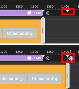
- Set this new breakpoint to „fixed width“.
- Now, all elements react responsively up to 1340 px and fixed at a larger browser width.
More work isn’t necessary.
Here you see a sample site. You may download the corresponding .muse file directly from there:
http://sample-pinning.businesscatalyst.com/index.html
Hope, I understood your intentions correctly. Otherwise push this posting into the thrash! 
Copy link to clipboard
Copied
Hi Günter,
Let me start by thanking you for your help - your paraphrasing is spot on and this is exactly what I am trying to do.
I did this in a roundabout way initially, by creating a 1920 breakpoint, and then not actually using the motion panel at all - Merely, by selecting align to top and edge pin on 1340 breakpoint and just top edge on 1920 fixed breakpoint - Which gave me similar results.
But what I was having an issue with, was the extra effort to create the greater fixed breakpoint layouts for multiple pages. What would you do? Merely finish the design at 1340 and then copy across to the larger breakpoint? Or am I creating a whole bunch of work that doesnt need to be that way?
Cliff
Copy link to clipboard
Copied
Again: If I understood correctly :
- Add the wide, fixed width breakpoint on your master page.
- Go through your layout pages and click onto the small triangle to add this breakpoint to the layout page and – important – set it to „fixed“.
Or even simpler:
- Add the wide, fixed width breakpoint on your master page.
- Place an element of your choice (whatever you want: rectangle, image, …) onto your master.
- Copy it (cmd +C) and delete it when copied (or „cut“ it = cmd+X).
- Go to every layout page and choose menu „Edit/Paste and Create Breakpoints“ and delete the element afterwards.
 AdChoices