 Adobe Community

Copy link to clipboard
Copied
Hi!
Can someone help me with my site:
1) Hamburger doesn't automatically close.
2) Hero banner not parallax (mobile)
3) Hero banner not full image (mobile)
4) Parallax banner not parallax (mobile)
5) Parallax banner not high resolution (mobile)
6) Portfolio img no high resolution (mobile)
How is this possible and what can I do about it?
Please help me!
Joey


 1 Correct answer

For your hamburger menu you should contact "Musefree", I´m afraid. Just don` tknow, if this widget is intended to work with onepagers in 2018-version.
For the rest, there might be a slight misunderstanding. We don`t do websites for others, we help others with their issues  .
.
So reading the suggestion from my earlier post form Guenter, you may see, that we please users to show us one page with issues.
We cannot inspect whole sites, search for the page with your issues.
That means in your case, just th
...
 5
Replies
5
5
Replies
5
Copy link to clipboard
Copied
1) How did you set up your mobile menu? Accordion? Composition? For one pagers, only menu will auto close.
2) mobiles deny parallax in most cases or it gets at least wacky (in most cases)
3) Not full image? What does that mean? Full width? Set your image to stretch to browser width, I guess.
4) look No. 2)
5) look No 2) and 4)
6) How did you set up your high res image? Double Size of the normal resolution, needed for mobile?
There are many ways to make things possible, best way to get help – provide a link, so we can see more.
2nd best way – provide a .muse by following these rules: Please Provide a .muse File to Help Us Fixing Your Issue!
Best Regards,
Uwe
Copy link to clipboard
Copied
Hi Uwe,
Thank you for your response back.
This is the link to my file (Dropbox) : Dropbox - joeycallidesign_website.muse
1) Composition 'Sexy Hamburger Menu' widget (Sexy Hamburger Widget for Adobe Muse by Musefree )
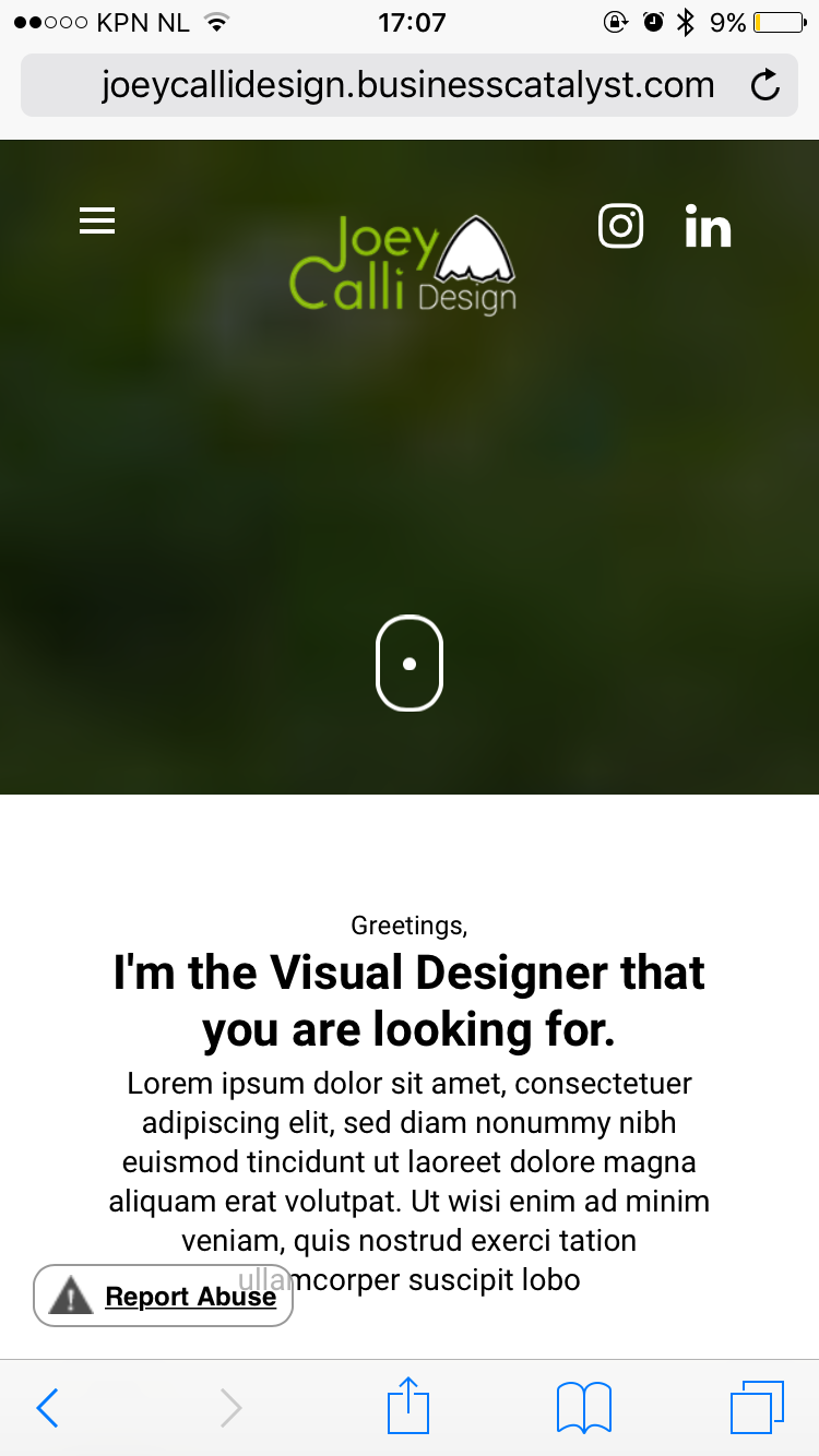
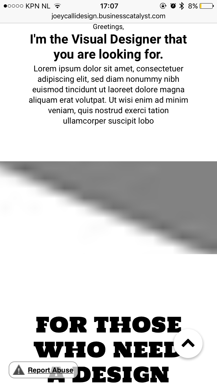
3) What I mean with 3 is that my image isn't clearly (see attachment).
6) I saved it as a Maximum .jpg and the img is on the desktop good but on mobile bad.
I hope that you can help me out. Thanks a lot!
Joey
Copy link to clipboard
Copied
For your hamburger menu you should contact "Musefree", I´m afraid. Just don` tknow, if this widget is intended to work with onepagers in 2018-version.
For the rest, there might be a slight misunderstanding. We don`t do websites for others, we help others with their issues  .
.
So reading the suggestion from my earlier post form Guenter, you may see, that we please users to show us one page with issues.
We cannot inspect whole sites, search for the page with your issues.
That means in your case, just the HOME would have been enough  .
.
On my side your image appears well on mobile, I was not able to reproduce this issue.
The hamburger menu scrolls with content, if this is meant to be self closing after clicking, ask MUSEFREE.
Your breakpoint at 320 is unnecessary, because no smaller devices than 320, so nothing to "break".
Set 320 as the minimum width. Maybe then your image-issue disappears ask well? Like I said, looks fine to me, …  .
.
For mobile, although you did right with the decision to use fixed width breakpoints all over the site, it still is not recommended for mobiles. Some handle it well, some don`t. Personally, on mobile it does not seem to be the most important feature, as it only happens for the hero image, but of course it is your decision (remember? we don`t do websites for others  ).
).
It is quite common to use fluid width breakpoints for mobile, maybe this solves the image issue as well?
Best Regards,
Uwe
Copy link to clipboard
Copied
Hi Uwe,
Well thank you for the effort and I will try to fix it ^_^!
Joey
Copy link to clipboard
Copied
You´re welcome all day long .
Uwe
 AdChoices