 Adobe Community
Copy link to clipboard
Copied
I made website, one page for mobile devices and couple pages for PC.
So for mobile I have all in one page (home, contacts, gallery..etc) and for PC, home is one page, contacts 2nd page, gallery 3rd...
My question is, is it possible to do, if I open link, page "contacts" for PC on mobile device, can that link automatically lead to that one page (first page) where is design for mobile device?
So I do not have to make again desing for mobile on that page too, because it's already there on first page.
 1 Correct answer
Right, this would be quite impossible, because if you send someone the link - www.mysite.com/contact.html and that is not associated with your phone site, then it will open the desktop link only.
As per my suggestion, it would be best for you to create an alternate phone layout in the same file, and anyone who will access the link the phone will automatically redirect to the phone site.
However, this confusion is only there if you are intending to share particular menu links with the viewers.
With
...Copy link to clipboard
Copied
From what I understand from your post, you are using adaptive layouts - creating separate sites for mobile and web. In that case, what you are trying to do is not possible.
I suggest using responsive design instead.
Copy link to clipboard
Copied
In case you did not understand me.
I'm using breakpoints so I can have responsive design as you said.
For example, from breakpoint 720 and higher it's as I call it PC design, and from 720 to 360 is mobile design as I call it.
So my first page, home page. On that page for mobile design, I put all content (home, gallery, audio...etc) on that one page, so basically to breakpoint 720 whole site is one page site. And after breakpoint 720 I didn't want to be one page site anymore. So all that content (gallery, audio...) I did new pages for that content.
And what worries me, if someone visits from mobile device directly "gallery" page via copied link it will show design from breakpoint 720, and in my case this is PC design, because on that page I didn't create design for mobile devices, yet.
So I just asking is it somehow possible to connect automatically that "gallery" page with first page if somebody is on mobile device go automatically to that first page to that content, and If you on PC stay on that page.
Maybe there's some trick to do that ![]()
Copy link to clipboard
Copied
Not that I know of. Hopefully someone else here has an idea. My reply will help bump the thread.
Copy link to clipboard
Copied
Thank you for your support.
Copy link to clipboard
Copied
If I understand it right, you use a one-page layout for mobiles while you use a "several-page" layout for desktop?
If you now link the gallery button of the mobile approach to the mobile gallery and the desktop gallery button to the desktop gallery – does this help?
If I misunderstood your issue, let us know.
Best Regards,
Uwe
Copy link to clipboard
Copied
Yes, you are right about "one-page layout for mobiles while you use a "several-page" layout for desktop", this is true.
But I was not asking how to link gallery button. I'll post more detailed after this post.
Copy link to clipboard
Copied
Hey there,
A working URL of your site shall help us better understanding the issue and easy to get a solution.
Please share one with us and we will investigate further.
Regards,
Ankush
Copy link to clipboard
Copied
I have not uploaded yet to any server for test, because site is still work in progress. When I'll be done with most stuff, then I can put link.
I can try to explain it like this for now.
Just for example, let's say link of my website is:
www.mysite.com
(This link is not my site, I just give it an example).
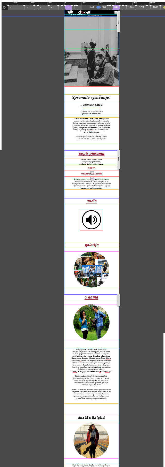
So when would you visit this site on mobile device that first page would look like this:
[url=https://www.uploadhouse.com/viewfile.php?id=26011792&showlnk=0] [/url]
Because I made from breakpoint 320 to 720 show all content in that first page.
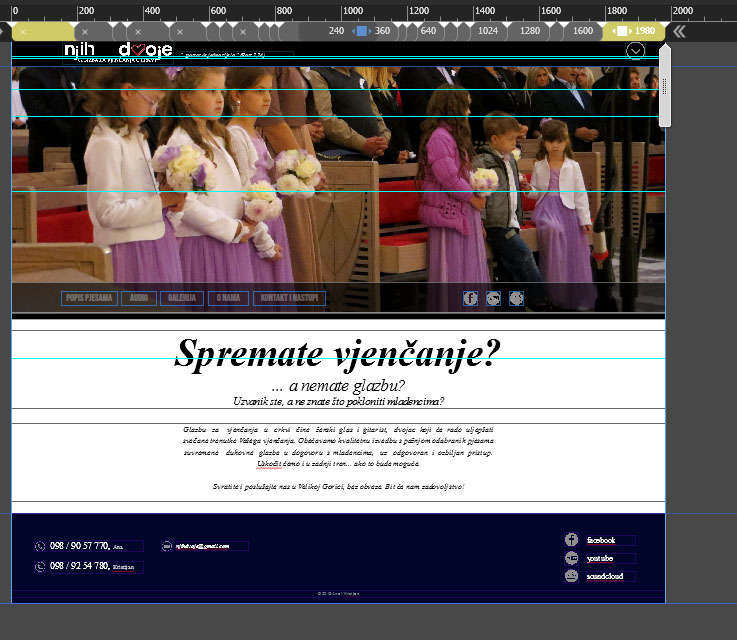
And if you visit that link if you on PC, then first site would look like this. Because from breakpoint 720 and higher site is not anymore one page site.
[url=https://www.uploadhouse.com/viewfile.php?id=26011795&showlnk=0] [/url]
And that's all working fine, depending on which device you access the site it will show first or 2nd layout I made. And thats great.
But, what If I wanna send somebody just some specific information of my site. Say I wanna send direct my "contact" content.
So for device with lower resolution of 720 then I would send this link:
www.mysite.com/index.html#contact
(Because that content is on first page)
And for device with higher resolution it will be this link:
www.mysite.com/contact.html
(Because that content is on differante page)
But because I do not know from which device the person will access that link I can't send that direct link to "contact" content.
So what I can do is:
1. Send just regular link of my site www.mysite.com, and say person visit "contact" from menu.
2. Or I can make in adobe muse again for that page "contact" layout for mobile devices too. Then I will be able to send that direct link to person and it will be no matter what device person use because that page will be OK for all devices.
My question was is it somehow possible to connect automatically that "contact" page with first page if somebody is on mobile device go automatically to that first page to that content (what would be this link then:www.mysite.com/index.html#contact),
and If you on PC stay on that page (www.mysite.com/contact.html).
Yes, I know that's probably impossible to do, but I had to ask ![]()
Copy link to clipboard
Copied
Or my next question would be:
If you are on mobile device via browser (chrome), and you wanna access facebook page:
www.facebook.com
You can't, it automatically lead you to this link:
m.facebook.com
Only if you turn on "destkop site" option in chrome then you can access that facebook.com link.
So is something like that possible to do with adobe muse?
Basically that would be my question of this thread.
Copy link to clipboard
Copied
Right, this would be quite impossible, because if you send someone the link - www.mysite.com/contact.html and that is not associated with your phone site, then it will open the desktop link only.
As per my suggestion, it would be best for you to create an alternate phone layout in the same file, and anyone who will access the link the phone will automatically redirect to the phone site.
However, this confusion is only there if you are intending to share particular menu links with the viewers.
With just www.mysite.com site will be adjusted according to the device.
For your next question: this can be possible only if you create a separate phone layout.
