 Adobe Community

Copy link to clipboard
Copied
Hello,
Looking for help please. Currently testing my site before it goes live and struggling with breakpoints and pinning.
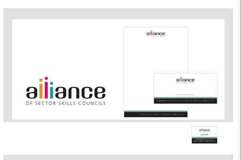
Here is the link - Carswell Creative | Logos, branding and stationery
If you just concentrate on the example on the top (Tool Hire Express) you'll see that when the browser width is reduced the logo and image start to reduce in size. This is fine and exactly what I want, but when you you get to a certain point the logo and image start to drop down so that they're not centred within the white box.
Can anyone suggest how I caould rectify this? I want the logo and image to get smaller as the browser window gets smaller, but I want them to remain centred within the white and grey boxes.
Thanks!


 1 Correct answer

As Uwe says, make the image and logo container box the same height as the grey panel
 3
Replies
3
3
Replies
3

Copy link to clipboard
Copied
The two boxes have to be the same height. Your logos (it´s all the same for all brands, right?) should be placed in a box with the same height than the pictures on the right hand side.
This has to be done in PS as far as I experience or any graphic software like Indesign or similar.
If you create rectangles (in PS as well) for the right hand parts, you could also avoid this misalignment at smaller breakpoints.
Does this help?
Best Regards,
Uwe
Copy link to clipboard
Copied
As Uwe says, make the image and logo container box the same height as the grey panel
Copy link to clipboard
Copied
Perfect, thenk you both!
 AdChoices