 Adobe Community
- Home
- Muse (read-only)
- Discussions
- Re: Home page image and header don't align?
- Re: Home page image and header don't align?

Copy link to clipboard
Copied
I created a one page scrolling site and the header/navigation do not align when I test it using preview or business catalyst. Everything else within the site is fine. It's not a responsive but fixed width site. The navigation/header is pinned to the top to appear on every page when a link is clicked. Can't figure out why the homepage does this. whats weird is it will align when condensed to 1160px, outside of that dimension it staggers. What am I missing and what's the solution? This has been very frustrating. I've attached the business catalyst link.
Thanks


 1 Correct answer

Try using a rectangle tool (not the Frame tool), then in the fill menu add your image, and make it scale to fill. and make it resize: stretch to browser width. On a wide screen monitor you're going to lose a lot of the image so you may have to add something more to the main pic first to make it fit.
On my wide screen monitor all your pics are doing the same thing and not stretching to the browser width. so you may need to do the same with those if you want them to fill the browser.
Hope that helps
 3
Replies
3
3
Replies
3

Copy link to clipboard
Copied
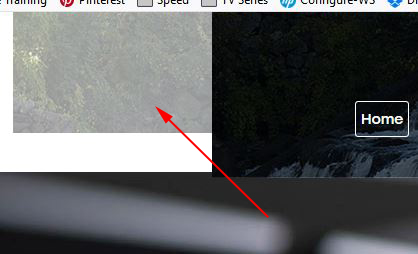
For starters what's this image being used for? It just seems to be sticking out on the left when not covered by other content.
Your content area is 1402 px wide:
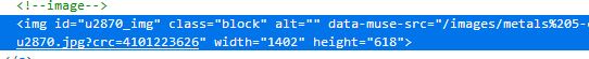
Your NAV bar background is 1161 px wide: 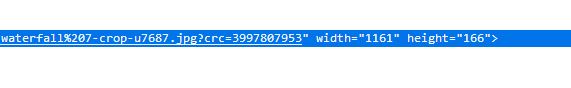
Check that your Site Properties are set to Fixed Width with 1402 as the width
Checkj that the Page Properties are set to Fixed Width
Up in the properties bar make sure the W - H link is broken then set the width to 1402
Drag the NAV image (waterfall) into place
I also just noticed the content area on pages other than Home is 1160px where your NAV bar is 1161 and the Home content width is 1402.
Suggest maybe starting with all the content the correct dimension
Copy link to clipboard
Copied
Thank you for picking up on the dimension issue after some trials and tribulations I finally got things worked out and no longer have the issue. Excuse my delayed response but again thanks for your help. Sometimes the obvious is not so obvious.
Copy link to clipboard
Copied
Try using a rectangle tool (not the Frame tool), then in the fill menu add your image, and make it scale to fill. and make it resize: stretch to browser width. On a wide screen monitor you're going to lose a lot of the image so you may have to add something more to the main pic first to make it fit.
On my wide screen monitor all your pics are doing the same thing and not stretching to the browser width. so you may need to do the same with those if you want them to fill the browser.
Hope that helps
 AdChoices