 Adobe Community

Copy link to clipboard
Copied
Hi
I'm building my website from an existing foundation which was created by a previous colleague. The website utilises the automatic Muse default horizontal menu widget which when breakpoint 725 is reached it changes to an accordion hamburger style.
I can see the accordion graphic in my Muse layout and when previewing in a browser but it doesn't work so the widget itself must be missing. Can anyone advise how I find this or update it?
Also my site now consists of 20 pages including child pages - I'm assuming the accordion menu will automatically picke these up?
Obviously I'm unable to test my site on any mobile device due to the navigation not working so any help would be much appreciated!
Many thanks
Kim
Please see example here:


 1 Correct answer

I "must" start with your master and the overall understanding of breakpoints.
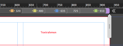
You really do not need that much breakpoints from 935 to 910 and so on. And there´s no need for breakpoint at 320. It should be minimum width of 320. Saves time and data on your ftp.
Your form uses system fonts instead of web fonts.
That leads to strange scaling behaviour.
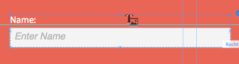
I can not see any accordion, I realize an empty text box beside the hamburger and I see the hamburger:
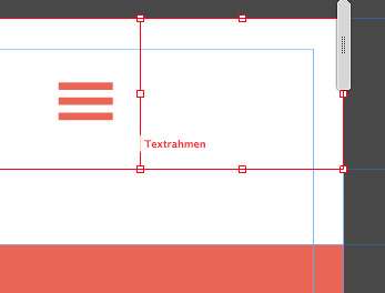
Also in your layers palette there´s no accordion.
U
...
 5
Replies
5
5
Replies
5
Copy link to clipboard
Copied
Also working in prerelease?
Uwe
Copy link to clipboard
Copied
Can you please post a screenshot of what you can see? When I view in my browser nothing happens when I hover over the accordion??
Copy link to clipboard
Copied
I "must" start with your master and the overall understanding of breakpoints.
You really do not need that much breakpoints from 935 to 910 and so on. And there´s no need for breakpoint at 320. It should be minimum width of 320. Saves time and data on your ftp.
Your form uses system fonts instead of web fonts.
That leads to strange scaling behaviour.
I can not see any accordion, I realize an empty text box beside the hamburger and I see the hamburger:
Also in your layers palette there´s no accordion.
Uwe
Copy link to clipboard
Copied
Ok what's the normal amount of breakpoints?
Is it best for me to delete the hamburger and recreate??
Copy link to clipboard
Copied
There´s no "normal". Just use breakpoints, when the design/layout starts bleeding outside the canvas or when elements do not fit any more. Quite common are 1200 – 960 - 768 with a minimum width of 320.
But these are just numbers regarding to devices. As the number of devices increases, it is not a strict rule.
In your case it was, that breakpoints were very narrow (910-935). This should be avoided.
Uwe
 AdChoices