 Adobe Community
- Home
- Muse (read-only)
- Discussions
- How Do I Design This "Simple" Site...???
- How Do I Design This "Simple" Site...???

Copy link to clipboard
Copied
hello again...
Purchased the app for 1 month, to try out. I am attempting to design a site for my local area of NA [from scratch...now in Muse...one that had previously been designed in Macromedia DW 2004...whereby all the child divs were of 'absolute' positioning; & resided inside a parent div set to margin: 0 auto...so everything was centered on the page (over a background image)]...but absolute positioning is horrible for responsive code construction; & I want our new site to be up to protocol for browser resize & smaller devices.
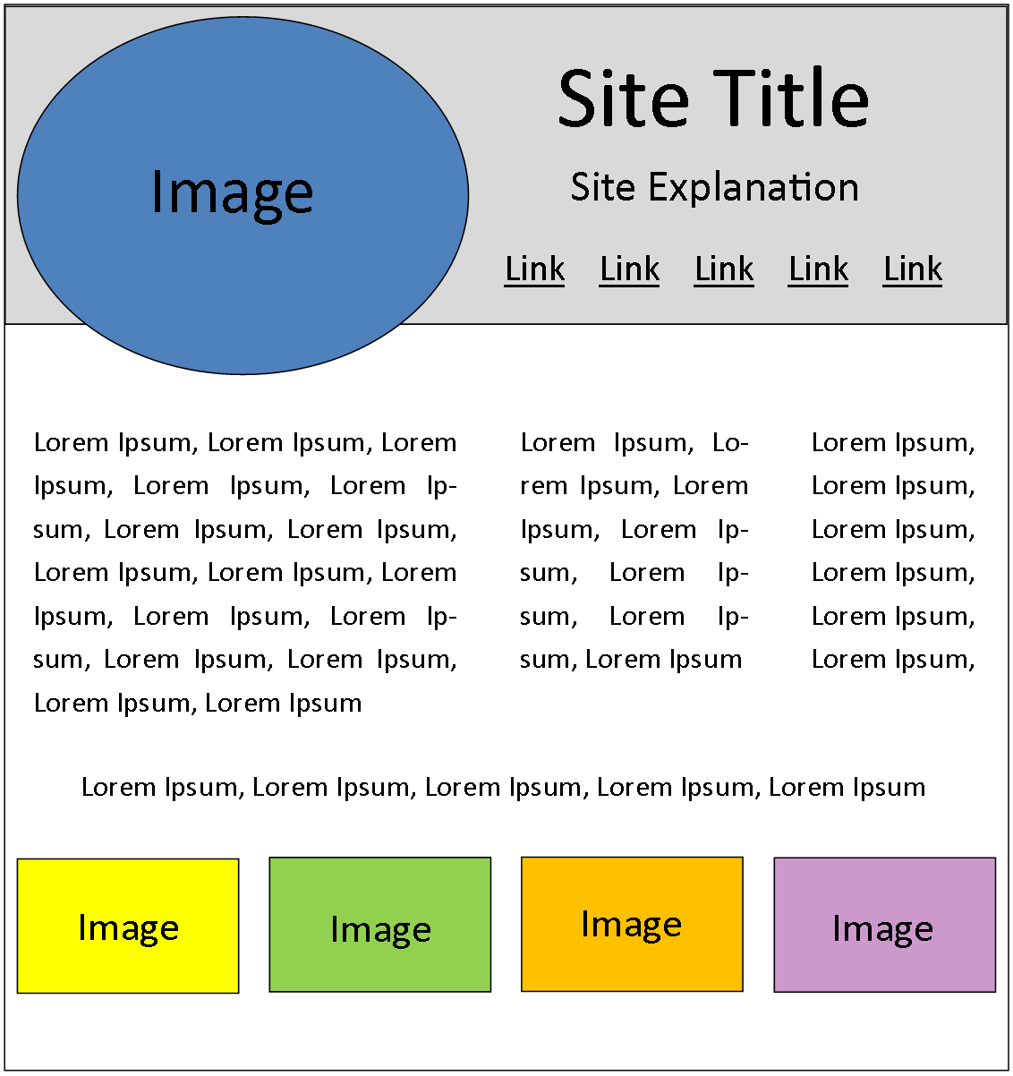
So...given the conspicuous lack of templates in Muse...I worked up a rough sample of what the site looks like...(it's very simple, so this should be easy, right?):
My questions are:
1) I heard/read somewhere that there is a SKETCH functionality in Muse...if this is true...can I use it to sketch out the above; & then build the site from there?
2) Can I simply just use the Rectangle Frame tool for the parent div & the Rectangle Tool for the child divs?
2) If not one of those two...how would I go about designing this simple site in Muse on my own...???...keeping in mind that all that you see above is always centered on the page (w/ a background image behind it)...& the page has to be responsive, whereby all you see is distributed/flows correctly for browser resize & smaller devices.
3) Please don't send me to such-and-such tutorial or such-and-such code learning online seminar...I just want to do this on my own, so as to learn the basics of Muse along the way...(& if it turns out I'm too stupid for this task...if someone could put together a starter code page, where I could then place my own blocks/images/text...I would be happy to pay you, in kind...I just need to get this done; & my local area is waiting).
thanx,
mark4man
(p.s., that top block is not a header or paragraph or anything, it's just a rectangular space filled w/ the color gray)


 1 Correct answer

If it matters, Adobe has announced the Muse EOL which means there is little future for this product beyond today. Tech support will extend to March 2020 but Muse will not be updated. So it is what it is.
Adobe Muse EOL announcement - Alternatives to Adobe Muse?
If you're serious about creating websites, I highly recommend using native web technologies or at least find another drag & drop app you can use to reach your goals while your commit to learning HTML, CSS and JavaScript coding.
...
 8
Replies
8
8
Replies
8
Copy link to clipboard
Copied
(sorry about the mux-up on the question #'s...this forum doesn't permit editing)
Copy link to clipboard
Copied
If it matters, Adobe has announced the Muse EOL which means there is little future for this product beyond today. Tech support will extend to March 2020 but Muse will not be updated. So it is what it is.
Adobe Muse EOL announcement - Alternatives to Adobe Muse?
If you're serious about creating websites, I highly recommend using native web technologies or at least find another drag & drop app you can use to reach your goals while your commit to learning HTML, CSS and JavaScript coding.
W3Schools Online Web Tutorials
I would be happy to show you how to create a responsive site based on your prototype in Dreamweaver. Let me know if you're interested.
Nancy
Alt-Web Design & Publishing ~ Web : Print : Graphics : Media
Copy link to clipboard
Copied
Nancy OShea...
Thanx!.
Yes...I am (interested)
mark4man
Copy link to clipboard
Copied
markf26988182 wrote
Nancy OShea...
Thanx!.
Yes...I am (interested)
mark4man
OK, this is a responsive layout I whipped up in Dreamweaver using Bootstrap 4. I had to take a few design liberties to keep it responsive in all devices. View source in your browser to see the code.

NOTE: The navbar sticks to top in all browsers except IE11 :-((
Design responsive websites using Bootstrap in Dreamweaver
Building Responsive Design in Dreamweaver CC, with Paul Trani - YouTube
Alt-Web Design & Publishing ~ Web : Print : Graphics : Media
Copy link to clipboard
Copied
Nancy...
Fantastic...!!!...thanx a billion.
OK...this is what I have thus far (worked this up in Pinegrow...kinda disgusted w/ Muse at the moment):
Burlington County Area of NA / Home page
So...a few basic questions:
1) The semi-transparent rectangle around the oval logo image...is there a way to bring the base up (reducing it's depth from the bottom, or overall) so as to look more like my example; & still retain the depth of the logo image (whereby it's depth would extend beyond, deeper than the rectangle)? [kinda like the old layer concept was set up...overlapping elements & the like. That logo could even extend down into the navbar (without interrupting the content, that is)]
2) Is there a way to move everything closer to the top of the page (slightly)?
3) The 3 columns...is there a way to move them up (more toward the top) slightly?
4) Speaking of the 3 columns...how do I change the overall maximum width (which I'm assuming is the main container) & the individual widths of each column (div columns sm-7, sm-6 & md-12)
Thanx again; & thanx for taking the time to work that template up...very much appreciated...this places me way down the road toward completion...much further (& with a much more beautiful design) than prior.
mark4man
Copy link to clipboard
Copied
When you go down the perdition path of absolutely positioning a logo as you have in your mock-up, it creates problems for users & designers alike.
1) Positioning removes your element from the normal document flow such that it has no relationship with other content on the page. This is fine for rare situations like modal windows but it's not a good practice in primary or responsive layouts where the layout is changing to the user's device width.
2) Because the navbar sticks to the top, an oversized logo is going to get in the way. Most designers put a small logo inside the Navbar-Brand which is what it was intended for. See screenshots.


I invite you to look at other responsive websites to see how they deal with logos on all devices. In most cases, keeping it simple is the best course of action.
Incidentally, a 1200px GIF is way too large. You need to resize and optimize for the web first in Photoshop. For photos, JPGs give better image quality than GIFs. For vector graphic logos, export to SVG.
For all other questions, look at CSS margins and padding.
Also review the Bootstrap 12-box grid system.
https://getbootstrap.com/docs/4.0/layout/grid/
Alt-Web Design & Publishing ~ Web : Print : Graphics : Media
Copy link to clipboard
Copied
(never mind on #3...figured that out myself)

Copy link to clipboard
Copied
1) There is Comp and that is what I think you are looking for
demo (about an hour in) from Max showing Comp CC with Muse https://images-tv.adobe.com/avp/vr/f9a22e0b-df84-4fab-95fd-82db9072a993/8899f4b9-f47f-4929-b75e-2637...
2) Yes... its not a great way to make a true responsive site but you could
2) I would have designed it like this Create a responsive website |
3) Muse is dead and this design of yours will be hard to make in Muse (responsive) so I would use pinegrow but there are dozens of other platfroms... even Dreamweaver can make it so use the software that works best for you mate
 AdChoices