 Adobe Community
- Home
- Muse (read-only)
- Discussions
- Re: How I can to set fixed objects in the browser ...
- Re: How I can to set fixed objects in the browser ...

Copy link to clipboard
Copied
Hello,
I have a site and I made an alternative layout for mobile device.
but I have a panel and other objects in the header which must remain fixed high in the browser.
How can I do and remaining in fluid mode?
Thanks for support


 1 Correct answer

I see! I overread, that you have an alternate layout! Sorry for that.
Since mobile devices in most cases don’t display pinned elements correctly, this option is disabled in alternate layouts. (If you create a fixed width breakpoint in an appropriate size, all will work well.
But you can achieve the same thing by using scroll effect, if the mobile layout is set to fixed width. (A fixed width alternate layout should work fine, because the so called „viewport scaling“ customises the layout width to t
...
 3
Replies
3
3
Replies
3
Copy link to clipboard
Copied
Could you please elaborate your question?
You can place fixed width element in fluid layouts and I bet, you know this. 
You only have to make sure, that these elements don’t „bleed“ out of the breakpoint width, when reducing the browser window.
So, what do you mean? Screenshot? .Muse file? Scribble?
Copy link to clipboard
Copied
[Telefono] = fluid mobile layout
I want to fix everything to the top of browser but the option is disabled...

Copy link to clipboard
Copied
I see! I overread, that you have an alternate layout! Sorry for that.
Since mobile devices in most cases don’t display pinned elements correctly, this option is disabled in alternate layouts. (If you create a fixed width breakpoint in an appropriate size, all will work well.
But you can achieve the same thing by using scroll effect, if the mobile layout is set to fixed width. (A fixed width alternate layout should work fine, because the so called „viewport scaling“ customises the layout width to the screen width perfectly (if you have no elements, which overlap or are placed outside the page/breakpoint boundaries).
Just use this configuration, and all will work fine:
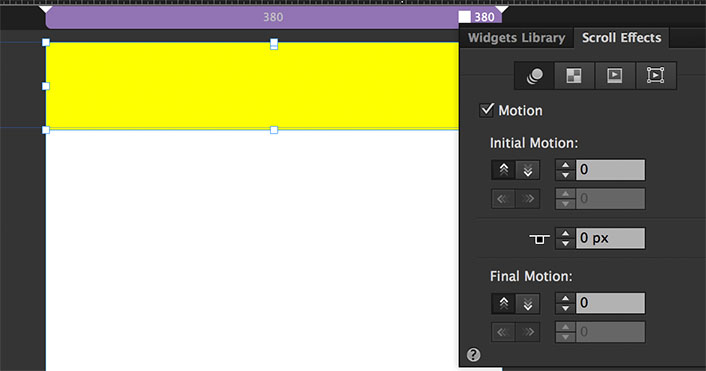
 AdChoices